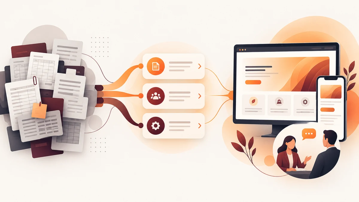
Accounting website design should turn complex services into clear client decisions. Qbiz Tax shows how three service paths, nine capability modules, responsive React development, visual hierarchy and human contact can explain financial support without making unverified performance or tax-saving claims.
Planning a project? Explore Crisant’s website development service in Mysore →
Why this accounting website design project was needed
Qbiz Tax is an Australian practice presenting tax returns, bookkeeping and payroll, and advisory and SMSF support. Those disciplines are connected, but a prospective client may arrive with only one immediate concern: a lodgment, an operational reporting gap, a payroll obligation, a cashflow question or a business decision. The website therefore needed to make several technical services understandable without asking visitors to diagnose the answer alone.
The need was not simply to list everything the practice could do. The interface had to show which service area was relevant, explain the scope in plain language and keep a direct quote, phone or email conversation available. That boundary matters in financial services. A website can help a person find the right discussion, but it should not imitate personalised tax advice or promise savings and outcomes that have not been measured.
For the Qbiz Tax Australia project, Crisant treated clarity as the central design requirement. The production experience would have to hold three service pillars, nine named capabilities and multiple contact paths inside one reassuring system. It also needed to work as a responsive financial services website rather than a desktop presentation compressed onto a phone.
How we structured the financial-services decision journey
The information architecture follows a practical sequence: orient, reassure, choose, understand, trust and talk. The opening proposition gives the visitor a reason to continue. The next chapter establishes the practice’s role. Three service doors then separate Tax Returns, Bookkeeping & Payroll, and Advisory & SMSF before individual capabilities explain what each path can contain.
That structure turns the Qbiz Tax website into a guided decision rather than a catalogue. A visitor can recognise the broad situation first and then scan examples including ATO lodgments, payroll compliance, regulatory reporting, complete bookkeeping, performance reports, cashflow planning, R&D incentives, export grants and business structuring. These are current service descriptions on the live site, not invented outcomes or an exhaustive promise for every engagement.
Human help remains close throughout the journey. Quote, telephone and email actions give visitors a way to describe their circumstances instead of forcing a technical self-assessment. This pattern is useful in tax advisor website development because it separates digital explanation from the professional judgement that should happen in a real conversation.
How the Qbiz Tax experience was visualised
The visual direction begins with the existing Qbiz identity and the emotional job of the website: make detailed information feel orderly, contemporary and approachable. Qbiz maroon carries recognition, deep advisory wine creates authority, warm blush adds a quieter human note, soft financial paper gives long explanations room to breathe and ledger ink keeps body copy dependable and readable.
Geologica is used across headings and supporting text. Its geometric construction suits structured financial information, while open spacing prevents the pages from becoming clinical. Strong scale introduces the proposition; compact modules organise capabilities; repeated service markers help visitors understand where they are. The result is a business advisory website design system, not a collection of unrelated page treatments.
We visualised the three service pillars as distinct doors inside one relationship. Each has enough separation to support quick scanning, yet the palette, typography, module rhythm and contact treatment remain consistent. This avoids two common extremes: a generic corporate template with no recognisable point of view, or a decorative interface that makes serious service information harder to use.
How the responsive React accounting website was developed
Crisant developed the experience as a responsive React accounting website. Reusable structures support the three service areas, the nine capability explanations and the shared contact actions, so repeated information follows the same hierarchy. Focused routes expand the homepage promise into detailed service journeys without requiring one oversized page to carry every question.
The production interface was documented at a 1440-pixel desktop viewport and a 390-pixel mobile viewport. On a wide screen, the site uses a broad maroon stage, centred propositions and paired image-and-copy sections. On mobile, the same story becomes a single purposeful sequence with readable actions and no horizontal overflow. The content order remains intact instead of being rearranged into a different message.
This React accounting website case study also shows why development choices belong in the content plan. Responsive behaviour, component boundaries and route structure determine whether a future update can preserve clarity. The front end is not just the final rendering layer; it is the system that keeps service descriptions, calls to action and visual hierarchy coherent across screens.
What the accounting website design framework controls
The framework below connects the client need to a visible design response and a development control. It documents what can be inspected on the delivered site. It does not claim that the project changed leads, revenue, retention, tax savings or any other commercial metric without client-supplied analytics.
| Client question | Design response | Development control | How to verify |
|---|---|---|---|
| Which service fits my situation? | Three clear service pillars | Consistent routes and service modules | Compare Tax Returns, Bookkeeping & Payroll, and Advisory & SMSF |
| What can the practice help with? | Nine named capability examples | Reusable scannable content blocks | Review the current descriptions on the live site |
| Can I understand this on a phone? | Single-column mobile hierarchy | 390-pixel responsive production layout | Open the website at a narrow viewport |
| How do I discuss my circumstances? | Visible quote, phone and email actions | Repeated contact paths across key routes | Follow the relevant action without diagnosing the answer alone |
| Can I trust what the website promises? | Plain service language and factual boundaries | No fabricated metric or automated tax conclusion | Compare the live experience with the documented case study |
What the completed financial-services website demonstrates
The completed accounting website design Australia project connects three service pillars and nine named capabilities through one consistent visual and technical system. Its strongest evidence is inspectable: the live site, the focused service routes, the responsive layouts and the documented production case study. The work demonstrates organisation and implementation rather than an unsupported business result.
Open the live Qbiz Tax website and compare the desktop and mobile journeys. Notice how the proposition leads into the service model, how each module translates a technical area and how a direct conversation remains available. Then review Crisant’s production case study for the architecture, palette, typography and captured viewports behind those choices.
The broader lesson is transferable to other complex professional services. Begin with the situations clients recognise, separate the major decisions, translate formal scope into plain explanations and preserve a clear boundary between digital guidance and expert advice. A free growth audit can identify where the current customer journey loses clarity before a visual redesign begins.
A useful professional-services website review starts with the decisions clients need to make, the evidence the firm can publish and the conversation that should remain human. Crisant can map those requirements before design or development begins.
Request a professional-services website review →