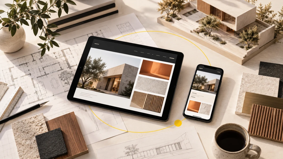
Architecture website design in Mysore should connect a studio’s disciplines, project proof and delivery process without reducing the work to a gallery. RA & KI demonstrates how editorial hierarchy, responsive composition and a structured portfolio can guide enquiries with lasting clarity.
Planning a project? Explore Crisant’s website development service in Mysore →
Why this architecture website design in Mysore was needed
RA & KI is a Mysuru-rooted studio whose published practice connects architecture, interiors, construction, visualisation, project management consultancy and design consultancy. Those six disciplines are not separate offers placed beside one another. The value lies in the relationship between them: design decisions affect materials, visualisation supports approval and construction knowledge influences what can be delivered.
A conventional services template would have fragmented that proposition into six nearly identical cards. A gallery-first approach would have created a different problem by showing attractive spaces before explaining how the studio thinks or works. The website therefore needed to establish one connected operating model, demonstrate range and still help a serious visitor decide how to begin a conversation.
Crisant treated the assignment as both positioning and website development. The architecture starts with the studio idea ‘We design the in-between’, then connects the disciplines, introduces completed work, explains a four-stage process and opens the 42-project archive. The early website development service in Mysore link gives firms planning a similar project a clear route into Crisant’s build process without interrupting the case study.
How the connected studio journey was visualised
The experience was planned as a sequence of decisions rather than a long portfolio wall. Position gives the practice a point of view. Connect shows why the six disciplines belong together. Prove introduces project material. Explain turns the working relationship into the four stages Listen, Draw, Resolve and Deliver. Archive supports deeper research, and Begin closes with a direct project conversation.
That sequence lets the RA & KI website serve visitors at different levels of readiness. Someone encountering the studio for the first time can understand its model before seeing dozens of images. Someone already evaluating the practice can move into the project archive and scan the available work without replaying the entire narrative.
| Visitor question | Website response | Purpose |
|---|---|---|
| What makes this studio different? | One organising proposition before the service list | Creates a memorable position |
| How do the disciplines connect? | Six capabilities shown as one operating model | Explains end-to-end involvement |
| Can the studio demonstrate range? | Project films plus a 42-view archive | Balances immersion with fast scanning |
| What will working together involve? | Listen, Draw, Resolve and Deliver | Makes the process tangible |
| How do I discuss my project? | A focused closing invitation | Turns research into a relevant enquiry |
A visual system shaped like a studio dossier
The design language avoids the white-card uniformity common to many professional-service websites. Warm drawing paper creates the main reading surface, near-black ink provides depth, blueprint slate separates supporting chapters and a signal yellow marks navigation and emphasis. The palette feels related to plans, models and site documentation without imitating technical drawings literally.
Space Grotesk carries the large editorial statements and numbered modules. Inter handles project descriptions, labels and practical copy. Together they give the experience the character of a contemporary studio dossier: expressive at the entrance, disciplined when the visitor needs detail. The visual system is recognisable without relying on a repeated logo at every turn.
The interior design website material and the architecture imagery are given different rhythms but share the same rules for crop, label and spacing. Construction content is not pushed into a secondary utility page. It appears inside the same story because delivery knowledge is part of the practice’s proposition, not an unrelated department.
How the React architecture website was developed
The production system uses reusable React structures for proposition chapters, connected-discipline modules, process stages, project films, archive entries and enquiry actions. Reuse keeps the hierarchy consistent while leaving enough flexibility for different project imagery and descriptions. The result is a content system rather than a single decorated homepage.
The architect portfolio website needed two browsing speeds. Immersive project films let imagery establish atmosphere, while the indexed archive supports deliberate scanning across 42 selected views. Consistent labels, spacing and navigation hold those modes together so visitors can change pace without losing their place.
Responsive behaviour was composed, not compressed. At a 1440-pixel desktop width, the site uses tension between wide statements, image fields and numbered modules. At 390 pixels, those relationships become a direct vertical sequence. Type and colour preserve emphasis while full-width actions, controlled crops and the absence of horizontal overflow keep the experience usable on a phone.
The same implementation approach supports construction website development because the content model can hold services, project context and delivery process together. React provides the modular interface, while the surrounding Next.js application supplies routing, metadata and production delivery for the live experience.
What the live project proves—and what it does not claim
The live RA & KI experience presents six connected disciplines, a four-stage working model, project films and a 42-view portfolio archive. The documented production captures show the homepage and portfolio at desktop and mobile widths. Visitors can verify the hierarchy, visual language and navigation directly through the external links near the top of this article.
The published result is a unified digital story that connects concept, design resolution, construction delivery and consultancy. It gives varied spaces one shared editorial grammar while keeping the practice’s central proposition visible. That is useful evidence of the design and development decisions made for the project.
This case study does not claim a percentage increase in leads, revenue, conversions or engagement. No supporting analytics were supplied for those outcomes. The factual proof is the delivered interface, the live project structure and the production views recorded by Crisant. Keeping those boundaries clear makes the case study more trustworthy than attaching an invented performance figure to design work.
Lessons for architecture and interior studios planning a website
Begin with the relationship between services, not the number of services. If architecture, interiors, visualisation and construction influence the same client outcome, the website should make that system visible. A visitor should understand why the disciplines are stronger together before being asked to inspect each one separately.
Give the portfolio more than one speed. A short, image-led route helps people feel the work, while an index supports comparison and deeper research. Decide which projects need narrative, which need concise context and how a visitor returns to the main proposition after browsing.
Write the process for the client, not for the studio. Labels such as Listen, Draw, Resolve and Deliver are useful because they describe progress a client can recognise. Internal terminology, org charts and long capability inventories rarely provide the same clarity.
Finally, design mobile as an editorial sequence of its own. Choose image order, crop, heading scale and action placement deliberately rather than shrinking a desktop grid. If your studio needs a website structure grounded in its real practice and proof, request a free growth audit before selecting a theme or rebuilding isolated pages.
An effective studio website begins by deciding how a prospective client should understand the practice before browsing individual projects. Crisant can map that journey, shape the visual language and develop a responsive system around the work you can genuinely prove.
Request an architecture website review →