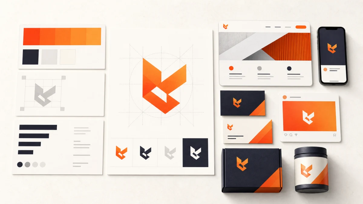
A branding agency in Mysore should understand your market, define positioning before visuals, present reasoned concepts, test every identity across real applications, supply source files and usage guidelines, clarify ownership, and support consistent rollout across web, social, packaging and print.
Planning a project? Explore our graphic design and branding service in Mysore →
Know what the brand system must solve
A logo is one component of identity, not the complete deliverable. The working system also covers approved lock-ups, colour, typography, imagery, icons, tone, spacing and rules for common applications. That system should help a customer recognise the same business on a Mysuru shop sign, an Instagram post, a product label, a proposal and a mobile screen without forcing every item to look identical.
Start with the business problem. A new company may need category clarity and a credible launch kit. An established retailer may have recognition but inconsistent packaging and social creative. A manufacturer may need technical documents, signage and sales presentations to feel related. A clinic, hotel or education brand may need bilingual or Kannada applications that remain legible instead of looking like an afterthought.
Write the required touchpoints before requesting concepts. Include the smallest and largest uses, print quantities, digital channels, languages, dark and light backgrounds, internal template users and any packaging or signage constraints. A strong brief lets the agency design a system for the real operating environment rather than a beautiful presentation that fails after handover.
Use this branding agency in Mysore checklist
Compare agencies on evidence and process, not the number of styles in a portfolio. The best-looking project may have had a different audience, budget and rollout problem from yours. Ask each team to explain how it learns the market, turns strategy into visual choices, tests applications, controls third-party assets and prepares your staff to use the identity correctly.
Use the ten checks below during the first conversation and proposal review. A clear answer can be short; a vague answer usually becomes an expensive assumption after design starts.
| Check | Strong evidence | Risk signal |
|---|---|---|
| 1. Discovery | Audience, offer, category and use cases are documented | The brief begins with preferred colours |
| 2. Positioning | The team can state the idea the identity should reinforce | Visual style is separated from business meaning |
| 3. Concepts | Distinct directions arrive with reasoning | Many near-identical logo options are presented |
| 4. Application tests | Small, large, one-colour, print and digital uses are shown | Only a polished mock-up is supplied |
| 5. Accessibility | Interface colours and ordinary text combinations are checked | The logo palette is copied to every UI element |
| 6. Language | Required English, Kannada or bilingual lock-ups are designed | Translation is left until final export |
| 7. Trademark screening | Preliminary search limits and legal handoff are clear | Registration is casually guaranteed |
| 8. Ownership | Rights, fonts, images and third-party licences are written | Usage rights are discussed after approval |
| 9. Files and guidelines | Vector masters, exports, colour values and rules are listed | Only JPG or PNG files are promised |
| 10. Rollout | Priority touchpoints, templates and an owner are named | Handover ends with a download folder |
Evaluate discovery and concept reasoning
A useful discovery session should separate what the business sells from why customers choose it. Expect questions about alternatives, buying concerns, price position, personality, proof, future offers and the places where the identity must work. The agency does not need months of research for every small business, but it should be able to show which assumptions are being tested and which decisions the owner must make.
Concept presentations should connect form to that brief. A designer might explain how a compact symbol helps small digital use, why a restrained type system suits an established professional service, or how a flexible pattern gives a retail brand variety without losing recognition. Reasoning does not make design objective, but it gives the team a better decision method than asking whether somebody personally likes orange or prefers a competitor's font.
Ask what will remain recognisable if the business expands. A Mysuru food brand may later add products and retail locations; a technology company may add a dashboard, app and investor material; a service business may enter Bengaluru. The identity should have enough structure to grow, while avoiding an elaborate system the present team cannot maintain.
Test the identity in real conditions
Approve a concept only after seeing it in the conditions that can expose weaknesses. Check the mark at favicon and profile-image size, on a low-cost one-colour print, against light and dark backgrounds, on signage viewed from a distance and beside actual product or service information. Test horizontal, stacked and symbol-only arrangements where they are genuinely needed. A mock-up should demonstrate a decision, not hide poor legibility behind lighting and perspective.
For bilingual work, design hierarchy and spacing for both scripts instead of shrinking a Kannada line under the English name. Confirm how the lock-up behaves when one language is used alone and when a narrow application cannot hold both. Use fonts with appropriate rights and a practical character set, then review production proofs before large print or fabrication orders.
Digital accessibility applies to more than the logo. WCAG 2.2 exempts text that is part of a logo or brand name from its minimum text-contrast rule, but ordinary interface copy, form labels and controls are not covered by that exemption. Ask for accessible brand-colour combinations for websites and apps, and avoid turning campaign headings into images of text when real text can provide the same presentation more flexibly.
Clarify trademark, ownership and source files
Do not discover a naming conflict after printing signage and packaging. India's official intellectual-property portal provides public trademark search, and WIPO explains why a trademark is the sign that distinguishes a business's goods or services. A branding agency can perform a preliminary search and design for distinctiveness, but it should not present that check as legal clearance. Use a qualified trademark professional for filing strategy or infringement-risk advice.
The proposal should state what transfers at payment and what remains licensed. Confirm ownership of the approved artwork, rights to commissioned illustration or photography, the licence terms for fonts and stock assets, and whether unused concepts remain with the agency. If a freelancer or subcontractor contributes, the agency should still be able to explain how the necessary rights reach the client.
Request editable vector masters such as AI, EPS or SVG where appropriate, plus print and digital exports, colour specifications, font information, one-colour versions and approved lock-ups. Source files are not a substitute for guidelines: the handover should also explain clear space, minimum size, background control, colour use, typography, imagery and common mistakes. Store the package in a business-owned location with version control and a named custodian.
Plan rollout and measure consistency
Roll out by customer impact and production timing. Digital profiles, the website, proposals, invoices and frequently used social templates can often change first. Packaging, uniforms, signage and vehicle graphics may follow inventory or replacement cycles. Record which old assets can remain temporarily and the date after which teams should stop creating new material with them.
Give internal users templates they can operate without rebuilding the system. A social-media template needs safe zones and a limited type hierarchy; a presentation needs approved title, chart and image styles; a branch sign may need a production specification. Decide who approves exceptions and how external printers, event partners or dealers receive the correct files. Consistency is a governance task, not a demand that every communication uses one rigid layout.
Review the first month of real applications. Look for unofficial colours, distorted marks, unreadable small type, duplicated local files, missing language variants and content that no longer matches the intended voice. Fix the cause through a better template, training or guideline—not only by correcting one artwork. Use a free growth audit to prioritise the identity, website, social and content changes that should move together.
A useful brand review starts with the audience, current touchpoints and the decisions your team cannot apply consistently. Bring the existing logo files, packaging, website, social templates and next launch plan so the first phase fixes the highest-impact gaps.
Request a practical brand-system review →