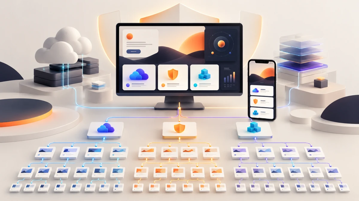
Cybersecurity website design should organise a complex technology offer around one promise, then connect services, products, proof and contact paths without losing trust. Cloud Unicorn shows how deliberate information architecture and a static Next.js build can support that clarity.
Planning a project? Explore Crisant’s website development service in Mysore →
Why this cybersecurity website design was needed
Cloud Unicorn presents a broad technology proposition: helping organisations modernise, protect and operate technology through connected Cloud, Security and Automation practices. Its live offer also spans IT security, developer tools, data, analytics, robotic process automation, DevOps, mobility and automated testing. A visitor should be able to recognise the overall promise and still find the specific capability relevant to a technical or business decision.
The challenge was therefore not a shortage of content. It was how to make a substantial content estate feel intentional. A B2B technology website can easily become a directory of product names, service labels and partner logos. That structure may be complete internally while remaining difficult for a buyer to understand. Cloud Unicorn needed a hierarchy that could introduce the company, organise its practices, retain useful legacy material and create clear routes into deeper product and service information.
Crisant’s website development team replatformed a 42-page WordPress estate as a static React and Next.js experience with no CMS runtime required to serve the site. This account explains observable design and development choices. It does not claim improvements in leads, traffic, conversion, security incidents or revenue because comparative analytics and private operational data were not supplied.
How the 42-page information architecture was shaped
The homepage begins with one outcome—making progress difficult to break—before introducing the three connected practices. This gives the visitor an organising idea before asking them to choose a detailed route. Cloud, Security and Automation are related through the operating promise, while dedicated pages can still answer the questions of different buyers, evaluators and implementation teams.
The site’s Sense, Shape, Ship and Strengthen loop turns delivery into a visible operating model. That is more useful than a loose list of capabilities because it tells a buyer how the organisation approaches change over time. Product categories then sit beneath this clearer strategic layer, so IT security, DevOps, analytics and testing can be explored without forcing every item into the first screen.
For cloud services website development, this sequence matters: promise first, practice second, method third, detailed capability fourth, evidence and contact when the visitor has context. The 42 routes retain depth, but navigation, page headings and repeated calls to action provide a shared grammar. Each page can focus on one subject without looking like a separate microsite.
How the Cloud Unicorn website was visualised
The visual system uses a night base with electric violet, cyan, coral and sun accents. That palette supports the precision and energy expected of a cybersecurity and cloud practice without falling back on generic padlocks, hooded figures or streams of code. Dark surfaces provide continuity, while brighter colours identify moments of emphasis and movement through the content system.
Outfit gives large statements a modern geometric presence, while Work Sans keeps navigation, service descriptions and longer passages readable. The typography separates propositions from explanation without making technical content feel theatrical. Cards, diagrams and sectional colour shifts help a visitor recognise when the story moves from company promise to practices, delivery method and product detail.
Responsive design was considered from a 1440-pixel desktop down to a 390-pixel mobile viewport. Wide screens can show relationships across practices and content groups; phones need the same evidence in a calm vertical order. Reduced-motion preferences are respected, so animation can support orientation without becoming a requirement for understanding the Cloud Unicorn website.
How the WordPress estate became a static Next.js system
The implementation converted the existing WordPress content estate into reusable React and Next.js page structures. Shared navigation, practice modules, product patterns, calls to action and responsive rules reduce inconsistency across 42 pages. The finished production export can be served without a WordPress CMS runtime, while still preserving the depth of the original material.
This is a WordPress to Next.js case study about content modelling as much as framework choice. Moving pages without defining reusable fields and relationships would reproduce the old complexity in a new codebase. Crisant first treated repeated content as a system, then used components to keep the visual and editorial grammar consistent across routes.
A Next.js static website also changes the operational surface: published pages are delivered as prebuilt output rather than assembling every public request through a live CMS. That does not remove the need for secure hosting, dependency updates, monitoring, backups or a controlled publishing process. It simply aligns the runtime with a corporate website whose public content does not need on-request database assembly.
What the technology website framework controls
The framework below connects a buyer question with an observable design response and a maintainable development control. Every point can be reviewed on the live website or in Crisant’s production case study. The table describes delivered structure, not private performance outcomes.
| Buyer question | Design response | Development control | How to verify |
|---|---|---|---|
| What does this company help me achieve? | One resilient-progress proposition leads | Shared hero and proposition pattern | Review the homepage opening |
| Where does my need fit? | Cloud, Security and Automation organise the offer | Dedicated practice routes with common navigation | Compare the three practice pathways |
| How does the team work? | Sense, Shape, Ship and Strengthen make the method visible | Reusable operating-loop module | Inspect the process section |
| Can I explore a specific capability? | Product categories reveal deeper detail | Consistent cards and page templates | Open security, DevOps or analytics content |
| Will the experience work on my device? | The hierarchy becomes a guided mobile sequence | Responsive components and reduced-motion support | Compare 1440 px and 390 px views |
What the completed technology website demonstrates
The completed website shows that a complex technology offer does not need to become a crowded catalogue. One proposition connects three practices, an operating loop explains the delivery approach, product categories preserve depth and reusable page structures keep the 42-page experience coherent. The live footer also identifies Crisant as the design and development partner.
Open the live Cloud Unicorn website and follow one path from the homepage into a practice or product area. Notice when the experience changes from broad promise to specific capability, how the colour and typography maintain continuity, and where contact becomes appropriate. Then review Crisant’s case study for the documented information architecture, brand system and production views behind those decisions.
The wider lesson is straightforward: a technical website should model the buyer’s understanding, not mirror an internal org chart. Define the promise, group capabilities by real questions, make the operating method visible and build repeatable page patterns before polishing individual screens. A free growth audit can identify where an existing technology website loses that sequence.
A useful technology website review starts with the buyer’s real decision: understand the promise, find the relevant capability, see credible proof and know the next step. Crisant can map that journey before visual design or development begins.
Request a technology website review →