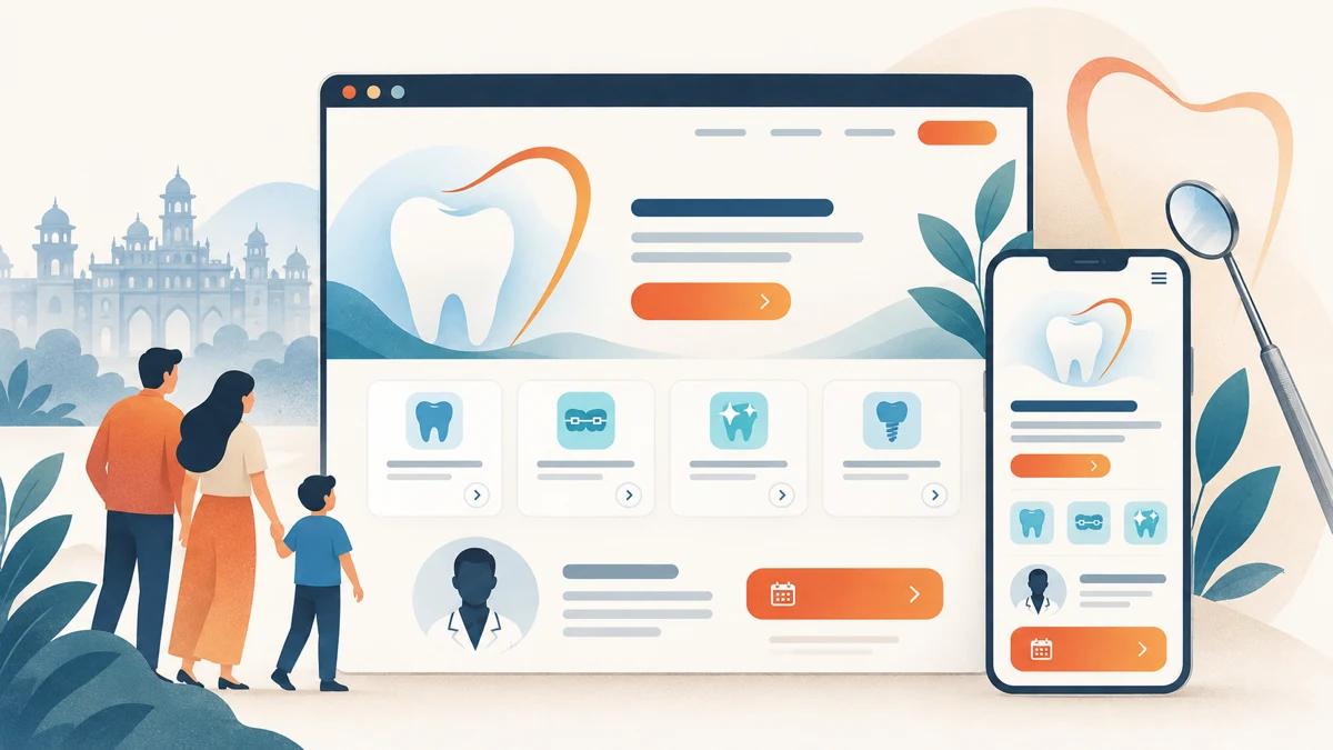
Dental clinic website design should turn clinical expertise into a calm, understandable patient journey. Dental Concepts shows how dedicated treatment routes, responsive React development, clinician-led trust signals and familiar appointment actions can explain precision without making dental care feel impersonal.
Planning a project? Explore Crisant’s website development service in Mysore →
Why this dental clinic website design was needed
Dental Concepts is a family dentistry clinic in Vijayanagar, Mysore, led by Dr. Anita Nitin. Its live website presents microscope-enhanced dentistry, root canal therapy, laser dentistry, dental implants, full-mouth rehabilitation, cosmetic dentistry, gum treatment and paediatric dentistry. A visitor may arrive with a specific concern, but still need help understanding the relevant treatment, the clinician behind it and the most appropriate next conversation.
The brief was not simply to list every procedure. Advanced dental technology can establish authority, yet it can also make care feel distant when equipment appears before explanation. The Dental Concepts Vijayanagar experience therefore needed to connect precision with empathy, organise eight treatment routes and show practical appointment information without overwhelming someone researching on a phone.
For this dentist website design Mysore project, the need became a content and interface question: how can the website explain technology, expertise and treatment choices while remaining calm, local and human? Crisant used the live clinic facts as the boundary. The project does not claim patient results, appointment growth, revenue or a clinical outcome because supplied analytics and clinical evidence are not part of this case study.
How we structured the patient decision journey
The information architecture follows a six-stage journey: Reassure, Differentiate, Choose, Understand, Meet and Book. The opening promise establishes a calm standard of care. Technology is then explained through practical purpose, treatment routes help visitors recognise the subject they want to explore, dedicated pages add depth, clinician context anchors accountability and familiar actions close the journey.
Eight individual treatment destinations prevent high-intent questions from disappearing inside one long services page. Each route can explain its purpose, approach, related care and next appointment action within a consistent page grammar. This dental clinic website development pattern creates depth without making the homepage behave like a clinical encyclopaedia.
Phone, clinic timings, location and appointment actions remain visible through the research journey. The website can make the path easier to understand, but it does not diagnose a condition or decide whether a treatment is suitable. That boundary matters in healthcare website design India projects because responsible clarity is more trustworthy than an unsupported promise.
How the Dental Concepts Mysore website was visualised
The visual direction began with a two-part idea: precise dental care, genuinely human. Dental navy creates professional depth, clear cyan supports links and clinical highlights, vitality green adds a positive-care signal, clinical ink keeps detailed copy readable and fresh mist gives patient-facing content room to breathe. The result avoids both a cold equipment catalogue and an overly decorative wellness template.
SF Pro Display gives major statements a confident geometric form, while SF Pro Text keeps service explanations, labels and actions legible. A restrained handwritten accent appears only where a human signature helps. Real treatment, clinic and practitioner imagery carries evidence; abstract dental decoration does not substitute for the place or person a visitor may meet.
The homepage uses scale and open space to establish the clinic’s proposition before introducing technology, treatments, practitioner trust and booking. A treatment page applies the same system to a deeper question such as root canal care. This React dental website case study visualises one coherent family of pages rather than a collection of unrelated landing screens.
How responsive React development kept the journey usable
Crisant developed reusable React structures for treatment cards, practitioner context, technology explanations, clinic evidence and appointment actions. Shared patterns let eight routes remain consistent while each page answers a distinct question. The system is easier to maintain because hierarchy and interaction rules do not have to be reinvented whenever clinic content changes.
At a 1440-pixel desktop viewport, large typography, real treatment photography and visible booking actions create an editorial clinical stage. At 390 pixels, the same evidence becomes a readable vertical sequence with comfortable touch targets and no horizontal overflow. Mobile does not receive a reduced message; it receives the same patient journey in a more focused order.
This clinic website development Mysuru project shows why content planning, visualisation and front-end development must happen together. Responsive code cannot repair an unclear service model after the fact. The team first defines what a visitor should understand, then chooses components, spacing and breakpoints that preserve that sequence across devices.
What the dental clinic website design framework controls
The framework below connects a visitor question with an inspectable design response and a development control. It records what can be checked on the delivered site. It intentionally avoids performance claims that would require client-supplied analytics, patient evidence or a controlled comparison.
| Visitor question | Design response | Development control | How to verify |
|---|---|---|---|
| What kind of care is available? | Eight recognisable treatment routes | Reusable treatment-page content grammar | Compare the service destinations on the live website |
| Who is responsible for the care? | Visible clinician identity and experience | Practitioner context near relevant services | Review the homepage and treatment-page hierarchy |
| Why does the technology matter? | Microscope and laser context tied to purpose | Structured explanation instead of equipment labels | Read the technology and treatment sections |
| Can I use this comfortably on mobile? | Focused vertical hierarchy and large actions | Responsive React layout documented at 390 pixels | Open the live website at a narrow viewport |
| How do I arrange a conversation? | Phone, timing, location and booking actions | Consistent conversion pattern across routes | Follow the appointment actions without submitting |
What the completed dental website demonstrates
The completed experience connects clinician, technology, treatment choice, clinic evidence and appointment access in one responsive system. The evidence is inspectable on the live website and Crisant’s production case study: eight treatment routes, desktop and mobile production views, a consistent visual system and a clear progression from reassurance to booking.
Open the Dental Concepts Mysore website and compare the wide and narrow journeys. Notice how technology is introduced through patient-facing purpose, how service pages preserve a shared grammar and how the clinician remains connected to the work being described. Then review the production case study for the palette, typography, journey map and responsive captures behind those decisions.
The broader lesson applies to any specialist practice: begin with the questions people recognise, name the accountable professional, explain technical capability in plain language and show the next conversation without promising a result. A free growth audit can identify where a current clinic website loses that clarity before a redesign begins.
A useful clinic-website review starts with the questions patients bring, the evidence the practice can responsibly publish and the decisions that belong in a direct consultation. Crisant can map those requirements before design or development begins.
Request a clinic-website review →