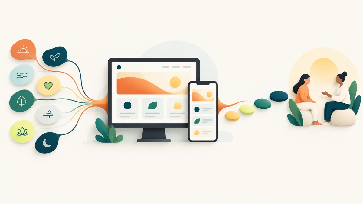
Dietitian website design should make practitioner expertise, service boundaries and consultation steps easy to understand. Nourish With Relma shows how eight concern pathways, responsive development, a warm visual system and four transparent steps can guide visitors without promising health outcomes.
Planning a project? Explore Crisant’s website development service in Mysore →
Why this dietitian website design project was needed
Nourish With Relma is a Mysuru nutrition practice led by clinical dietitian Relma Gangam. People may arrive at its website with questions about weight, hormones, pregnancy, stress, digestion, recovery or sports nutrition, yet they may not know which formal service fits. The website therefore needed to translate a broad professional offering into familiar starting points without asking visitors to diagnose themselves.
The need was larger than publishing a programme list. The Relma Gangam dietitian profile had to introduce the practitioner, make the food-first point of view understandable, organise several concerns and show what happens after an enquiry. It also had to preserve an important boundary: the website can explain the consultation path, but it cannot provide individual health advice or guarantee a health outcome.
For this dietitian website design Mysore project, Crisant treated clarity and human accountability as the central requirements. The live experience would need to connect eight named pathways with one consistent four-step process. It also had to operate as a responsive nutrition website rather than a desktop presentation reduced to a narrow screen.
How we structured the wellness decision journey
The content architecture follows six questions in sequence: can this feel achievable, who is guiding me, is my concern recognised, what does the support involve, can I trust the relationship and how do I begin? Those questions became an experience pattern of Encourage, Position, Recognise, Explain, Reassure and Begin.
Eight lifestyle and life-stage pathways let visitors start in their own language. Weight management, PCOD and PCOS, hormonal balance, pregnancy nutrition, stress, digestive health, post-surgery recovery and sports nutrition are presented as current service labels on the live Nourish With Relma website. They are navigation cues, not medical conclusions or claims that a particular service is appropriate for every visitor.
The consultation journey then reduces process uncertainty through four visible steps: book an appointment, complete an assessment form, join a one-to-one video call and receive a personalised diet plan. Call, WhatsApp and enquiry routes stay close to the content. This healthcare website design Mysuru pattern lets the interface prepare a useful conversation while leaving professional judgement with the practitioner.
How the Nourish With Relma experience was visualised
The visual system begins with a practitioner-led idea rather than a generic wellness template. Deep Nourish teal creates a dependable base, herbal green signals fresh action, sun-washed yellow adds optimism, fresh lime highlights approachable next steps and mineral mist gives detailed content breathing room. Together they balance professional care with everyday warmth.
Playfair Display gives the main ideas an editorial wellness voice. Roboto keeps navigation, service explanations and consultation actions legible at smaller sizes. Relma’s portrait gives the experience a human centre, while soft organic geometry and generous white space support the food-first positioning without turning the interface into a decorative lifestyle collage.
We visualised the eight pathways as recognisable entrances into one coherent relationship. Repeated module shapes, colour roles and action patterns show that each concern belongs to the same practice. The result is a nutritionist website case study about visual hierarchy: use colour and type to make choices easier, then let real practitioner information carry trust.
How the responsive nutrition website was developed
Crisant developed reusable structures for the practitioner introduction, service pathways, process steps, review evidence and contact actions. Focused pages can extend the homepage into deeper search-aware explanations while preserving the same visual and editorial rules. This approach keeps the system maintainable as service information changes.
The production experience was documented at a 1440-pixel desktop viewport and a 390-pixel mobile viewport. On a wide screen, editorial typography, open section rhythms and supporting imagery create a calm practitioner-led stage. On mobile, the content becomes a clear vertical sequence with readable actions and no horizontal overflow. The message stays consistent rather than becoming a shortened, disconnected version.
This wellness website development India project shows why content architecture and front-end development must be planned together. Responsive behaviour determines whether the consultation explanation remains understandable, whether action labels stay readable and whether eight choices become overwhelming. Components are useful only when their order, language and visual weight continue to support the visitor’s decision.
What the dietitian website design framework controls
The framework below connects a visitor question to a visible design response and a development control. It documents what can be inspected on the delivered site. It does not claim that the work changed bookings, leads, revenue, symptoms or health outcomes because client-supplied analytics and clinical evidence are not part of this case study.
| Visitor question | Design response | Development control | How to verify |
|---|---|---|---|
| Is my situation recognised? | Eight familiar concern pathways | Consistent service modules and deeper routes | Compare the named pathways on the live site |
| Who will guide me? | Visible practitioner identity and point of view | Reusable biography and trust sections | Review the practitioner-led homepage sequence |
| What happens after I enquire? | Four transparent consultation steps | Ordered process component with nearby actions | Follow booking, assessment, video call and plan |
| Can I use this on my phone? | Focused single-column mobile hierarchy | 390-pixel responsive production layout | Open the live website at a narrow viewport |
| Does the website promise a result? | Responsible service language and clear limits | No fabricated performance or health metric | Compare the live experience with the documented case study |
What the completed wellness website demonstrates
The completed Nourish With Relma website connects eight familiar pathways and a four-step consultation journey through one responsive system. Its evidence is inspectable: the live website, the production viewports, the page architecture and Crisant’s documented case study. The project demonstrates design and implementation decisions, not a claimed clinical or commercial result.
Open the live site and compare the desktop and mobile journeys. Notice how the practitioner introduction leads into the food-first positioning, how the pathways help a visitor recognise a concern and how the consultation steps turn an abstract service into a process. Then open Crisant’s case study to inspect the palette, typography, content architecture and responsive captures behind those choices.
The broader lesson applies to other practitioner and professional-services websites. Begin with the situations clients recognise, show the responsible human behind the service, explain the process before asking for an enquiry and be precise about what the website cannot decide. A free growth audit can identify where the current customer journey loses clarity before a redesign begins.
A useful practitioner-website review begins with the concerns people recognise, the facts the practice can responsibly publish and the decisions that should remain with a qualified professional. Crisant can map those requirements before design or development begins.
Request a practitioner-website review →