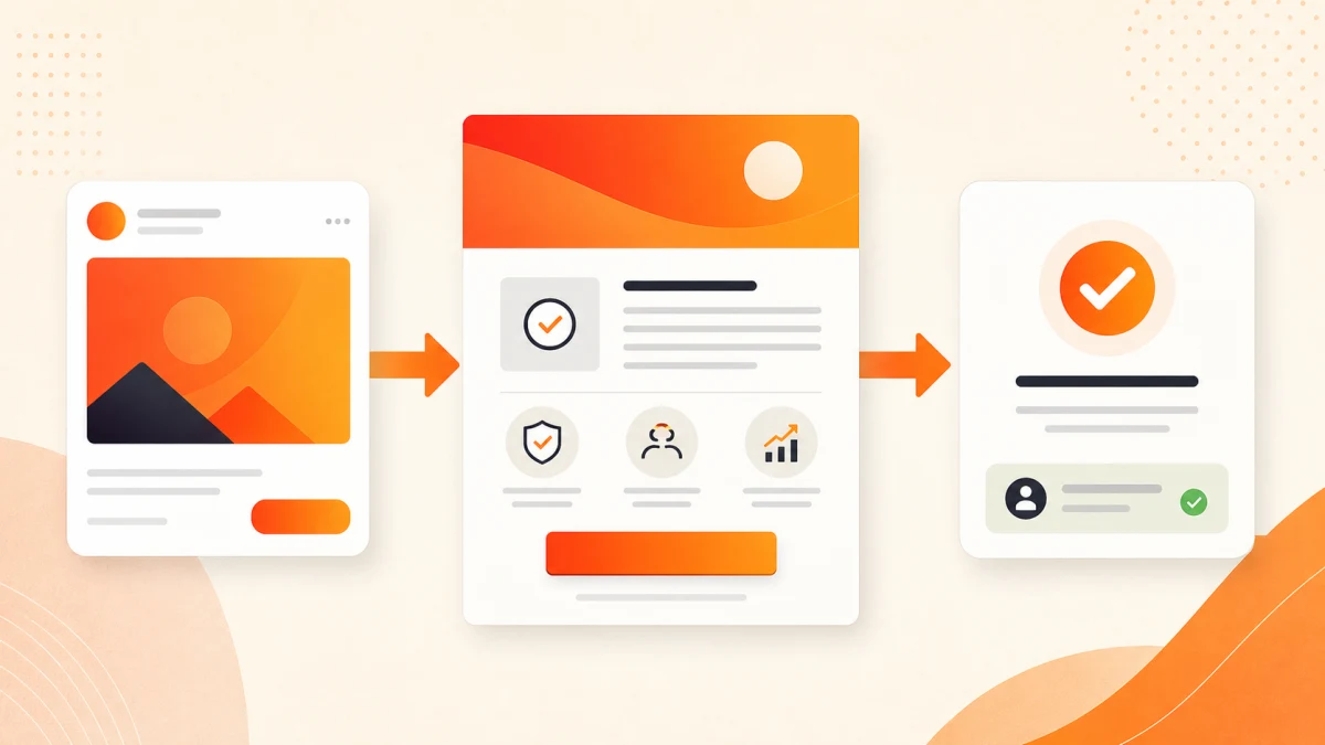
Landing page design Mysore campaigns need message match between the ad and page, focused proof, fast mobile delivery, one clear action, tracking and a defined follow-up process. Build each element around the visitor’s decision, then improve it with qualified-enquiry evidence.
Planning a project? Explore Crisant's digital marketing and landing-page work in Mysore →
Start landing page design Mysore with the ad promise
A landing page begins before the page loads. The visitor has already seen a search phrase, headline, image, offer and call to action. Those elements create an expectation. Google Ads describes landing-page experience through relevance, usefulness, navigation and whether the destination meets expectations created by the ad. The first screen should therefore continue the same promise in language instead of introducing a company story.
Write the promise as one testable sentence: who the offer is for, which problem it addresses, what the visitor can do next and any condition that changes the decision. Then compare that sentence with every ad variant. If one campaign advertises emergency support and another promotes a planned consultation, they may need different destinations. Sending both to a generic homepage makes the visitor reconstruct the connection and makes campaign evidence harder to interpret.
Message match does not mean copying every word mechanically. It means preserving the intent. A paid campaign landing page can expand the promise with scope, process, proof and safeguards, but it should not change the product, location, price condition or next step. Review the search terms, creative, audience and page together so a mismatch is not blamed only on design.
Build one decision path, not a smaller homepage
A homepage must serve many visitors. A conversion-focused landing page should serve one decision. Remove navigation choices that do not help that decision, but keep the information a buyer needs. The page may still explain alternatives, constraints and who the offer is not for. Focus is not pressure; it is a clear route through the evidence.
Arrange sections around buyer questions. Begin with the promised outcome and relevant context. Follow with the problem, approach, deliverables, suitable customers, proof, process, common objections and next step. A local service may need location and availability details. A considered B2B purchase may need technical scope, governance or implementation information before the form. Do not force every offer into the same template.
Use one primary action label consistently, such as requesting an assessment, booking a consultation or checking availability. Secondary actions should support the same decision rather than compete with it. A phone number can help urgent visitors; a downloadable specification may help procurement. Define which action is primary, which is diagnostic and who owns the response before development begins.
| Page element | Decision it should support | Evidence to review |
|---|---|---|
| Opening promise | Am I in the right place? | Ad, keyword and headline alignment |
| Proof | Why should I believe this? | Relevant work, verified review or process detail |
| Offer scope | What is included and excluded? | Deliverables, conditions and suitability |
| Primary action | What happens next? | Form completion and qualified response |
| Mobile experience | Can I act without friction? | Real-device checks and field errors |
Use proof that answers the visitor’s actual risk
Proof should reduce a specific uncertainty. A portfolio image can show design quality, but it may not demonstrate delivery discipline, technical ownership or ongoing support. A testimonial can show trust, but only when it is attributable and relevant. A process explanation can prove that the team has thought beyond the visual layer. Choose proof by asking what the visitor is afraid of getting wrong.
Place evidence near the claim it supports. If the page promises local delivery, show the office, service area or local project context. If it promises a maintainable website, explain ownership, handover and updates. If it promises campaign support, show how enquiry sources and outcomes will be reviewed. Avoid unqualified superlatives, borrowed badges and decorative client logos that the team cannot explain.
Crisant's public portfolio and verified reviews can support a page when the project or feedback genuinely matches the offer. They should not be stretched into a claim about guaranteed results. A lead generation landing page is more credible when it states the next step, response expectation and decision criteria plainly. Buyers often need clarity more than excitement.
Design the mobile form and follow-up as one system
Many paid visits arrive on phones, so test the page on devices and connections. The first screen should orient the visitor without hiding useful content behind animation. Type must remain readable, controls must be easy to tap and layout shifts must not move the call to action. Compress media, limit third-party scripts and load only what helps the decision.
Ask only for information the response team will use. Every additional field needs a reason. A consultation request may need name, contact method, business context and the problem to solve; it rarely needs a full procurement questionnaire before the first conversation. Use input types, visible labels, useful error messages and a confirmation that explains what happens next. Protect form data and avoid placing personal information in analytics parameters.
The page does not finish at submission. Route enquiries to a named owner, set a response expectation and record whether the lead was contactable, suitable and commercially useful. If a fast form produces many unsuitable enquiries, the answer may be better qualification copy rather than more traffic. Page design, campaign settings and sales handling should share one feedback loop.
Measure the journey without confusing activity with value
Define measurement before launch. A completed form, booked appointment, qualified call or purchase may be the primary conversion. Scroll depth, video plays and button clicks can diagnose behaviour, but they are not automatically business outcomes. Record the source, campaign, offer and meaningful downstream status so the team can distinguish cheap activity from useful demand.
Google Analytics supports campaign parameters such as source, medium, campaign and content. Use a documented, case-sensitive naming convention across channels, and preserve advertising identifiers through redirects. Do not add names, email addresses, phone numbers or other personal data to campaign URLs. Test every final URL, confirmation event and route to the sales record before spending begins.
Review the journey as a sequence. If suitable visitors do not reach the page, investigate targeting and creative. If they arrive but do not understand the offer, inspect message match and hierarchy. If they begin but abandon the form, inspect friction and trust. If submissions are plentiful but unsuitable, revisit qualification, optimisation and follow-up. One dashboard number cannot locate every failure.
Plan landing page development Mysore as an experiment
A practical build starts with evidence already available: customer questions, search terms, sales objections, existing analytics, call notes, portfolio material and compliance requirements. Turn that material into a page brief covering audience, promise, primary action, required proof, exclusions, tracking and response ownership. Approve the structure before visual polish, then build a responsive version with the real copy rather than placeholder text.
Quality assurance should cover copy accuracy, forms, keyboard use, mobile layouts, performance, analytics, consent, redirects, confirmation messages and lead routing. Test from the advertisement's final URL on each important device path. A digital marketing agency Mysore team should be able to explain both the creative decision and the technical hand-off, because a page cannot compensate for a broken follow-up process.
Launch with one hypothesis and an agreed review window. Change one meaningful element at a time when traffic volume allows a useful comparison. Record the version, date, reason and downstream result. Do not declare a winner from a handful of clicks, and do not keep a weak offer alive by endlessly changing button colours. For an evidence-led plan across traffic, page and follow-up, request a free growth audit.
Bring one live campaign, its ads, the destination page and a sample of qualified and unqualified enquiries. Crisant can review the message path, mobile experience, proof, measurement and follow-up before recommending a rebuild or a smaller test.
Request a free landing-page review →