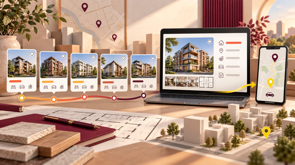
Real estate website design should turn property interest into confident evaluation by connecting status, location, configurations, approvals, amenities and visit actions. Prithvi Infrastructure shows how one system can present five Mysuru addresses without reducing them to a repetitive listing directory.
Planning a project? Explore Crisant’s website development service in Mysore →
Why this real estate website design was needed
Prithvi Infrastructure presents apartments and villas across five named Mysuru addresses: Prithvi World, Prithvi Orchids Villa, Prithvi Palace, Prithvi Lifestyle and Prithvi Castles. A homebuyer needs to recognise the developer, understand which communities are available, compare the type and location of each project, inspect the relevant facts and know how to arrange a visit. The website therefore had to work as more than a visual brochure or a flat property directory.
Property decisions combine emotion with verification. Architecture, landscape and atmosphere create interest, while status, configurations, RERA information, development facts, amenities, gallery, directions and contact options support evaluation. If the experience leads only with imagery, serious details become difficult to find. If it leads only with specifications, every address can feel interchangeable. Crisant’s website development team planned the site around the sequence in which confidence grows.
This case study describes observable content, design and implementation choices on the live Prithvi Infrastructure website. It does not claim changes in enquiries, bookings, sales, revenue or search performance because comparative analytics and private commercial data were not supplied. The outcome is assessed through the delivered information architecture, responsive production views and visible visit pathways.
How the buyer-confidence journey was organised
The homepage begins with a Mysuru-led residential promise and a ready-to-move route before presenting the wider developer story. That opening answers three immediate questions: where the homes are, what can be explored now and why this portfolio belongs in the city. The experience then moves from proposition to trust, project comparison, detailed inspection and site-visit action.
Five project cards attach a name, home type, location and status to each address. Ready-to-move and completed states appear while visitors compare, so the website helps separate current choices from the developer’s delivered record. Dedicated project routes can then carry configurations, planning facts, highlights, amenities, gallery, location and visit controls without crowding the first screen.
For property website development Mysore businesses can review, the important principle is progressive disclosure. A casual visitor receives a clear orientation; an active buyer can move into evidence; and a high-intent visitor can choose brochure, directions, phone, WhatsApp or a structured visit request. The hierarchy supports different research depths without creating disconnected microsites.
How the Prithvi Infrastructure website was visualised
The visual system extends Prithvi’s existing seal and wordmark through heritage wine, deep wine, signal yellow, architectural pearl and residential ink. Wine carries identity and trust, pearl gives property photography and longer copy a warm reading surface, and yellow marks availability, wayfinding and actions that deserve attention. The palette feels specific to Prithvi rather than borrowing the generic black-and-gold language common in property marketing.
Playfair Display gives location-led statements a residential, editorial character. Sora keeps navigation, labels, project facts and forms compact and legible. That pairing separates atmosphere from utility: display type can create a sense of place, while the information used to compare homes remains easy to scan.
At a 1440-pixel desktop viewport, the composition can place property imagery, project context and actions side by side. At 390 pixels, those elements become a deliberate vertical sequence with large controls and preserved hierarchy. The builders website design Mysuru audiences see on a phone is not a shrunken desktop page; it is reordered for one-handed research and direct contact.
How the Next.js real estate website was developed
Crisant designed and developed the experience with React and Next.js, using reusable structures for navigation, project cards, availability states, property details, galleries, insights and enquiry paths. Shared components keep five project stories recognisable as one portfolio while allowing each address to retain its own proposition, images, configurations and location context.
The content model treats status and facts as part of the interface rather than decorative captions. Project routes can place RERA references, land and open-space information, home types, amenities, walkthroughs and directions where buyers naturally look for them. A consistent grammar also makes it easier to add or update property information without redesigning the journey for every page.
Search-friendly headings and the property journal give the site useful context beyond project names, while descriptive routes let each page focus on a distinct decision. Technical delivery still depends on controlled deployments, current dependencies, monitoring and maintained hosting. Framework choice supports the experience, but clear content relationships and disciplined component design do the larger organisational work.
What the property website framework controls
The framework below connects a buyer question with a visible interface response and a maintainable development control. Each point can be checked on the live website or in Crisant’s production case study; none depends on an unverified performance claim.
| Buyer question | Interface response | Development control | How to verify |
|---|---|---|---|
| Which homes can I consider now? | Availability appears during project comparison | Reusable status labels and project data | Review the homepage portfolio |
| Where is each address? | Location accompanies the project name and type | Consistent project-card fields | Compare all five project cards |
| Can I inspect the important details? | Project routes organise approvals, facts, amenities and gallery | Shared detail-page modules | Open Prithvi World or Orchids Villa |
| Does the brand feel distinctive? | Wine, pearl and signal yellow extend the existing identity | One responsive design-token system | Compare homepage and project routes |
| How do I move from research to a visit? | Brochure, directions, phone, WhatsApp and visit request remain accessible | Repeated high-intent action patterns | Follow a project route to its visit controls |
What the completed Mysuru property website demonstrates
The completed experience shows how one portfolio can hold five distinct residential stories without becoming five unrelated websites. A shared promise, comparison grammar and visit system create continuity. Status, configurations, planning detail, galleries and location context give each project enough depth for serious research.
Open the live Prithvi Infrastructure website and follow the journey from the Mysuru proposition into one project. Notice when status becomes visible, how the visual language shifts from atmosphere to evidence, and where the site offers different ways to plan a visit. Then review Crisant’s case study for the documented responsive views, brand system and experience architecture behind those decisions.
The wider lesson is practical: organise a real-estate website around confidence, not inventory alone. Establish place, make availability clear, attach facts to the relevant project and keep the next step proportional to the visitor’s intent. A free growth audit can identify where an existing property website interrupts that journey.
A useful property website review starts with the questions a serious buyer must answer before planning a visit: availability, location, configuration, approvals, amenities and the next action. Crisant can map that decision journey before design or development begins.
Request a property website review →