Restro Design
Website Design & Development · Food & Restaurants
Restro Design: bringing the brand, menu and customer experience together online
Responsive Static Website for Restaurants for Restro Design, shaped around bringing the brand, menu and customer experience together online with responsive UX and a search-friendly content foundation.
Visit restrodesign.com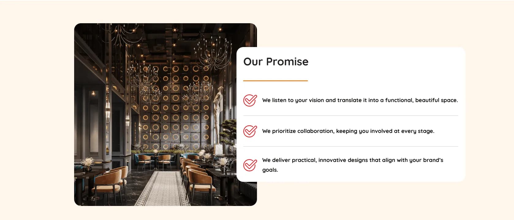
- Responsive
- desktop, tablet and mobile experience
- Clear UX
- content organised around visitor intent
- SEO-ready
- search-friendly page foundation
The client
Restro Design works in the Food & Restaurants sector. The project brief called for responsive Static Website for Restaurants, with a website experience designed around how its audience researches and decides online.
The design challenge
The website needed to serve customers looking for the offer, location and a quick route to order or enquire. That meant making the offer understandable quickly, establishing credibility with relevant proof and keeping the next action visible on both desktop and mobile.
Search visibility also depended on giving every important service, product or programme a clear place in the page hierarchy. The challenge was to balance keyword relevance with copy that still reads naturally for a real customer.
What we built
Crisant delivered responsive Static Website for Restaurants for Restro Design. The experience combines responsive layouts, a clear information hierarchy, focused calls to action and visual storytelling suited to its market.
Developed a stunning and user-friendly website for RestroDesign, capturing the essence of creativity and functionality. The platform highlights their expertise in designing exceptional restaurant interiors, showcasing a perfect blend of aesthetics and practicality. The website offers a seamless digital experience, effectively presenting their interior design portfolio and emphasizing their commitment to transforming dining spaces into extraordinary experiences.
Semantic page sections, descriptive headings, crawlable service content and internal conversion paths created a practical SEO foundation while helping visitors view the offer and order or enquire.
Decisions behind the screens
The details that mattered
Clarity before decoration
The page hierarchy makes Restro Design's offer and proof easier to understand before asking the visitor to act.
Designed for the small screen
Navigation, reading rhythm and calls to action were planned for mobile visitors who need to view the offer and order or enquire.
Search-friendly structure
Descriptive headings and service-led sections give search engines useful context about Restro Design and its food & restaurants offering.
A direct next step
Important pages guide the visitor toward the relevant action: view the offer and order or enquire.
Responsive website screens
Restro Design, from first impression to final action
A closer look at the visual system, content rhythm and responsive layouts delivered for the project.
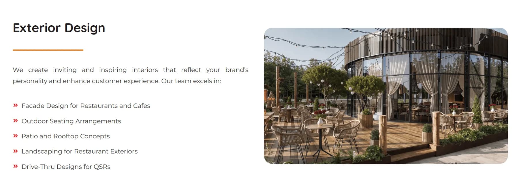
Restro Design website experience
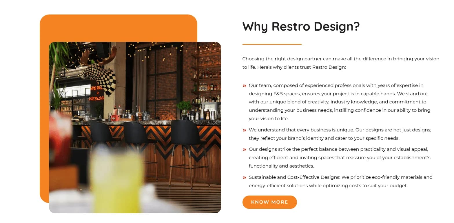
Restro Design responsive interface detail 2
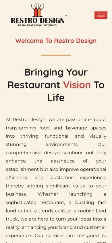
Restro Design mobile homepage at a 390px viewport
Delivered value
The outcome
- A focused digital presence that presents Restro Design with greater clarity and credibility.
- A consistent responsive experience across desktop, tablet and mobile screens.
- A reusable, search-friendly foundation for future service, product and content growth.
Build something relevant to your market
Explore our website development service
The same team, process and attention to business intent are available for your next website.
Explore Website Development →More in Food & Restaurants
Related website case studies


Want Restro Design's clarity for your business?
Tell us what you want to build or improve. We’ll identify the strongest content, search and conversion opportunities before proposing a plan.
Prefer to talk? WhatsApp us → · +91 77568 73424