01
Sell the pace before the inventory
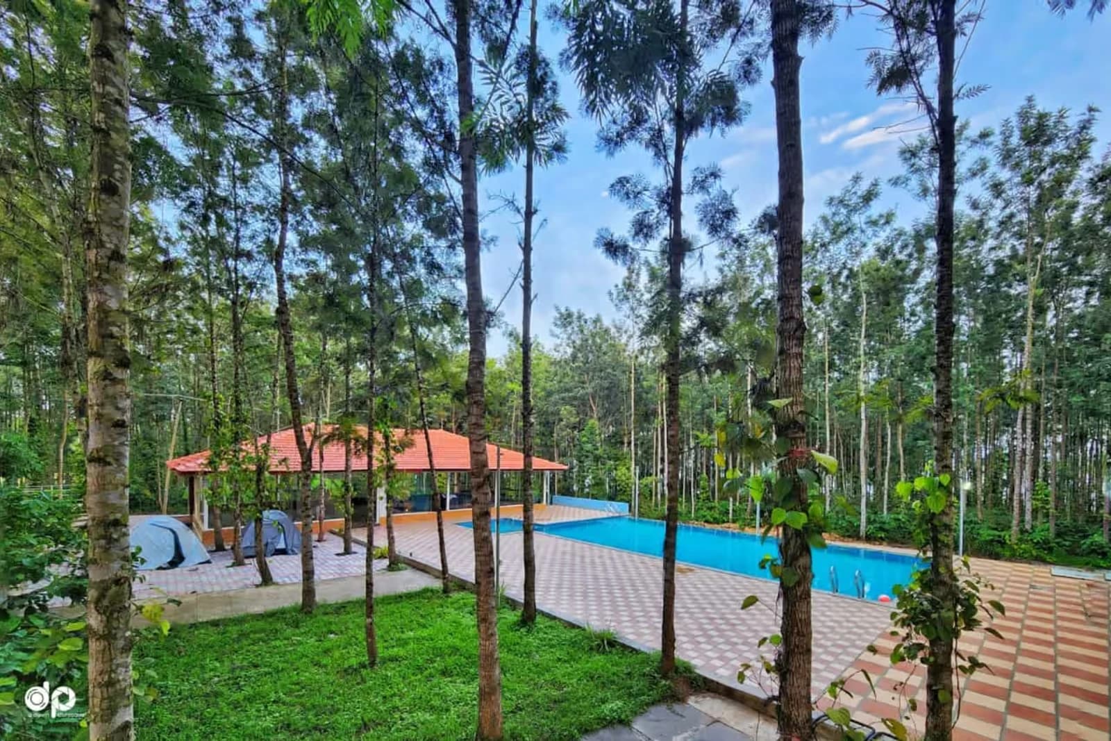
The opening uses the wooded pool, editorial scale and a place-specific promise to establish why the retreat feels different before presenting its room list.
Waterview Holiday Retreat
React & Next.js Resort Website · Hospitality & Accommodation
A responsive hospitality experience for a nature-led retreat in Bolenahalli, Sakleshpur—connecting six distinct stays, authentic property photography, guide prices, shared amenities and a secure booking handoff.
Visit waterviewholidayretreat.com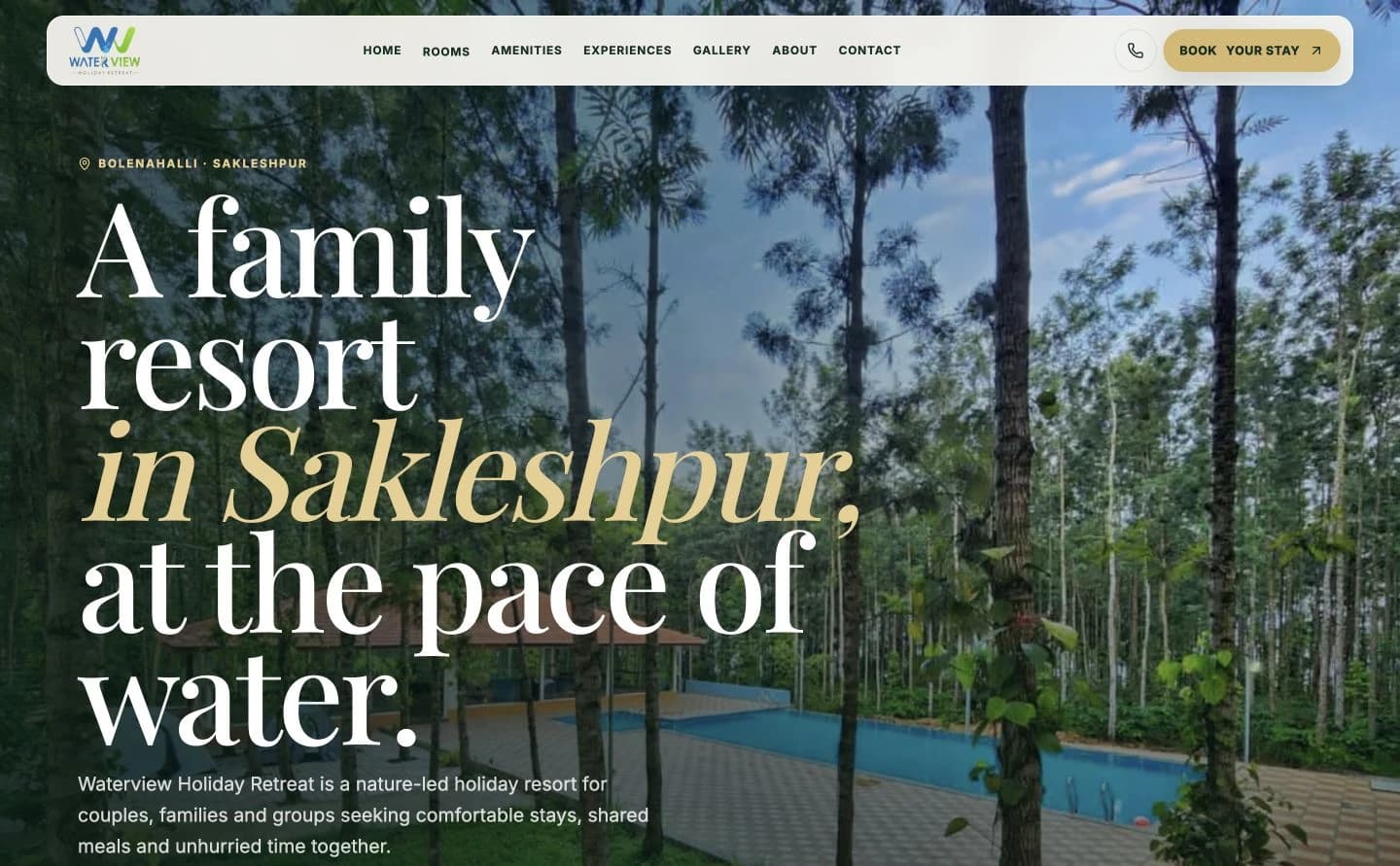
The hospitality decision
Couples, families and groups need to feel the landscape, then verify practical details: which room fits, how the beds differ, what is shared, what a guide price means and where availability is confirmed. The experience had to hold emotion and evidence in the same journey.
The website begins at the pace of water, then becomes progressively more useful—moving from place and possibility into six inspectable stays, real photography, shared experiences and a secure booking handoff.
01
The opening uses the wooded pool, editorial scale and a place-specific promise to establish why the retreat feels different before presenting its room list.
02
Every accommodation card connects a distinct proposition with real photography, bed information, occupancy language, a guide price and its own detail route.
03
Real rooms, greens and water views replace generic destination imagery, while careful qualifiers protect the booking decision from assumptions.
04
The website owns inspiration and comparison; the official booking provider owns the final availability and payment flow, with that handoff clearly signposted.
Hospitality experience architecture
Each chapter answers the next decision: where is this, what does it feel like, which stay fits, what can we do together, what should we confirm and how do we book securely?
01
Open with the pool among the trees and a promise rooted specifically in Sakleshpur.
02
State who the retreat is for, where it is and what the shared experience includes.
03
Present six stay types through real imagery, bed layouts, capacity notes and guide prices.
04
Show the pool, recreation, food, bonfire possibility, open seating and time by the water.
05
Name the details guests should confirm instead of turning incomplete information into a promise.
06
Keep phone access and the official secure booking engine visible on desktop and mobile.
Responsive composition
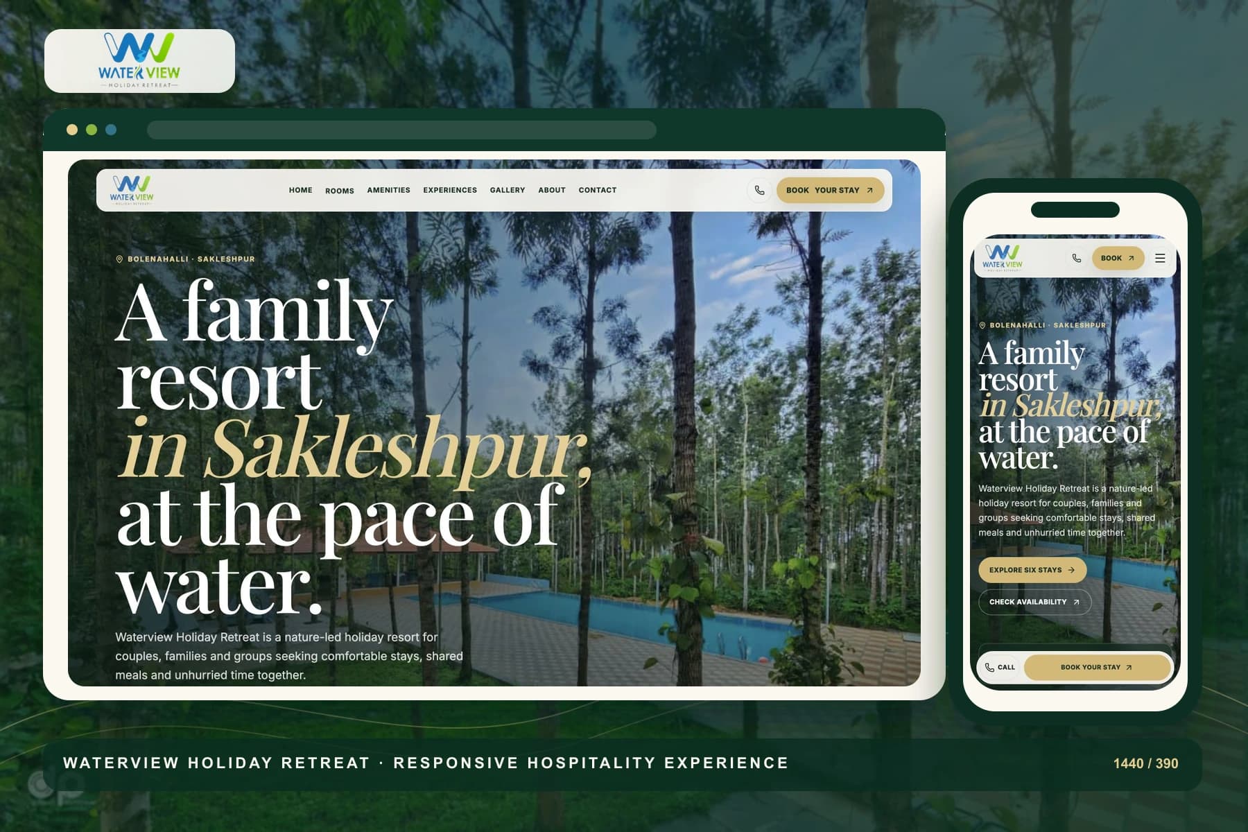
At 1440px, the wooded setting, oversized editorial type and generous image fields create immersion. At 390px, the same system becomes a one-handed sequence with legible comparison content, a compact menu and persistent call and booking actions without horizontal overflow.
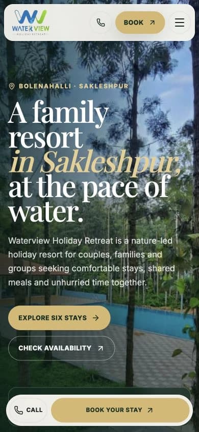
Live production captures
Desktop 1440 px · Mobile 390 px
Responsive width verified with no overflow
Brand system in use
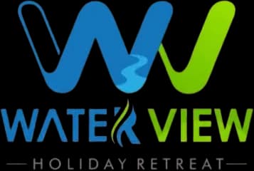
The existing mark combines two flowing W forms in lake blue and leaf green. Its central human-and-water detail makes the identity feel active and place-led, while the compact lockup remains recognisable across the wide desktop navigation and smaller mobile header.
#0B2E22Immersive fields, device framing and the retreat's natural foundation
#164535Navigation emphasis, grounded panels and primary brand continuity
#34738AWater references, secondary emphasis and connection to the logo
#8CB73FLandscape detail, freshness and small positive signals
#D8B86DPrimary actions, editorial emphasis and warm hospitality
#FBF8F1Reading surfaces, breathing room and soft contrast
Typography
Playfair Display
Headlines and display moments
Inter
Body, labels and utility
A family resort in Sakleshpur, at the pace of water.
Playfair Display gives the destination language a slow, editorial rhythm with expressive italics for place. Inter keeps navigation, room facts, conditions and booking actions direct and readable at practical sizes.
Stay comparison architecture
The accommodation system lets guests begin with who is travelling, compare each stay at a glance and continue into room-specific facts and authentic galleries before checking live dates.
CPL
A king-bed room framed as a calm, practical base for one or two guests.
PRM
A bright king-bed stay with seating, storage and added in-room conveniences.
STE
The most spacious one-king-bed option, positioned around privacy and a more premium pause.
QDL
A two-king-bed room presented for families and small groups, with capacity kept as a confirmable detail.
DOR
A shared six-bed room for friends, organised groups and corporate outings.
TNT
An outdoor option for guests who want the hill air and green surroundings to feel closer.
Accommodation comparison route
The focused route keeps the same editorial hospitality language while organising six options around the practical details that shape a stay: real photography, guest and bed notes, room comforts, guide prices, deeper galleries and the final secure availability check.
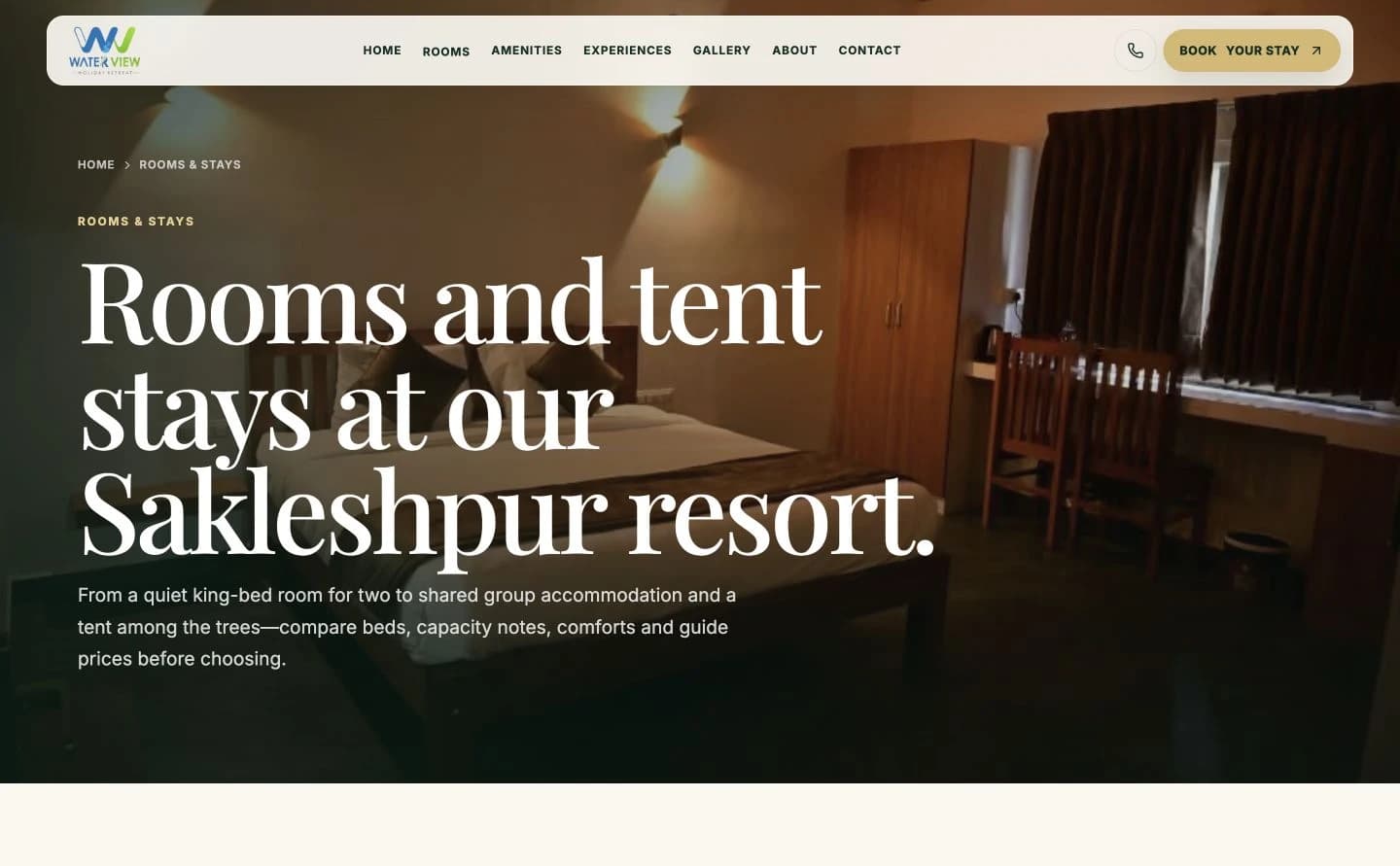
Production captures document the responsive interface. The wooded pool and room photography come from Waterview's live media library, keeping the portfolio story aligned with the experience presented to prospective guests.
Outcome note
A factual case study
Stay names, bed layouts, guide prices, amenities, location language and booking-provider details are taken from the live Waterview Holiday Retreat website captured on 20 August 2026. Property and room imagery comes from the site's existing media library. No occupancy, booking, conversion, revenue or guest-satisfaction performance is claimed without client-supplied analytics.
Production interfaces captured on 20 August 2026.
Delivered value
Build something relevant to your market
The same team, process and attention to business intent are available for your next website.
Explore Website Development →More in Hospitality & Accommodation
Tell us what you want to build or improve. We’ll identify the strongest content, search and conversion opportunities before proposing a plan.
Prefer to talk? WhatsApp us → · +91 77568 73424