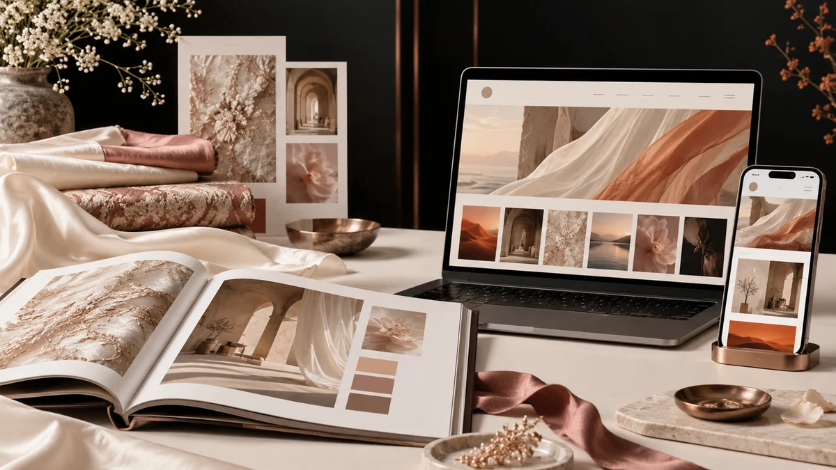
Luxury fashion website design should preserve brand atmosphere while guiding visitors toward a commercial action. Dazzles shows how textile heritage, named campaign stories, bridal inspiration, a digital magazine and responsive editorial layouts can lead naturally to personal styling appointments online.
Planning a project? Explore Crisant’s website development service in Mysore →
Why this luxury fashion website design was needed
Dazzles is a Mysore and Bangalore womenswear house whose published textile lineage begins in 1946. The live website records its first retail boutique in 1998 and a dedicated bridal studio operating since 2018. It also carries contemporary womenswear, six named campaign worlds, personal styling and a ninety-frame digital edition of the original Dazzles magazine. That is richer material than a conventional category-and-product catalogue can express.
The central design problem was therefore not how to fit more merchandise above the fold. It was how to preserve atmosphere, authorship and history while making the route to a commercial next step unmistakable. Visitors needed to discover collections, understand the fashion house, explore bridal work, experience the archive and choose a Mysore or Bangalore appointment without the interface interrupting the photography.
Crisant approached the project as an editorial retail experience. The website development service in Mysore organised the content around a simple progression—Enter, Browse, Understand, Imagine, Archive and Book—so every visual chapter answers a useful question and moves closer to a personal store visit. The result is neither an anonymous online shop nor a static brand brochure.
How the fashion website journey was visualised
Fashion audiences do not always arrive with a product code or a precise filter in mind. They may begin with mood, occasion, silhouette, craft or a campaign they remember. The information architecture gives those forms of discovery room to work. Six selected campaigns keep their authored names—such as Beige, Bloomage and Gendha Phool—instead of being reduced to generic retail labels.
The homepage then places context beside desire. Textile lineage appears in the main narrative rather than being buried on an About page. Bridal receives a distinct emotional stage. The magazine becomes a tactile, page-by-page archive. Store and appointment information remains available without turning every section into a sales banner. This is the commercial logic behind the visual rhythm.
| Visitor question | Website response | Commercial purpose |
|---|---|---|
| What does this fashion house feel like? | Image-led opening and restrained editorial interface | Establishes atmosphere before detail |
| Which collection should I explore? | Six named campaign worlds | Supports discovery without a dense product grid |
| Why does the brand have depth? | 1946 lineage and 1998 retail milestone in the main story | Connects contemporary work to heritage |
| Can I imagine a bridal consultation? | Dedicated bridal archive and styling route | Makes a personal service visible |
| How do I continue? | Appointment form with Mysore or Bangalore preference | Turns inspiration into an in-store conversation |
A visual system built from restraint, texture and pace
Luxury is easy to over-design online. Excessive gold, constant motion, decorative scripts and layered effects can compete with the garments they are meant to support. Dazzles uses a more controlled system: near-black ink creates cinematic depth, warm ivory keeps reading fields soft, rose metal carries the signature accent and soft clay separates quieter editorial moments.
Space Grotesk gives headings a contemporary magazine geometry, while Inter handles captions, campaign labels, archive data and practical store information. The pair creates contrast without imitating a print masthead too literally. Numbered campaigns and precise labels guide the eye, but photography remains the primary interface.
Large crops, negative space and alternating fields create the desktop rhythm. Mobile required a different composition rather than a smaller version of the same spread. Image order, crop, label position and spacing change for a 390-pixel viewport so the pace remains deliberate and touch targets remain usable. The published case study records desktop and mobile production views with no horizontal overflow.
The rose-metal wordmark informed the interface without requiring constant repetition. Colour, typography, image scale and spacing carry recognition across routes while giving campaign photography room to lead.
How the React fashion website was developed
The delivered experience uses reusable React structures for campaign introductions, editorial spreads, lineage milestones, bridal galleries, magazine frames, store information and appointment actions. Shared components keep spacing, labels and responsive behaviour consistent while allowing each campaign to retain its own mood and image sequence.
Collections behave as story pages rather than filter-heavy product grids. A visitor enters through a decisive image, sequence number and campaign name, then moves through a curated set of photographs before reaching practical store actions. This reflects the appointment-first retail model documented on the live site instead of importing ecommerce conventions that do not fit the intended experience.
The magazine posed a different interaction problem. Its ninety original frames needed to feel like an editorial object without becoming an inaccessible animation. The page-by-page treatment gives the archive a clear place in the content system, while the surrounding navigation keeps the main website routes available. Bridal uses the same discipline: inspiration first, then a complimentary styling-consultation path.
React supports that modular content system, and Next.js provides the route, metadata and production framework around it. The same visual rules can therefore govern the homepage, collections, bridal, journal, magazine and contact routes without collapsing them into one template. Development follows the brand and visitor journey instead of forcing the content to fit a generic theme.
What the live Dazzles website demonstrates
The live Dazzles website now presents six campaign worlds, the published textile lineage, the bridal archive, the digital magazine, journal content and an appointment route for Mysore or Bangalore. Visitors can move from atmosphere to context and then to a personal styling conversation without encountering an artificial cart or a catalogue structure that the brand did not ask for.
The historical dates, campaign count, city presence and magazine details in this article come from Dazzles’ live website and the documented Crisant case study. They describe published brand material, not independently audited commercial performance. No appointment, lead, revenue or conversion increase is claimed because no supporting analytics were supplied for this article.
That distinction matters in portfolio writing. A factual case study can show the problem, design choices, content architecture, responsive implementation and delivered experience without inventing growth figures. The useful proof here is visible: the live site, its routes, the visual system and the way a visitor reaches an appointment.
Lessons for fashion website design in Mysore
Choose the commercial model before choosing familiar interface patterns. A store built for direct online checkout needs product comparison, stock, delivery and payment detail. An appointment-led fashion house needs inspiration, confidence, store context and a clear consultation route. Copying ecommerce conventions into the second model can make the experience busier without making it more useful.
Treat existing brand assets as source material, not decoration. Campaign names, textile history, editorial photography, the magazine and store experience all shaped the Dazzles architecture. The strongest fashion website design begins by deciding which material deserves to be preserved and what job each piece should perform online.
Make mobile art direction explicit. A luxury desktop composition can lose its meaning when every crop, gap and label is merely compressed. Decide which image leads, where the campaign name sits, how much silence remains and when the commercial action should appear on a narrow screen.
Finally, keep proof proportional. Show the live work, explain the rationale and state what was delivered. Do not turn aesthetic choices into unsupported sales claims. If your brand needs an editorial website journey grounded in real customer behaviour, request a free growth audit before selecting a theme or rebuilding isolated pages.
A useful fashion website review begins with the brand material already worth preserving: campaign photography, collection stories, heritage, store experience and the way customers prefer to buy. Crisant can turn those assets into a deliberate digital journey before development begins.
Request a fashion website review →