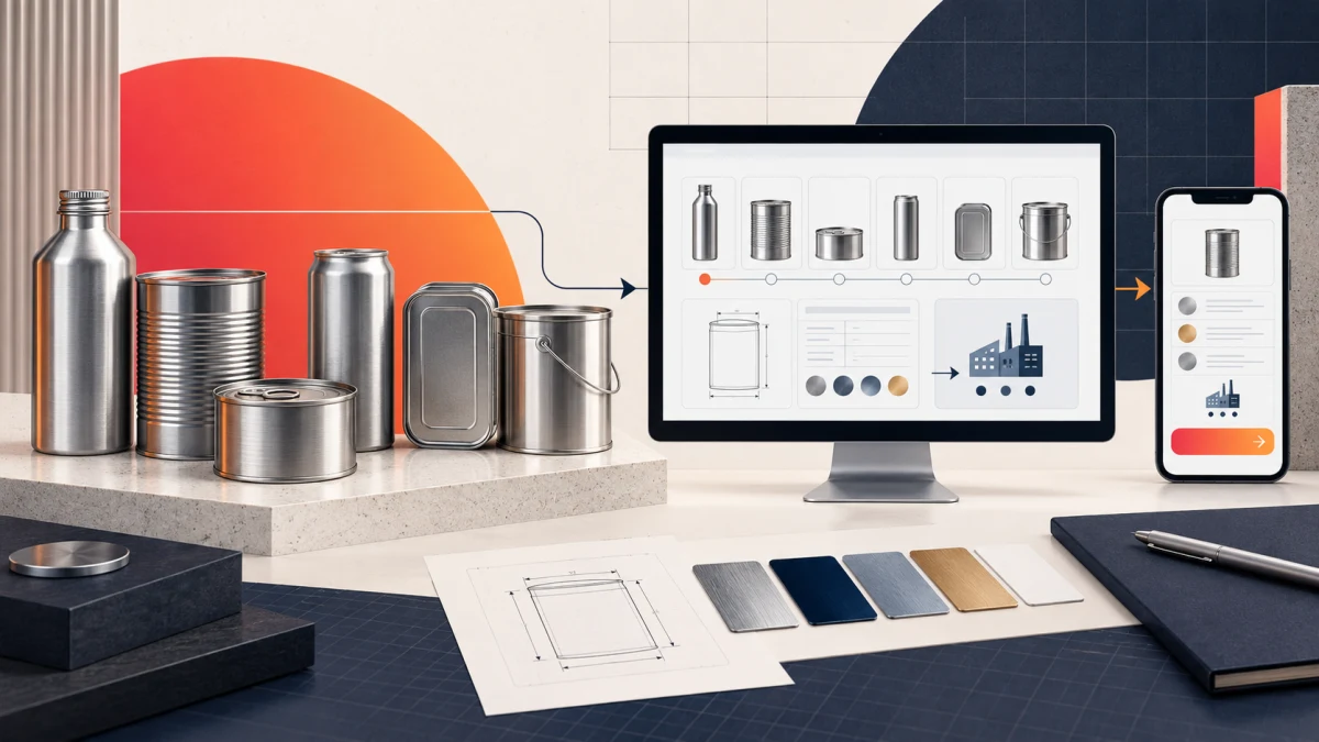
Metal packaging website design should move procurement teams from supplier relevance to range, scale, specifications and a useful enquiry. Vaspal Packaging shows how product families, capacity evidence, plant context and readable technical tables can form one responsive manufacturing website journey.
Planning a project? Explore Crisant’s website development service in Mysore →
Why this metal packaging website design was needed
Vaspal Packaging LLP manufactures metal packaging for food, industrial and aerosol applications from Hebbal Industrial Estate in Mysuru. Its live website publishes a 50 ml to 25 L solution range, six product-family entrances, current stated capacity of two million cans per month and scalable stated capacity of five million. A procurement visitor therefore needs more than an attractive corporate introduction: the website must make product relevance, operating scale and technical fit understandable before a detailed requirement is shared.
The information challenge was equally important. Company background, plant capability, quality management, manufacturing processes, product families, size ranges, components and enquiry details all carry commercial value, but presenting them as one long catalogue would make evaluation difficult. The website needed a clear hierarchy that could serve an early-stage buyer scanning for capability and a technical evaluator checking dimensions, applications or configuration notes.
Crisant’s website development service in Mysore approached the project as a procurement journey rather than a collection of corporate pages. The sequence establishes why Vaspal is relevant, proves scale, organises the range, exposes operational evidence and gives buyers several proportionate ways to continue—from a catalogue to a detailed product enquiry.
How the procurement journey was visualised
Industrial buyers do not all enter with the same question. One may know the required application but not the can family. Another may already have dimensions and need to assess capacity, material discipline or manufacturing context. The information architecture therefore works in layers: broad capability first, recognisable product choices next, then increasingly specific proof and specifications.
The homepage opens with a systems-based operating proposition, followed quickly by establishment, packaging range and capacity facts. Six product families—Aerosol, Monotop, Paint, Food, Components and Can Range—become clear entrances instead of being hidden inside a single products menu. Plant, process, people, technology and material content then answer the reliability questions behind a sourcing decision.
| Procurement question | Website response | Decision value |
|---|---|---|
| Does this supplier serve our application? | Food, industrial and aerosol positioning | Establishes relevance before detail |
| What can it manufacture? | Six product families and a published 50 ml–25 L range | Creates a scannable product map |
| Can the operation support scale? | Current and scalable capacity beside plant context | Makes operating capability inspectable |
| Will a configuration fit? | Size, diameter, capacity and characteristic tables | Supports technical comparison |
| How do we continue? | Catalogue, contact and requirement-led enquiry routes | Matches different stages of buyer intent |
A visual system rooted in metal and manufacturing
The interface needed industrial authority without becoming cold or visually dense. Foundry navy carries the page architecture and technical depth. Signal crimson marks action, active states and directional cues. Steel blue supports secondary information, while process white gives specifications and tables enough room to remain readable. The result extends Vaspal’s existing container-shaped mark into a consistent website language rather than placing a logo over a generic template.
Product photography is treated as evidence. Close crops of cans, closures, printed metal and production surfaces keep the experience connected to what Vaspal actually makes. Engineering-grid details and restrained rules help structure the material without pretending that every section is a technical drawing. The visual interest comes from scale, texture, contrast and content hierarchy—not decorative effects unrelated to procurement.
System sans-serif typography keeps numerical facts and specification labels neutral and legible. Oversized statements are used where the buyer needs orientation; compact labels and table rows take over when comparison matters. That change in typographic behaviour helps the same brand feel confident on a hero and precise on a technical product route.
Responsive design was considered as a reordering problem, not a shrink-to-fit exercise. The wide split hero becomes a vertical mobile composition, actions become full width, touch targets gain space and technical tables remain usable within the narrower reading path. Production views document the system at 1440-pixel desktop and 390-pixel mobile widths.
How the React manufacturing website was developed
The delivered experience uses reusable React structures for company, plant and product content. Shared page patterns preserve orientation while allowing each product family to carry its own description, application context, sizes and configuration details. This reduces inconsistency across a technically deep content estate and makes future content maintenance more controlled than repeating bespoke layouts page by page.
Product routes use a stable information pattern: overview, options, specifications, contextual note and enquiry. Casual visitors can stop after confirming relevance, while technical evaluators can continue into diameter, capacity, type and special-characteristic detail. A persistent range navigator keeps adjacent categories visible without forcing every buyer back to the top-level products page.
Next.js provides the routing, metadata and production framework around those reusable components. The website can present a broad manufacturing offer as searchable page-level content while preserving a consistent responsive shell. Contact, catalogue and requirement actions use the same labels and visual treatment across the estate, so the conversion pattern does not have to be relearned on every route.
This is the practical difference between an industrial brochure online and a B2B procurement website design system. The first displays company information. The second anticipates the questions behind supplier evaluation and helps each visitor reach the appropriate depth before beginning a commercial conversation.
What the live Vaspal Packaging website proves
The live Vaspal Packaging website presents food, industrial and aerosol applications, the six product-family entrances, current and scalable capacity, plant context and several enquiry routes. The accompanying Crisant case study documents how those elements were organised into an Orient → Prove scale → Browse → Validate → Specify → Enquire sequence.
The published capacity, establishment and packaging-range figures in this article come from Vaspal’s live website. They describe the company’s stated operating context; they are not independent audits. Crisant does not claim lead, revenue, conversion, delivery or quality improvements where client analytics or verified commercial evidence were not supplied.
The finished website demonstrates a coherent route from high-level capability to specific sizes, finishes and packaging requirements. It also shows why industrial website development in India benefits from real product and plant evidence: a buyer can inspect what is made, how the portfolio is organised and where to take a specific requirement next.
Lessons for manufacturing website design in Mysore
Start with the commercial evaluation sequence, not the internal organisation chart. Buyers usually want to confirm application fit, product range, operating credibility, specifications and contact. Navigation should reflect those questions even when the company’s departments use different labels internally.
Separate evidence by its job. Capacity and plant information support scale; product photography supports material credibility; specification tables support fit; quality and process content support supplier confidence. Mixing every proof point into one crowded homepage makes each one harder to assess.
Give detailed products a repeatable grammar. A consistent overview, options, specifications, note and enquiry pattern helps visitors compare categories and helps the business maintain a growing technical estate. The structure should be reusable without making different products look indistinguishable.
Finally, design the next action around buyer readiness. A catalogue suits exploration, direct contact suits a focused question, and a requirement-led form suits a buyer with specifications to share. If your industrial website needs this kind of procurement-path review, request a free growth audit before rebuilding pages in isolation.
A useful industrial website review begins with the questions a serious buyer must answer before sending a requirement: product fit, capacity, specifications, quality evidence, delivery context and the next conversation. Crisant can map that procurement journey before design or development begins.
Request an industrial website review →