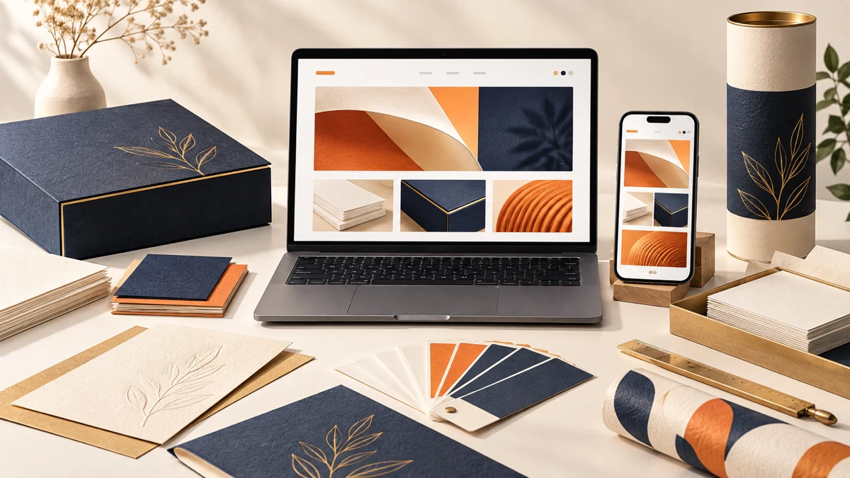
Printing website design should let buyers understand capability before discussing a job. Arihanth Graphics shows how three connected disciplines, a four-stage working process, portfolio evidence and responsive React development can turn design, print and packaging services into one clear journey.
Planning a project? Explore Crisant’s website development service in Mysore →
Why this printing website design was needed
Arihanth Graphics is a Mysuru design, printing and packaging partner established in 2000. Its live offer spans graphic design, digital, offset, screen and UV printing, finishing, invitation cards and custom packaging. A buyer may arrive looking for one item, yet the real advantage is that concept, proof and production can remain connected under one accountable team.
That breadth created the central website challenge. A single list would flatten very different intentions: someone commissioning business stationery does not research in the same way as someone planning luxury packaging or invitation cards. Separating every capability too early, however, would hide how design decisions and production knowledge influence one another. The Arihanth Graphics Mysore website therefore needed one memorable proposition plus clear specialist routes.
For this printing company website design Mysore project, the need became a question of evidence. Visitors should be able to see the types of work, understand how a brief moves toward production and find a direct way to discuss their requirement. This case study documents those inspectable decisions. It does not claim new enquiries, sales, output volumes or conversion improvements because no client analytics were supplied for that comparison.
How we structured design, print and packaging
The opening line, ‘Design. Print. Package. Made remarkable.’ establishes one studio proposition before the visitor chooses a service. Three focused doors then explain graphic designing, printing and packaging in their own language. This preserves specialist depth without making the business look like three unrelated suppliers sharing a navigation bar.
The journey follows six decisions: Position, Explore, Imagine, Understand, Verify and Discuss. It introduces the integrated offer, opens the service routes, uses material photography to help visitors picture an outcome, explains the four-stage process, presents finished applications and keeps contact actions available. That sequence lets a packaging portfolio website work as both inspiration and practical pre-enquiry guidance.
Arihanth’s Brief, Concept, Proof and Finish model turns an invisible production relationship into four understandable stages. It tells a prospective customer what information begins the work, when ideas take form, where artwork and production details are checked and when an approved piece moves into making. The website clarifies the process without promising that every project has identical scope or timing.
How the Arihanth Graphics website was visualised
The visual system begins with the existing identity rather than imposing a generic technology style. Production navy supplies depth, press gold marks actions and finishing details, studio ink keeps service information legible, warm paper creates open reading fields and a softer cream supports process cards. Together they connect digital navigation with the materials a customer may eventually hold.
Poppins gives headlines the impact of a campaign sheet or packaging panel. Nunito keeps explanatory copy, labels and utility actions more conversational. The contrast matters: the site needs enough graphic confidence to represent a creative studio, but it also needs calm reading conditions for methods, materials and contact information. This React graphic design website case study uses typography as part of the customer journey, not simply decoration.
Photography carries the strongest proof. Invitations, printed applications, presentation boxes and paper tubes remain large enough for form, surface and finish to be understood. The interface frames that evidence with disciplined grids and warm space instead of competing through excessive effects. The visualisation asks a practical question at every stage: does this composition help the visitor see what can be made and where to go next?
How responsive React development preserved the craft
Crisant developed the experience with reusable React and Next.js structures for service introductions, process stages, portfolio entrances, application details and contact actions. Shared components keep the three disciplines related while allowing each route to explain distinct materials and production questions. This is the maintainable foundation behind the printing website development India work shown here.
At a 1440-pixel desktop viewport, the layout behaves like a wide studio wall: large statements and material photography can sit in deliberate tension. At 390 pixels, the same story becomes one clear vertical sequence with readable copy, purposeful crops, comfortable touch targets and no horizontal overflow. Mobile keeps the service distinctions and portfolio proof instead of reducing the website to a logo, gallery and phone number.
This Next.js website development Mysore project shows why content architecture, visual design and front-end implementation must be planned together. The code can preserve hierarchy across devices only after the team decides which proposition, services, process evidence and actions deserve priority. Responsive development then protects that decision order rather than shrinking a desktop canvas after approval.
What the printing and packaging website controls
The framework below connects a buyer question with an observable design response and a development control. Each item can be checked on the live website or Crisant’s documented production case study. The table deliberately avoids business-performance claims that would require analytics, sales records or a controlled before-and-after comparison.
| Buyer question | Design response | Development control | How to verify |
|---|---|---|---|
| Can one team handle the complete piece? | One proposition connecting three disciplines | Shared service navigation and page grammar | Compare Design, Printing and Packaging routes |
| What happens after the brief? | Brief, Concept, Proof and Finish sequence | Reusable four-stage process component | Read the working-process section |
| Can I judge the finish? | Large tactile portfolio photography | Responsive image treatments and crops | Open invitation, print and packaging work |
| Is the site usable on a phone? | Focused vertical reading order | Responsive React layout at 390 pixels | Open the live site at a narrow viewport |
| How do I discuss a requirement? | Visible phone, WhatsApp and contact routes | Consistent actions at decision points | Follow the enquiry path without submitting |
What the completed printing website demonstrates
The delivered website connects one business proposition, three service disciplines, four process stages and several finished-work categories in a coherent responsive system. The evidence is visible: service routes remain distinct, the working sequence is easy to scan, material imagery receives enough space and contact options stay available at serious decision points.
Open the live Arihanth Graphics website and compare its wide and narrow layouts. Notice how the opening statement establishes the integrated capability before individual services appear, how the process makes collaboration easier to picture and how portfolio applications replace abstract claims about quality. Then review Crisant’s case study for the colour system, typography, journey map and production captures behind those decisions.
The broader lesson applies to any maker with several connected capabilities: start with the advantage of keeping the work together, give each specialist service enough clarity, make the operating process visible and let completed applications carry the proof. A free growth audit can identify where a current website separates those elements or leaves the buyer guessing.
A useful print or packaging website review starts with the applications buyers compare, the process your team can explain and the work you are permitted to show. Crisant can map that evidence before design or development begins.
Request a website evidence review →