01
Own the complete sequence
‘Design. Print. Package.’ makes the studio’s connected offer memorable in four short words.
Arihanth Graphics
React Print & Packaging Website · Graphic Design, Print & Packaging
A responsive React and Next.js portfolio for a Mysuru studio established in 2000, connecting graphic design, precision printing and custom packaging through one tactile navy-and-gold experience.
Visit arihanthgraphics.com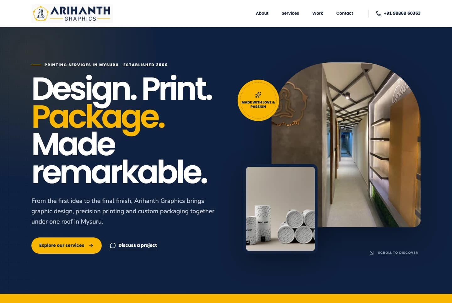
The making proposition
Arihanth can shape the idea, print the piece and resolve the final package. The website needed to make that integrated advantage immediate while still helping visitors identify the exact capability or application relevant to their brief.
The answer is a tactile studio portfolio: one bold proposition, three service doors, a visible making process and finished work that carries the proof.
01
‘Design. Print. Package.’ makes the studio’s connected offer memorable in four short words.
02
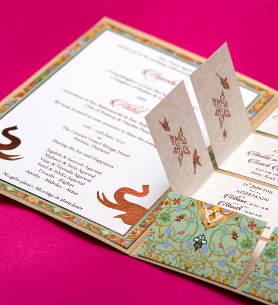
Printing, invitation and packaging photography remains large enough for finish, texture and form to be understood.
03
Brief, Concept, Proof and Finish turn an invisible production relationship into a familiar client journey.
04
The identity colour marks actions and emphasis while navy preserves authority and visual depth.
Making experience architecture
The sequence establishes the integrated offer, separates specialist services, explains the collaborative process and uses finished applications as the strongest reason to start a project.
01
Introduce design, printing and packaging as one connected Mysuru capability.
02
Open distinct routes for graphic design, printing and custom packaging.
03
Use tactile photography to show what materials, forms and finishes can become.
04
Explain the four-stage Brief, Concept, Proof and Finish working process.
05
Present six application categories across invitation, print and packaging work.
06
Close with a direct contact, call or WhatsApp route for the next brief.
Responsive composition
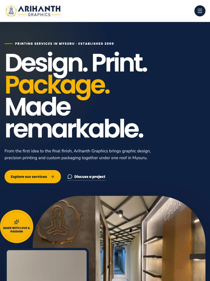
Desktop uses a strong left-right editorial stage with layered material photography. Mobile preserves the large type, gold actions and purposeful image crops in a single readable sequence.
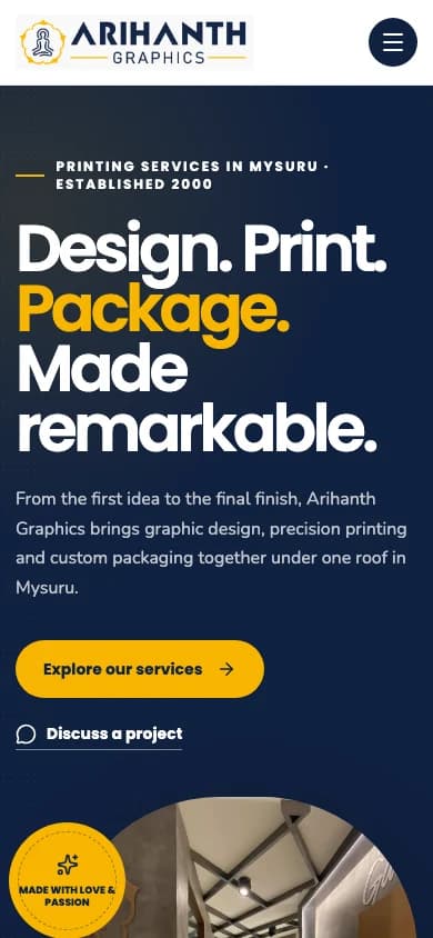
Live production captures
Desktop 1440 px · Mobile 390 px
Responsive width verified with no overflow
Brand system in use

The existing Arihanth wordmark combines a precise geometric name with a traditional framed emblem. Gold introduces craft and celebration; navy supplies consistency across business print and packaging applications.
#10213FHero canvas, navigation depth and portfolio contrast
#F7B500Identity energy, actions and finish details
#15233DHeadlines, labels and practical information
#FBFAF6Reading fields, service pages and open composition
#F6F1E7Process cards, quiet panels and material warmth
Typography
Poppins
Headlines and display moments
Nunito
Body, labels and utility
Design. Print. Package. Made remarkable.
Heavy Poppins headlines provide the graphic impact of a campaign or press sheet. Rounded Nunito supports service detail and process explanations with a friendlier reading rhythm.
Studio content architecture
The site keeps design, printing and packaging distinct enough to browse while the shared process, portfolio and contact language reinforce Arihanth as one accountable making partner.
DES
Identity, campaign, invitation and communication work shaped before production begins.
PRT
Screen, digital, offset and UV printing supported by finishing and production knowledge.
PKG
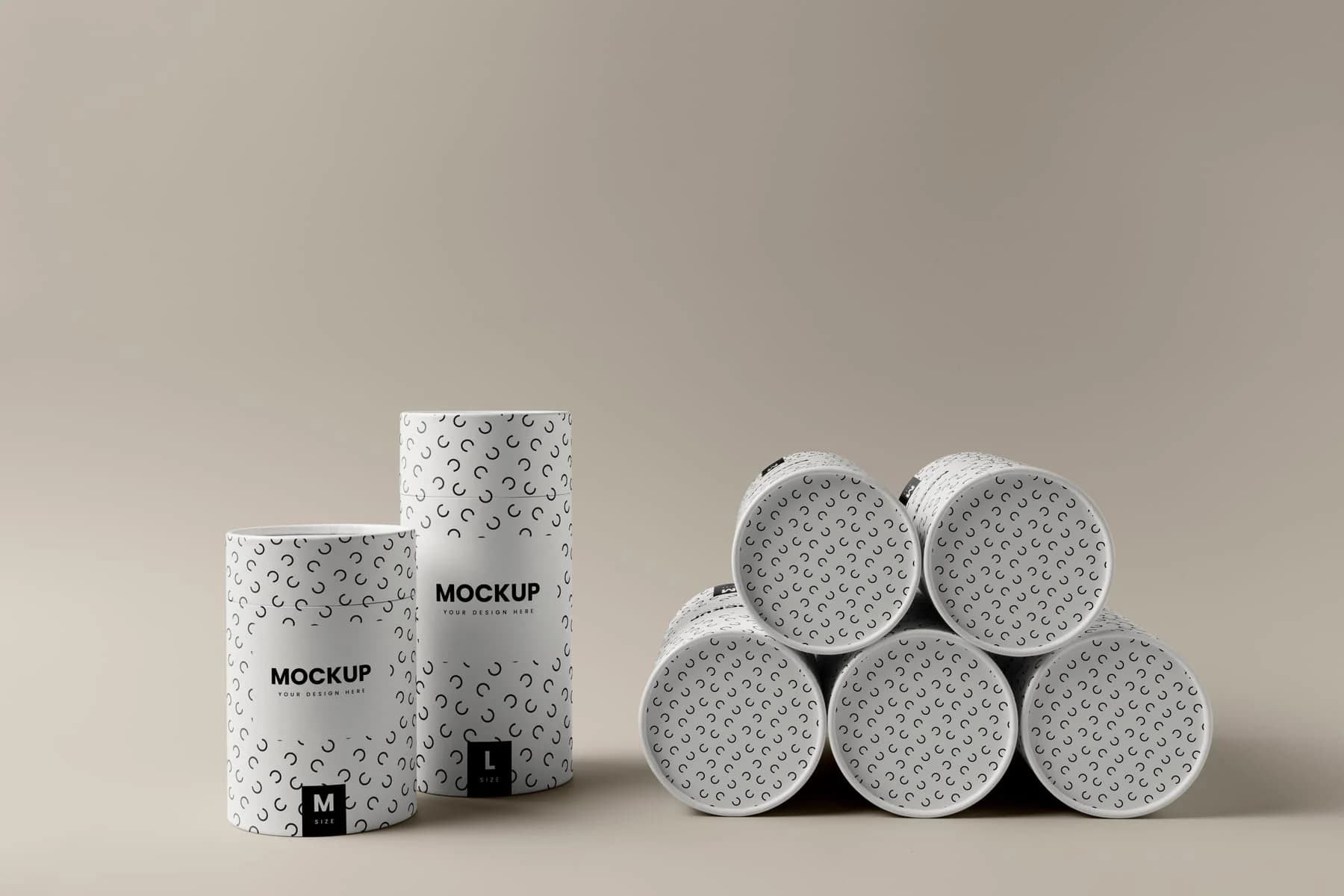
Rigid boxes, paper tubes and custom structures developed around product and presentation.
INV
Custom wedding and event invitations where material, print and finishing meet.
PFN
Six finished application categories used as evidence of breadth and attention to detail.
BRF
Phone, WhatsApp and contact routes for visitors ready to discuss the work.
Portfolio architecture
The work route separates custom invitation cards, hoarding design, luxury packaging, digital printing, business stationery and paper tube systems into clear visual entrances, each linking back to the relevant specialist service.
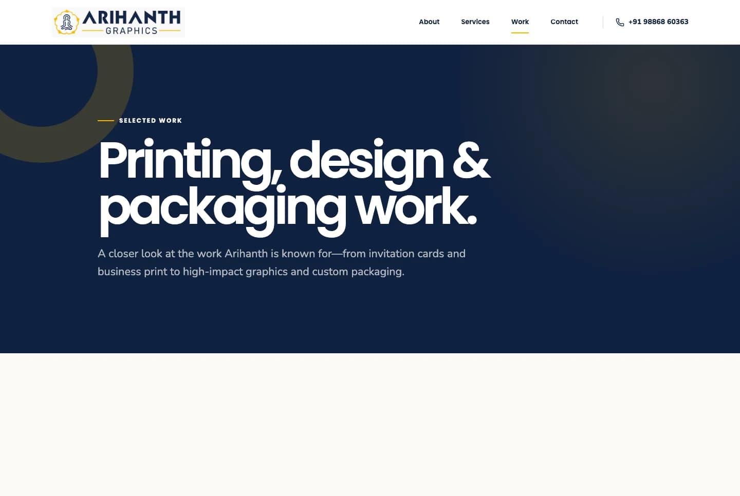
The tablet perspective proves the responsive design before invitation and paper-tube imagery move closer to the details clients ultimately commission and hold.
Outcome note
A factual case study
Establishment year, service scope, process stages and portfolio categories are taken from the live Arihanth Graphics website. No production volume, sales or conversion figures are claimed without supplied analytics.
Production interfaces captured on 31 July 2026.
Delivered value
Build something relevant to your market
The same team, process and attention to business intent are available for your next website.
Explore Website Development →More in Graphic Design, Print & Packaging
Tell us what you want to build or improve. We’ll identify the strongest content, search and conversion opportunities before proposing a plan.
Prefer to talk? WhatsApp us → · +91 77568 73424