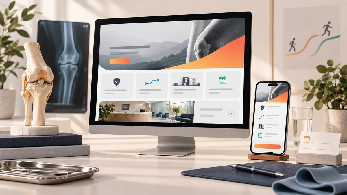
Orthopaedic clinic website design should help patients verify the specialist, care pathways, facilities and appointment step without decoding a hospital directory. Ortho Next shows how responsive structure, calm visual hierarchy and direct contact routes can make that decision clearer online.
Planning a project? Explore Crisant’s website development service in Mysore →
Why this orthopaedic clinic website was needed
People often reach an orthopaedic website while managing pain, an injury or uncertainty about the right next step. They need practical orientation before a long medical biography or an exhaustive services directory. The Ortho Next website therefore had to establish the clinic, the specialist, the available care and the appointment route in an order that a visitor could understand quickly on any screen.
Ortho Next is a bone and joint clinic in Vijayanagar, Mysore, led by Dr Nitin Srichand. The clinic’s live website states more than nineteen years of orthopaedic experience and presents qualifications, fellowship training and current consulting context. It also publishes orthopaedic emergencies, imaging, rehabilitation, day-care procedures, joint replacement and trauma care among its service routes. Those are meaningful facts, but only when the information structure helps a visitor connect them to a real decision.
The need was not to turn the website into medical advice. It was to make the clinic’s own published information easier to inspect: who leads the care, which needs the clinic addresses, what infrastructure is available, where the clinic is located, when it is open and how to request an appointment. This Ortho Next Mysore account documents those observable design and development choices. It does not claim patient outcomes, new appointments, traffic, revenue or conversion improvement because analytics and clinical records were not supplied for such a comparison.
How the patient journey was structured
The opening line, ‘Orthopedic care that helps you move forward,’ frames the website around recovery rather than a list of procedures. Specialist context follows early, so the visitor can identify the accountable doctor before moving deeper into care options. Grouped entrances then translate a broad orthopaedic practice into recognisable needs, while dedicated doctor, services, infrastructure, gallery, contact and appointment routes keep each question focused.
The live site currently presents routes for orthopaedic emergencies, computed radiography, sports medicine and rehabilitation, day-care orthopaedic procedures, laser therapy, physiotherapy, joint replacement, and trauma and fracture care. The Crisant production case study groups these into six broader care entrances to keep the main journey manageable. This distinction matters: a navigation model can simplify discovery without pretending that different services are clinically identical.
The Ortho Next website also keeps practical information close to intent. Visitors can see the Vijayanagar location, published Monday-to-Saturday timings, phone access and an appointment request without searching a generic footer. Facility information covers computed radiography, physiotherapy rooms and equipment, ramp and wheelchair access, and pharmacy and lab support. Each point helps a prospective visitor prepare for a conversation; none is presented as a promise of a particular medical result.
How the Ortho Next website was visualised
The visual system starts with a disciplined navy foundation for clinical authority, clear cyan for navigation and decision cues, and recovery green for progress and reassurance. Patient ink keeps long explanations readable, while clinic-paper surfaces and generous white space prevent the experience from feeling like a dense hospital directory. The colours support hierarchy; they do not attempt to imply clinical effectiveness.
Real clinic photography makes the environment inspectable. It lets a visitor see treatment and diagnostic spaces while keeping the website grounded in the actual practice. A soft script accent adds a human note to selected statements, but the primary type remains a strong sans-serif system so qualifications, services, timings and contact details stay legible. This balance is central to doctor website design India projects: authority should be visible without turning the clinician into a decorative endorsement.
Cards, evidence blocks and directional actions share one visual grammar. The specialist introduction feels connected to the care pathways; facility information feels connected to appointment planning; and desktop, tablet and mobile compositions retain the same decision order. The final identity is recognisably Ortho Next rather than a generic healthcare template, yet every visual choice remains subordinate to clarity.
How responsive React development protected clarity
Crisant built reusable React structures for specialist context, care-path cards, infrastructure, gallery material, frequently asked questions and appointment actions. Shared components make the experience consistent while allowing each route to answer a different patient question. That is the maintainable foundation behind this React healthcare website case study and the wider healthcare website development Mysore work it represents.
At a 1440-pixel desktop viewport, the interface can place specialist evidence, service entrances and facility cues beside one another. Tablet reduces the grid without losing context. At a 390-pixel mobile viewport, the content becomes one deliberate sequence with readable labels, comfortable touch targets and no horizontal overflow. The phone view does not discard the evidence merely to create a shorter page.
Responsive clinic website development Mysuru work begins with priority, not breakpoints. If the team has not decided which answer belongs first, CSS alone cannot make the journey easier. The Ortho Next implementation preserves the same order across screens: understand the proposition, verify the specialist, recognise a relevant care path, inspect practical infrastructure and reach the appointment route. Screen size changes the composition, not the responsibility of the content.
What the orthopaedic clinic website design controls
The framework below connects a patient question with an observable design response and a development control. Each item can be inspected on the live clinic website or in Crisant’s production case study. The table deliberately avoids claims that would require patient records, appointment data or a controlled before-and-after study.
| Patient question | Design response | Development control | How to verify |
|---|---|---|---|
| Who is responsible for care? | Specialist context appears early | Reusable doctor profile and qualification blocks | Review the homepage and doctor route |
| Does the clinic address my need? | Care paths use recognisable labels | Responsive service cards and dedicated routes | Compare the services navigation and pages |
| What can I inspect before visiting? | Facilities and real clinic spaces are visible | Infrastructure and gallery modules | Open the infrastructure and gallery routes |
| Can I plan an accessible visit? | Location, timings and access features are published | Structured practical-information components | Review contact and infrastructure information |
| How do I request an appointment? | Phone and request actions stay close to intent | Consistent actions across desktop and mobile | Reach the appointment path without submitting |
What the completed clinic website demonstrates
The completed experience connects specialist context, grouped orthopaedic care, inspectable facilities, location details and appointment actions in one responsive system. Its useful evidence is visible: the clinician is introduced early, service routes are recognisable, clinic spaces are shown, practical access information is published and contact choices remain available across screen sizes.
Open the live Ortho Next website and compare the desktop and mobile paths. Notice how the opening proposition leads to the specialist, how care cards help visitors recognise a starting point, and how the infrastructure and appointment routes answer practical questions. Then review Crisant’s case study for the colour system, content architecture and documented 1440-pixel and 390-pixel production views behind those decisions.
The broader lesson for a clinic website is straightforward: patients should not have to understand the organisation before they can find the right human conversation. Publish only the specialist, service and facility facts you can substantiate; arrange them around real visitor questions; and keep the next step visible without overstating the outcome. A free growth audit can identify where an existing clinic website makes that verification harder than it needs to be.
A useful clinic website review starts with the questions patients need answered before they call: specialist context, relevant care, practical facilities and a clear appointment route. Crisant can map that decision journey before visual design or development begins.
Request a clinic website review →