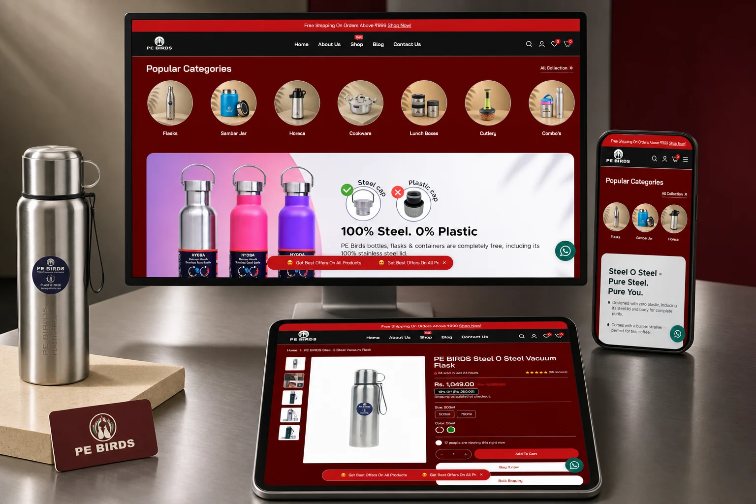
Shopify ecommerce case study India evidence is most useful when it connects design decisions to operating scale. PE BIRDS shows how category-first discovery, mobile merchandising, variant clarity, conversion content and retail-plus-bulk journeys can support a store handling reported daily volume.
Planning a project? Explore Crisant's eCommerce development service →
Why this Shopify ecommerce case study India project was needed
PE BIRDS sells a broad kitchenware and household catalogue that includes stainless-steel flasks, sambar jars, cookware, lunch boxes, cutlery, hotelware and product bundles. A store with that range cannot behave like a digital brochure. It must help customers enter through the right category, understand product differences, trust the material and move through checkout with very little ambiguity.
The second need was operational. Campaign banners, offer stories, launch products and collection changes had to move quickly without making the brand inconsistent. Kitchenware ecommerce website design therefore had to solve two systems at once: a customer-facing buying journey and a repeatable merchandising framework that the team could operate after launch.
How catalogue discovery was designed before the theme
The information architecture begins with seven high-intent category entrances. Shoppers can start with the job to be done—flask, jar, cookware or lunch box—rather than scanning one undifferentiated product wall. Campaign modules then connect offers and product stories to those categories, while search, filters and collection pages help visitors narrow a wider choice.
On product pages, price, discount, size, colour, stock, reviews, delivery cues and purchase actions stay together. That proximity matters because every separated decision introduces a reason to hesitate. The PE BIRDS Shopify website supports add to cart, buy now and bulk enquiry, allowing consumer and hospitality buyers to begin from the same product evidence but finish through different commercial routes.
How the high-volume store was visualised
The visual direction uses PE BIRDS' recognisable deep red foundation, high-contrast product photography and generous campaign surfaces. Large promotional modules provide energy, while category tiles and product cards return the experience to a predictable shopping rhythm. The goal was not to make every screen look like an advertisement; it was to give campaigns a strong stage without losing catalogue clarity underneath.
Product storytelling moves from short promises into practical proof. Plastic-free construction, thermal performance, material quality, care, delivery and customer reviews answer the questions that matter before checkout. D2C conversion design works when visual emphasis follows the decision: campaign imagery earns attention, product imagery enables inspection, and type, spacing and action hierarchy make the next choice obvious.
How Shopify development supported daily operations
Crisant shaped Shopify around category maintenance, campaign updates, product and variant decisions, mobile buying and both retail and bulk demand. The platform provides the maintained commerce foundation, while the custom content and theme system express how PE BIRDS merchandises. That separation helps the team update offers without rebuilding the complete experience for every launch.
A high volume Shopify store also depends on work beyond the visible page: catalogue ownership, payment and shipping settings, analytics, customer communication, recovery procedures and a disciplined release process. The case study does not imply that design alone created volume. It shows how interface, content and operations can be organised so a reported high-order business is not constrained by a confusing storefront.
How every project keyword describes real evidence
The complete project language is used where it adds context. PE BIRDS Shopify website identifies the finished store. Shopify ecommerce case study India and ecommerce development company Mysore connect the work to regional research. Kitchenware ecommerce website design describes the category challenge, high volume Shopify store describes the operating context, and D2C conversion design explains the decision-focused method.
These phrases do not replace the canonical eCommerce service page. The service URL owns the broader hire intent, while this article gives buyers a proof-led explanation of what was needed, how the store was visualised and how the system was developed. That architecture prevents one case study from becoming a keyword list and gives every page a distinct job.
What the reported outcome means—and does not mean
The client reports approximately 1,300+ orders per day and describes the commercial return as significant. Those statements are attributed to the client because Crisant does not have permission to present private store analytics as independently audited figures. The verified delivery evidence is the live Shopify system, its catalogue structure, campaign modules, responsive product journeys and retail-plus-bulk paths.
Open the live store and inspect how quickly you can reach a relevant category, understand a product and choose a purchase route on mobile. The transferable lesson is to design the operating model and decision path before selecting decorative features. A free growth audit can show whether catalogue structure, product clarity or backend ownership is the next constraint in an existing store.
A scalable store needs a merchandising and operating system, not only an attractive theme. Crisant can review your catalogue architecture, product decisions, mobile conversion path, integrations and ownership before you redesign or migrate.
Request an eCommerce review →