A
Ignition
A single flame gave us energy, but not enough belonging.
Agnira
Logo Design & Brand Identity · Wellness & Lifestyle
A logo identity shaped from the idea of inner fire — moving from mood board and hand-drawn forms to a warm, rooted mark built for every brand touchpoint.

01Listen
The brief was not “draw a wellness logo.” It was to make Agnira feel like a quiet source of energy: grounded enough to trust, alive enough to remember.
Our mood board paired ember light with seed pods, branching silhouettes, ceremonial circles and tactile earth. Three words became the filter for every decision: rooted, radiant, human.
Rooted.
Radiant.
Human.
Earth pigment
brushed metal
cotton paper
Still at the centre.
Alive at the edges.
02Draw
We sketched for gestures, not polish. Each round removed an unnecessary idea until fire, growth and continuity could live in one silhouette.
A single flame gave us energy, but not enough belonging.
Parallel roots introduced steadiness and upward direction.
Repeated leaf-flames created a recognisable canopy and cadence.

The circle held the energy together and made the symbol complete.
Removed literal fire and decorative flourishes.
Evened the canopy and strengthened the central trunk.
Tuned line weight and spacing for print and embroidery.
03Mean
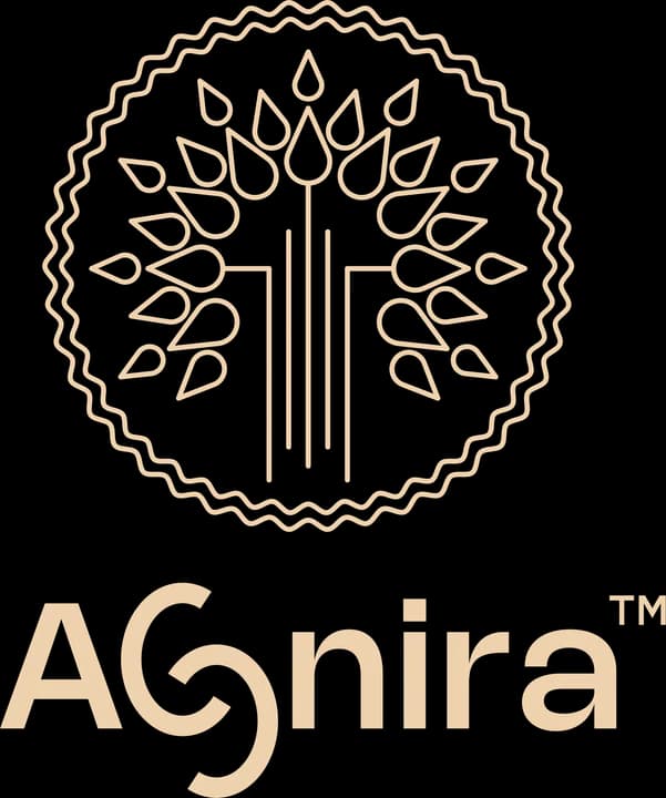
The final logo avoids a literal illustration. Its meaning appears through the relationship between the parts.
Energy becomes growth. Every upward form can be read as a leaf, a flame or both.
The centred vertical rhythm gives the expressive canopy a steady, grounded core.
A continuous hand-drawn boundary suggests community, wholeness and an identity held together.
A calm geometric voice balances the organic emblem and keeps the name clear at every size.
04Systemise
A logo becomes a brand when its choices can be repeated. The mini guideline turns the concept into a usable visual system.
Agnira · mini brand guidelines
Core palette
Inner fire
#2A1322
Ember plum
#5B3346
Kindled copper
#B66B45
Champagne sand
#F0D0B0
Quiet bone
#F7F1E8
Primary
Reversed
One colour
Emblem
Keep one flame-leaf of open space around every edge of the lockup.
Use the full lockup at 28 mm or wider; below that, switch to the emblem.
Never stretch, rotate, add effects or place the mark on low-contrast imagery.
Identity in the world
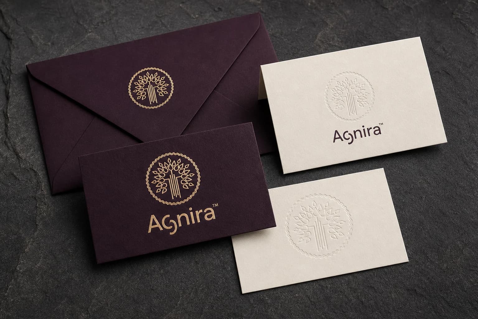
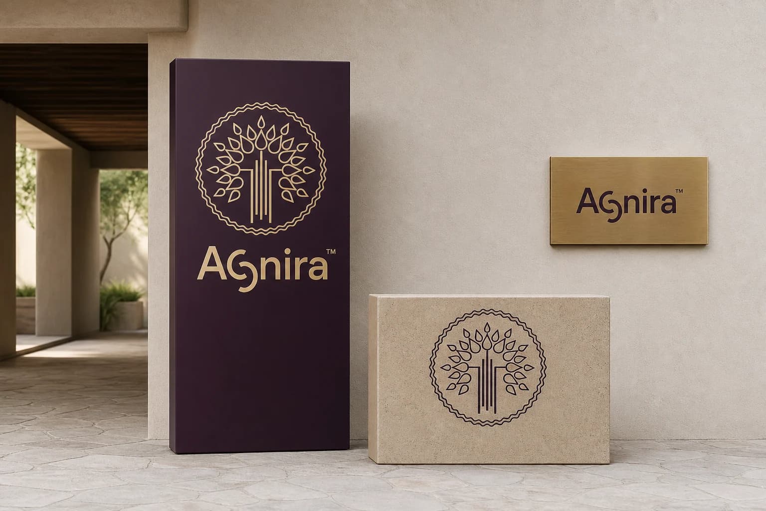
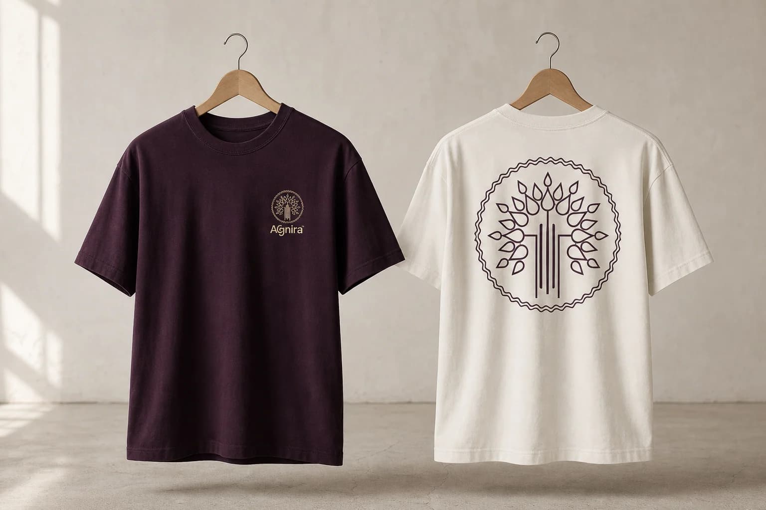
From a foil-stamped visiting card to an entrance wall, the mark keeps its warmth, rhythm and recognisable silhouette.
Delivered value
Build something relevant to your market
The same team, process and attention to business intent are available for your next brand or design project.
Explore Graphic Design & Branding →More Branding & Design
Tell us what the work should mean before we discuss how it should look. We’ll turn that story into a distinctive, usable design system.
Prefer to talk? WhatsApp us → · +91 77568 73424