A
Begin with the wearing moment
Portraits, mirrors, moonlight and jewellery rituals replaced predictable gemstone references.
Dhanvi Abharan
Logo Design & Brand Identity · Fine Jewellery
A graceful portrait emblem that turns the act of wearing jewellery into the identity itself.
01Listen
The visual direction came from profile cameos, crescent moons, soft velvet and the private ritual of choosing an earring before an occasion.
Three words became the filter for every choice: graceful, intimate, luminous.
Graceful.Intimate.Luminous.
Cameo portraits · Crescent forms · Earring sparkle
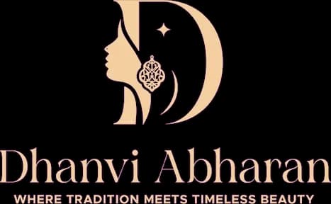
A woman's profile and crescent form create the initial D. The earring becomes the focal point: a small star of light that explains the category without writing it out.
02Draw
We started with loose visual gestures, tested the strongest relationship and then removed detail until the idea stayed clear at real working sizes.
Portraits, mirrors, moonlight and jewellery rituals replaced predictable gemstone references.
The cheek, hair and crescent were adjusted until the illustration also suggested a confident D.
The earring was isolated as the one high-contrast detail so the category reads immediately.
Fine lines and enclosed spaces were simplified for hot foil, debossing and miniature certificates.
The silhouette had to belong unmistakably to Dhanvi Abharan, not merely to its category.
Every line that did not strengthen recognition, balance or reproduction was removed.
The final artwork was checked against use rose-gold foil only on calm fields and keep portrait details above 18 mm.
03Mean
A woman's profile and crescent form create the initial D. The earring becomes the focal point: a small star of light that explains the category without writing it out. The restrained serif wordmark leaves space around the illustration, giving the identity the composure of fine jewellery.
The identity focuses on how jewellery feels when worn, making the brand more personal than a product icon.
The D-shaped silhouette builds name recognition without turning the mark into a conventional monogram.
Midnight navy anchors the system while blush and rose gold add warmth without excess sparkle.
Fine lines and enclosed spaces were simplified for hot foil, debossing and miniature certificates.
04Systemise
The logo becomes a usable identity when clear space, scale, colour fields and reproduction rules are defined well enough for another person to apply consistently.
Dhanvi Abharan · mini brand guidelines
Identity guide · 01
Core palette
Midnight
#151839
Blush
#E8C4B1
Rose Gold
#B97B68
Champagne
#F2DFC6
Soft Ink
#3A2831
Primary
Reversed
One colour
Clear space
Use rose-gold foil only on calm fields
Keep portrait details above 18 mm
Never separate the earring from the profile
Use midnight as the primary luxury colour
Delivered identity family
Identity in the world
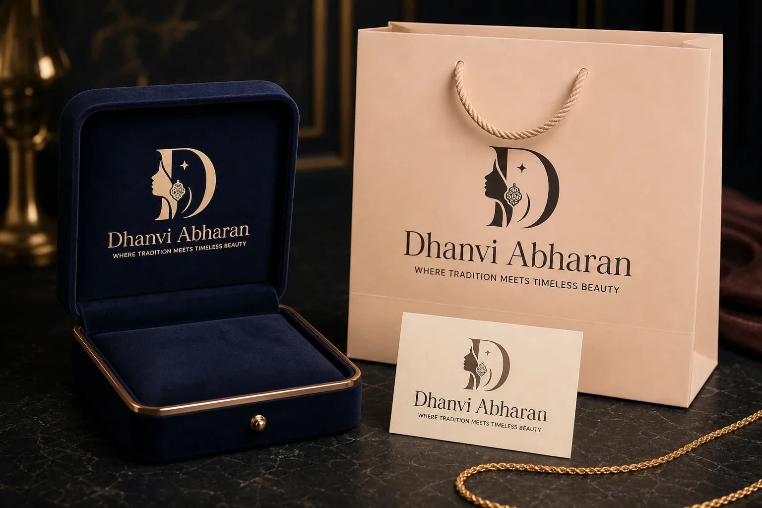
The applications use the logo at a comfortable scale, with enough surrounding space for the symbol and wordmark to remain complete, legible and recognisable.
Delivered value
Build something relevant to your market
The same team, process and attention to business intent are available for your next brand or design project.
Explore Graphic Design & Branding →More Branding & Design
Tell us what the work should mean before we discuss how it should look. We’ll turn that story into a distinctive, usable design system.
Prefer to talk? WhatsApp us → · +91 77568 73424





