List the patient questions
What is offered, can I trust it, what does it cost and how do I respond became the wireframe.
Apta Lab
Poster & Print Design · Diagnostics & Healthcare
A high-information diagnostic flyer that makes home sample collection, trust and contact details easy to find in a clinic or on a phone.
The client and context
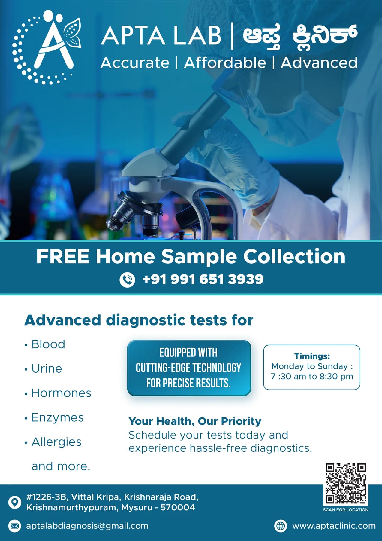
The flyer had several jobs: introduce the laboratory, communicate the home-collection offer, establish clinical trust and make contact possible immediately.
It needed to scan from a clinic noticeboard and remain readable when shared as an image in a messaging app.
The central idea
We built a strong information ladder around the patient's decision. The home-collection promise leads, the microscope establishes category, supporting proof follows and the contact path closes the page.
Blue layers separate information zones without making the flyer feel fragmented or overly promotional.
Mood board · visual territory
Clinic wayfinding, laboratory precision, clean daylight and the directness of public-service information shaped a campaign built to answer quickly.
Reference language
Print communication · Visual direction
Structure to final artwork
Four deliberate stages turned information, imagery and format into a coherent physical experience.
What is offered, can I trust it, what does it cost and how do I respond became the wireframe.
Thumbnail layouts tested whether the offer and category survived at phone-preview size.
The laboratory image was positioned to establish context without competing with the main message.
Type and spacing were balanced for physical print and compressed digital sharing.
Resolved artwork
The final system was checked at real scale, in colour and one-colour reproduction, and against the surfaces where people will actually meet it.
Why the design works
Home sample collection is the clearest reason to pause, so it sits above supporting detail.
Related tones organise the dense content while preserving one trustworthy healthcare voice.
The response path receives real visual weight instead of being treated as footer fine print.
Colour system
The palette balances recognition, category trust and practical reproduction. Primary colours carry the identity; supporting tones create hierarchy, space and flexibility.
#087BA8
#13A8C6
#07516E
#F5FAFC
#D7E5EA
Mini brand guidelines
Delivered system
The work in context
The final piece brings information, imagery, colour and production decisions together as one coherent experience.
Delivered value
Build something relevant to your market
The same team, process and attention to business intent are available for your next brand or design project.
Explore Graphic Design & Branding →More Branding & Design
Tell us what the work should mean before we discuss how it should look. We’ll turn that story into a distinctive, usable design system.
Prefer to talk? WhatsApp us → · +91 77568 73424





