Map the consultation
The most natural patient questions shaped the order of the guide instead of the clinic's internal service list.
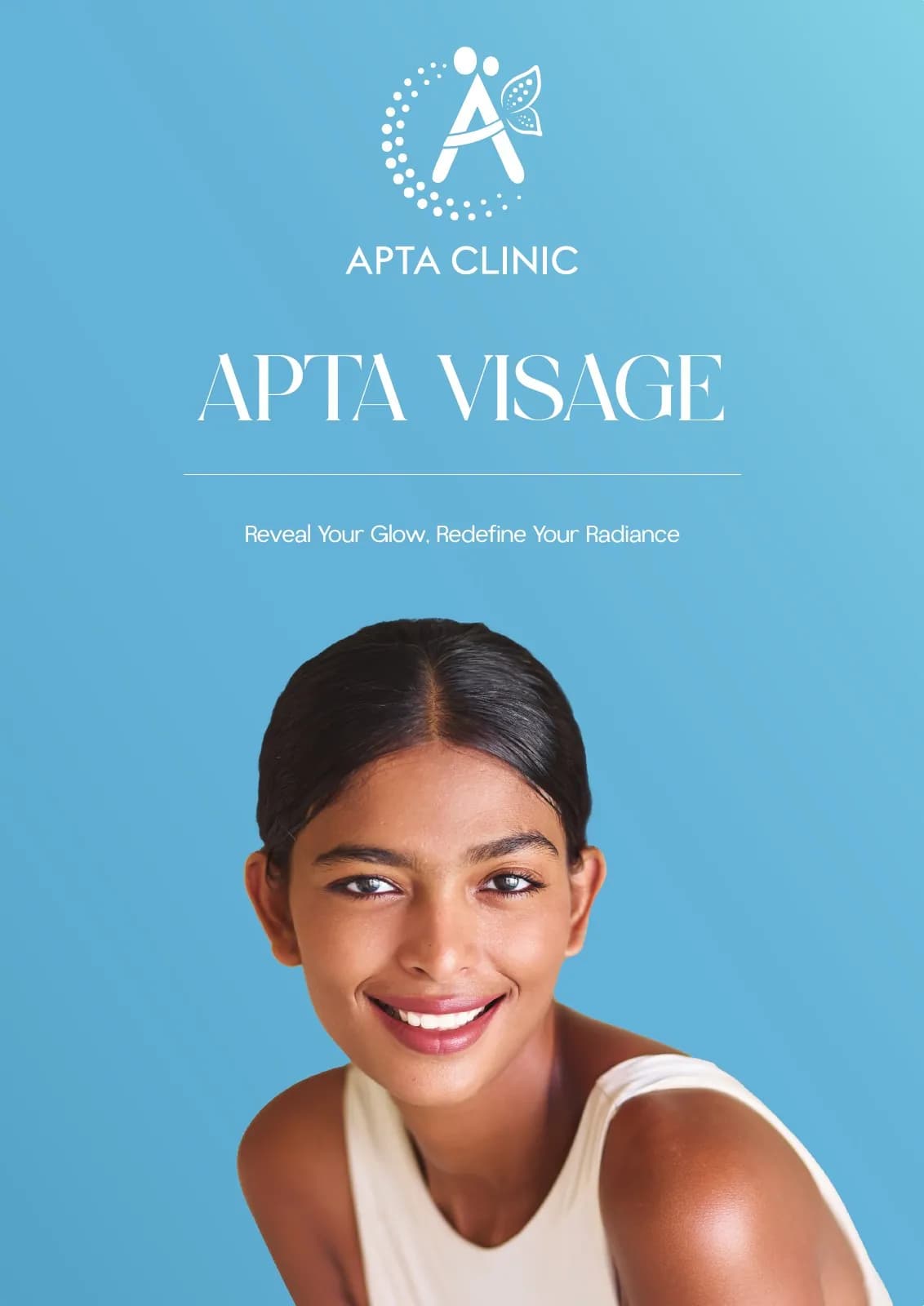
Apta Visage
Table-top Brochure Design · Aesthetics & Skincare
A calm in-clinic treatment guide that makes services easier to browse, compare and discuss with a care team.
The client and context
A treatment menu can overwhelm readers with unfamiliar names and promises. The brochure needed to help patients understand options without feeling sales-led.
As a tabletop piece, it also had to work in short waiting-room glances and longer one-to-one consultation conversations.
The central idea
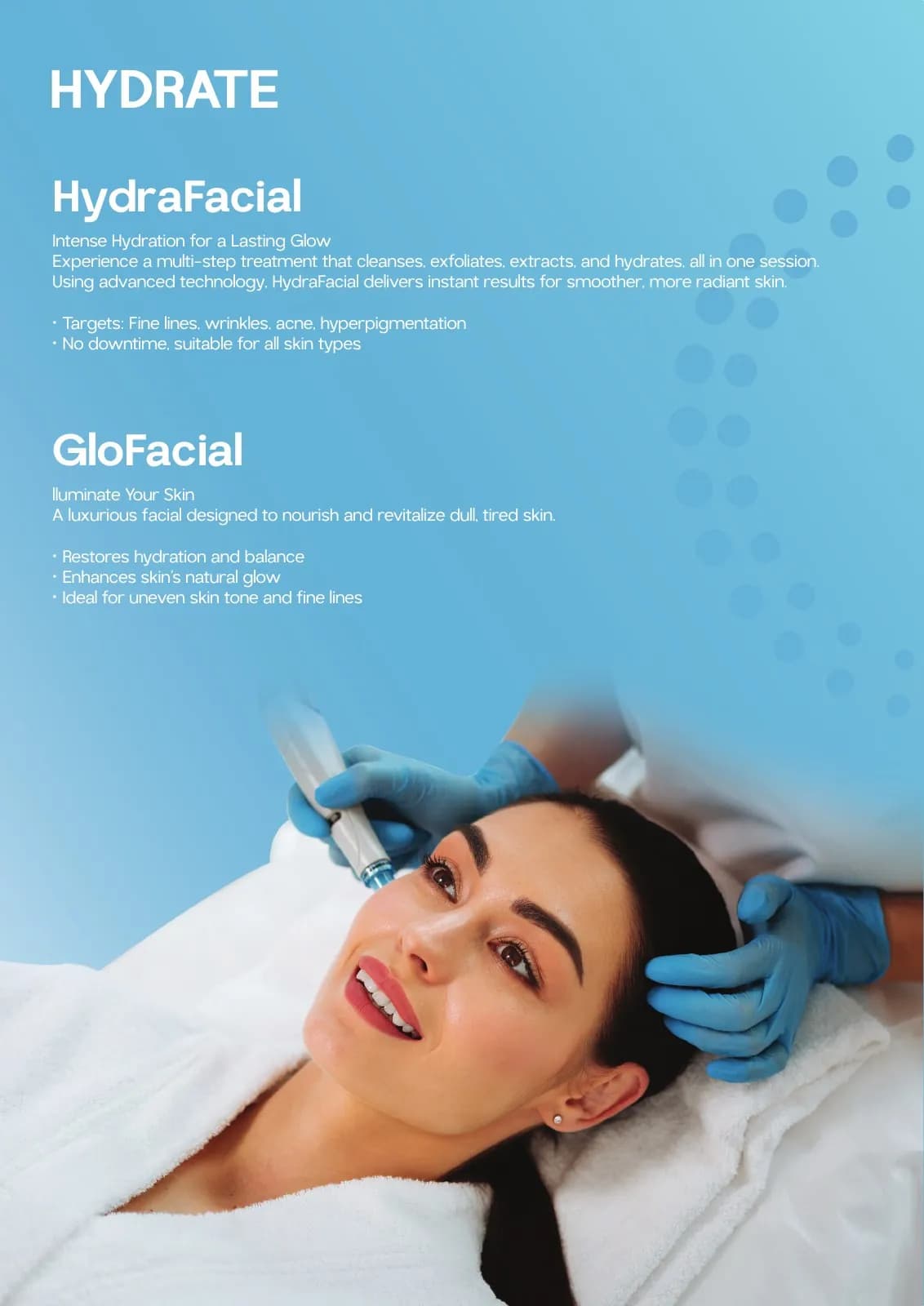
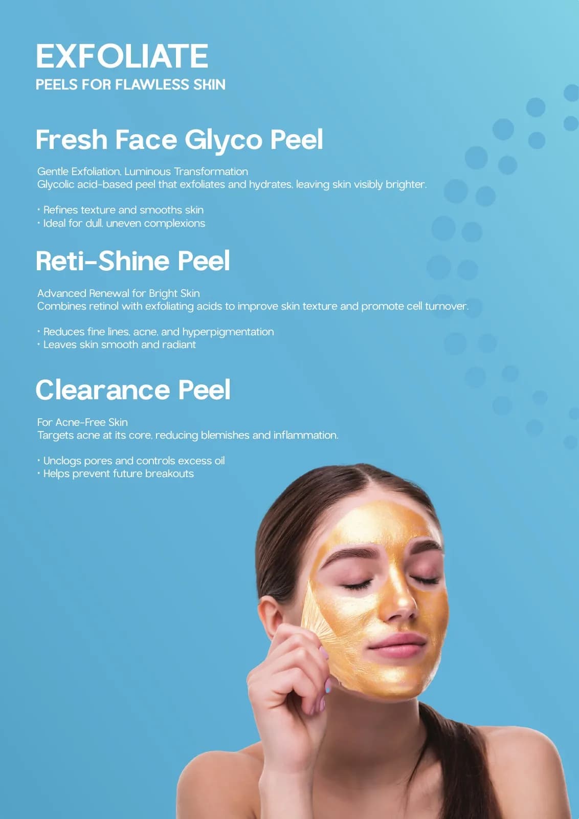
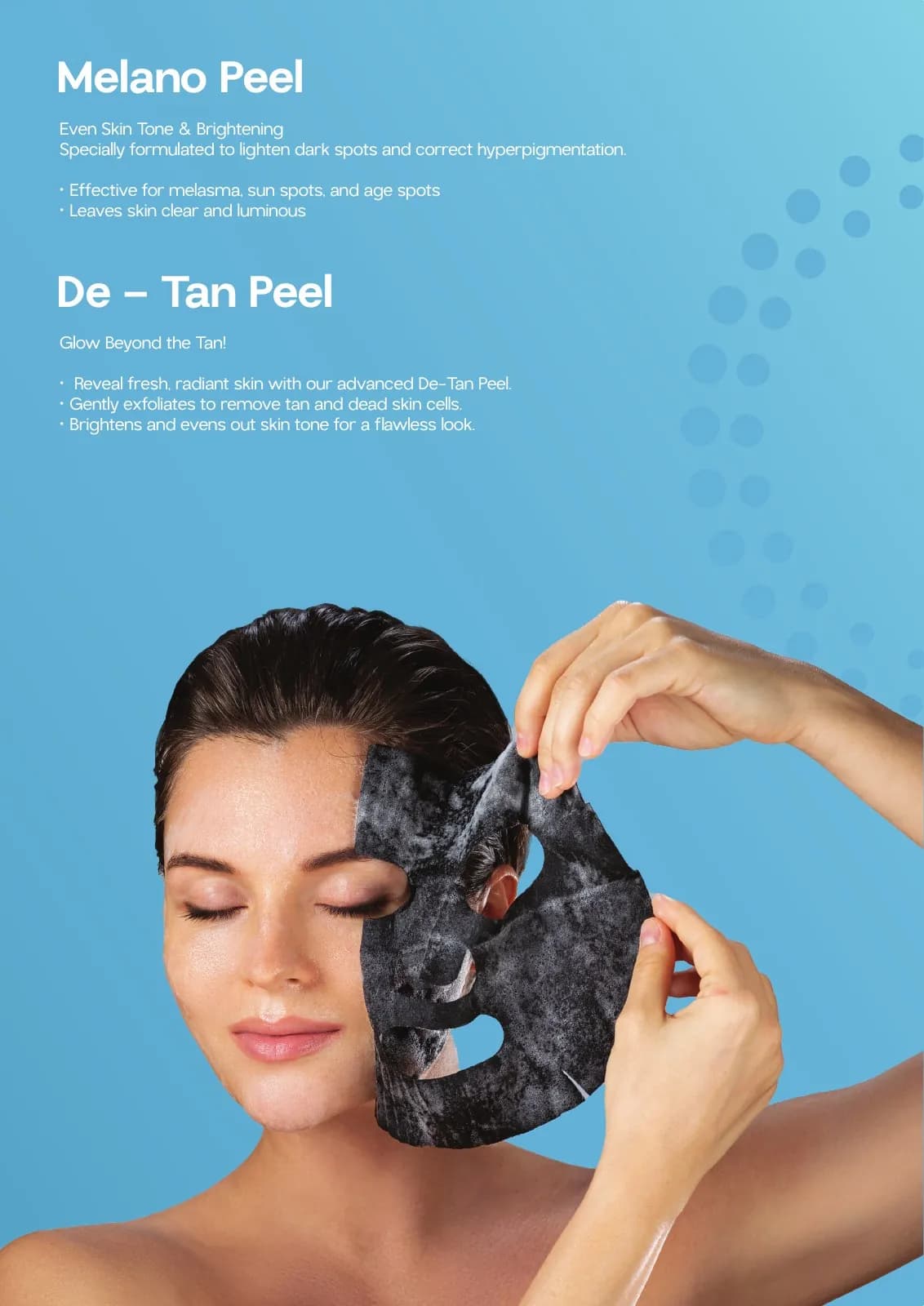
Eight pages are organised as a calm pathway: welcome, understand, explore and discuss. Light blue creates continuity while white panels give each treatment enough space to be considered on its own.
Photography supports recognition and aspiration, but the information hierarchy keeps the care relationship central.
Mood board · visual territory
Soft clinic daylight, clear skin textures, translucent materials and reassuring consultation spaces shaped a guide that supports conversation rather than pressure.
Reference language
Editorial system · Visual direction
Structure to final artwork
Four deliberate stages turned information, imagery and format into a coherent physical experience.
The most natural patient questions shaped the order of the guide instead of the clinic's internal service list.
Treatments were organised into understandable needs before individual details were introduced.
Blue anchors, white modules and consistent image crops reduce the effort of moving between options.
Page turns, viewing distance and consultation pointing were considered alongside standard print details.
Resolved artwork
The final system was checked at real scale, in colour and one-colour reproduction, and against the surfaces where people will actually meet it.
Why the design works
Organising by patient understanding makes the piece more helpful than a simple service inventory.
A soft, daylight blue feels clinical enough for trust and gentle enough for beauty care.
Clear modular spaces make comparison easier and leave room for a practitioner to explain.
Colour system
The palette balances recognition, category trust and practical reproduction. Primary colours carry the identity; supporting tones create hierarchy, space and flexibility.
#5DBAD8
#A8DCE9
#315D72
#F7FBFC
#D9E3E6
Mini brand guidelines
Delivered system
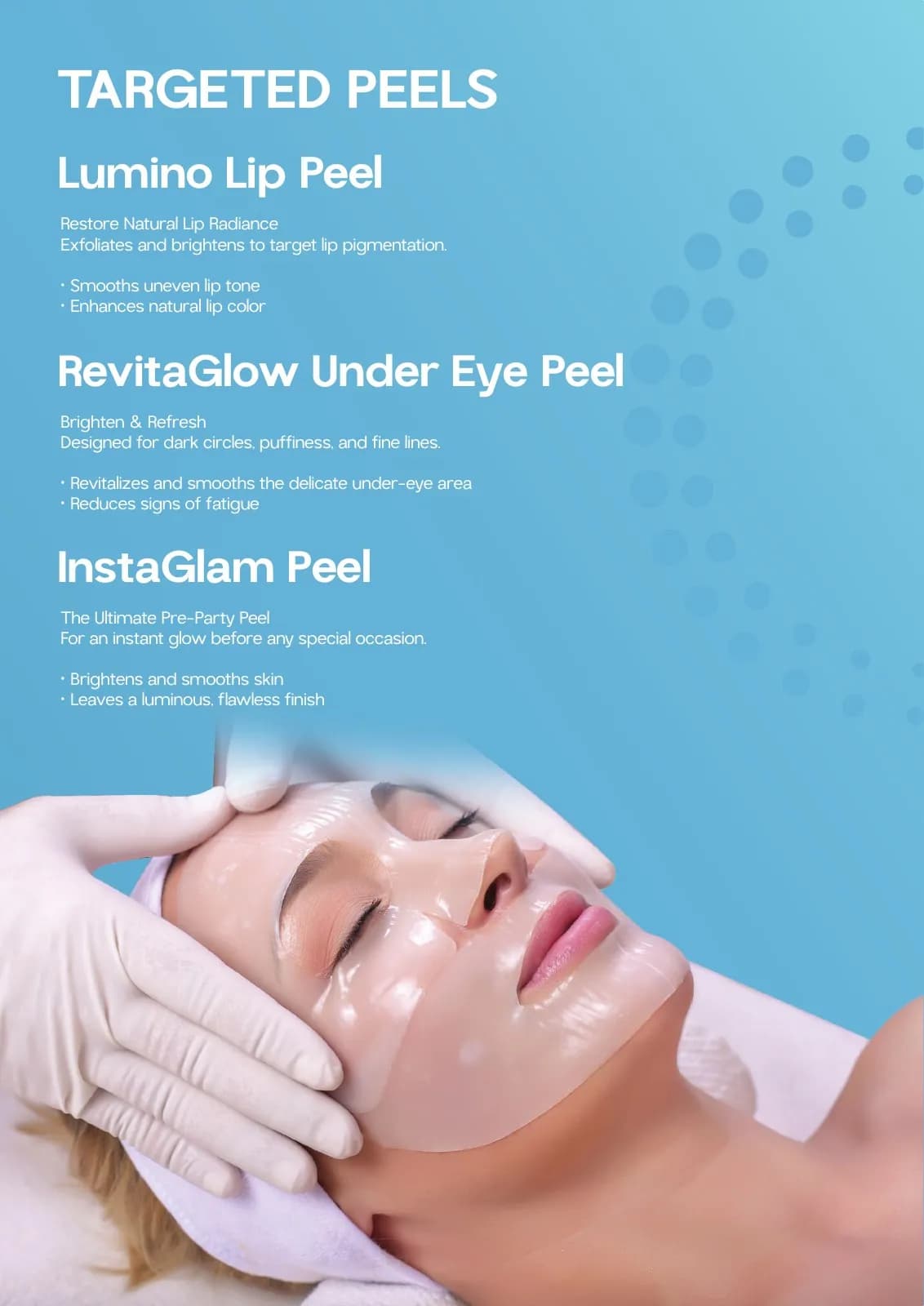
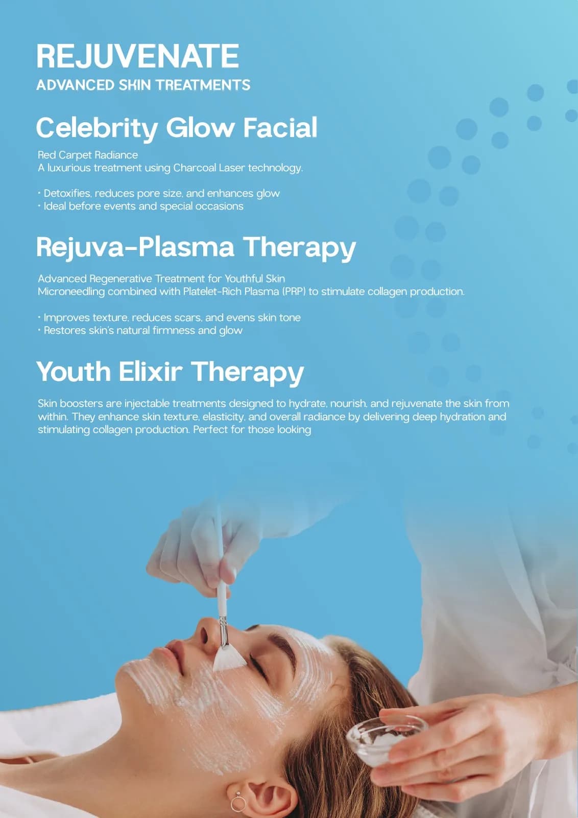
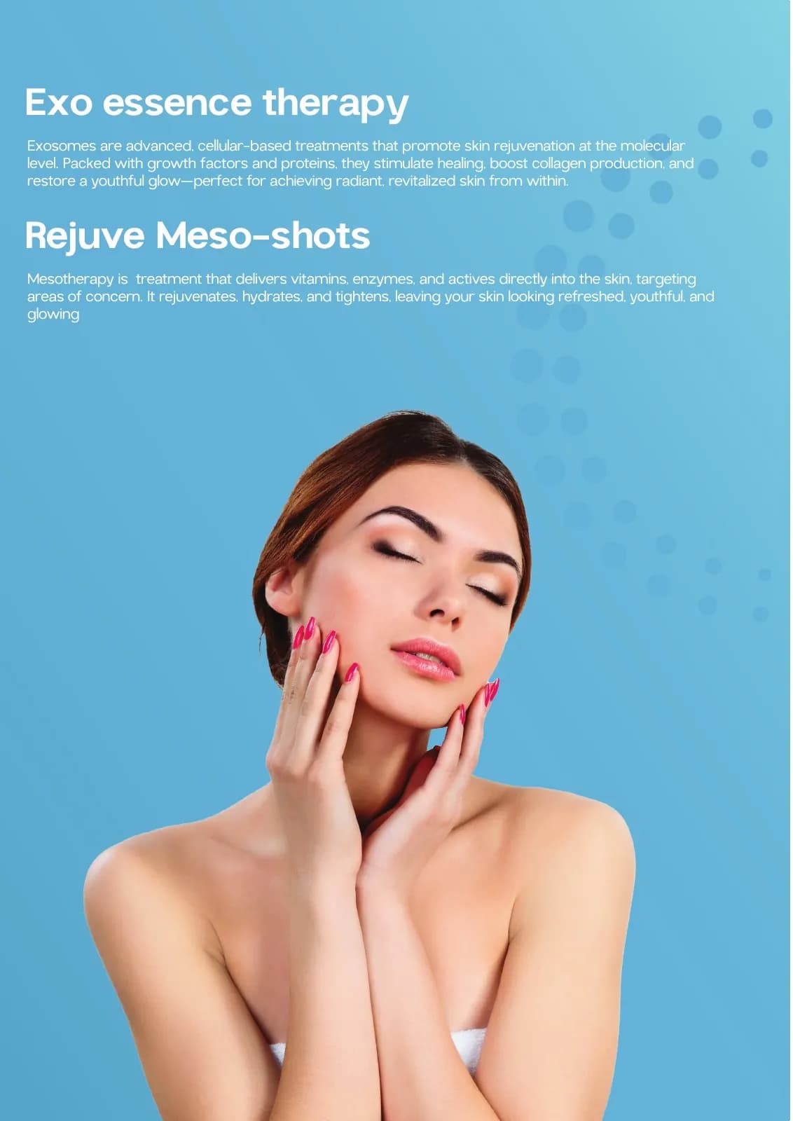
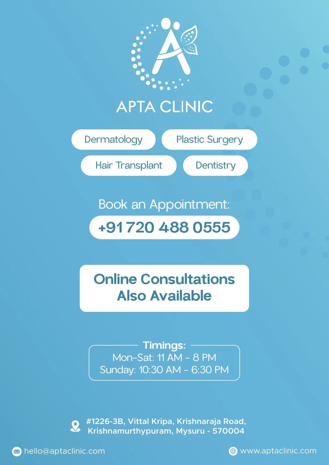
The work in context
The final piece brings information, imagery, colour and production decisions together as one coherent experience.
Delivered value
Build something relevant to your market
The same team, process and attention to business intent are available for your next brand or design project.
Explore Graphic Design & Branding →More Branding & Design
Tell us what the work should mean before we discuss how it should look. We’ll turn that story into a distinctive, usable design system.
Prefer to talk? WhatsApp us → · +91 77568 73424





