Define luxury as comfort
The mood board replaced decorative premium cues with privacy, support, daylight and room to breathe.
Atrix Healthcare
Healthcare Brochure Design · Maternity Healthcare
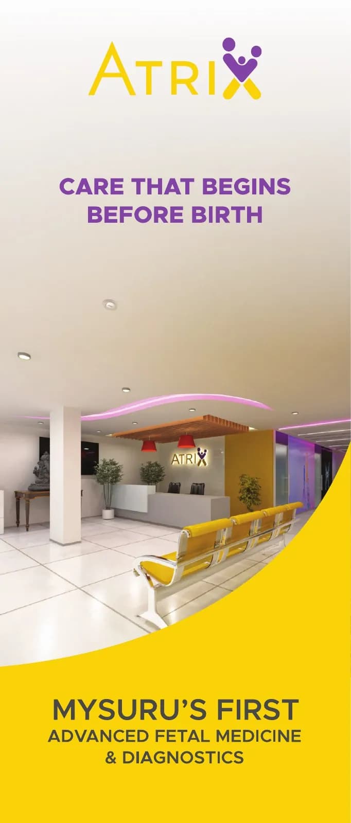
A compact vertical brochure that introduces Mysuru's luxury birthing-suite experience with optimism, warmth and clinical clarity.
The client and context
The brochure had to introduce a premium birthing experience while keeping medical trust and emotional sensitivity intact.
A short four-page format meant every image and sentence needed a clear role: welcome, explain, reassure or invite.
The central idea
The editorial system alternates bright optimism with quieter information spaces. Yellow carries warmth and visibility; purple links back to Atrix care and gives the piece maturity.
Tall proportions echo the feeling of a private suite and guide the reader through a concise, composed story.
Mood board · visual territory
Sunlit rooms, supportive family moments, soft textiles and modern care wayfinding helped us frame luxury as comfort rather than ornament.
Reference language
Editorial system · Visual direction
Structure to final artwork
Four deliberate stages turned information, imagery and format into a coherent physical experience.
The mood board replaced decorative premium cues with privacy, support, daylight and room to breathe.
Cover, experience, care detail and response were assigned before visual design began.
Yellow-led emotional pages alternate with calmer purple and white information zones.
Type scale, image crop and page rhythm were tuned for the narrow vertical format.
Resolved artwork
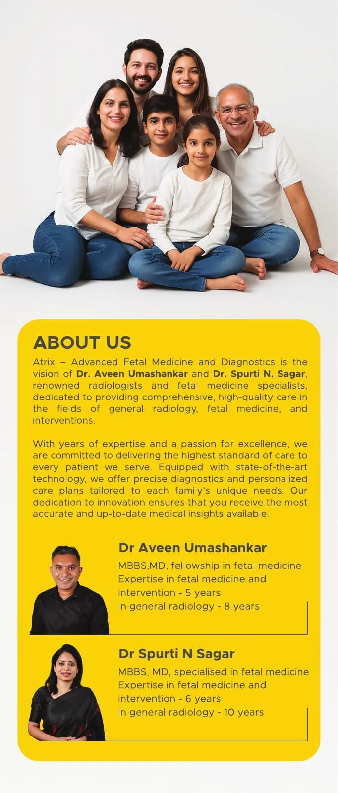
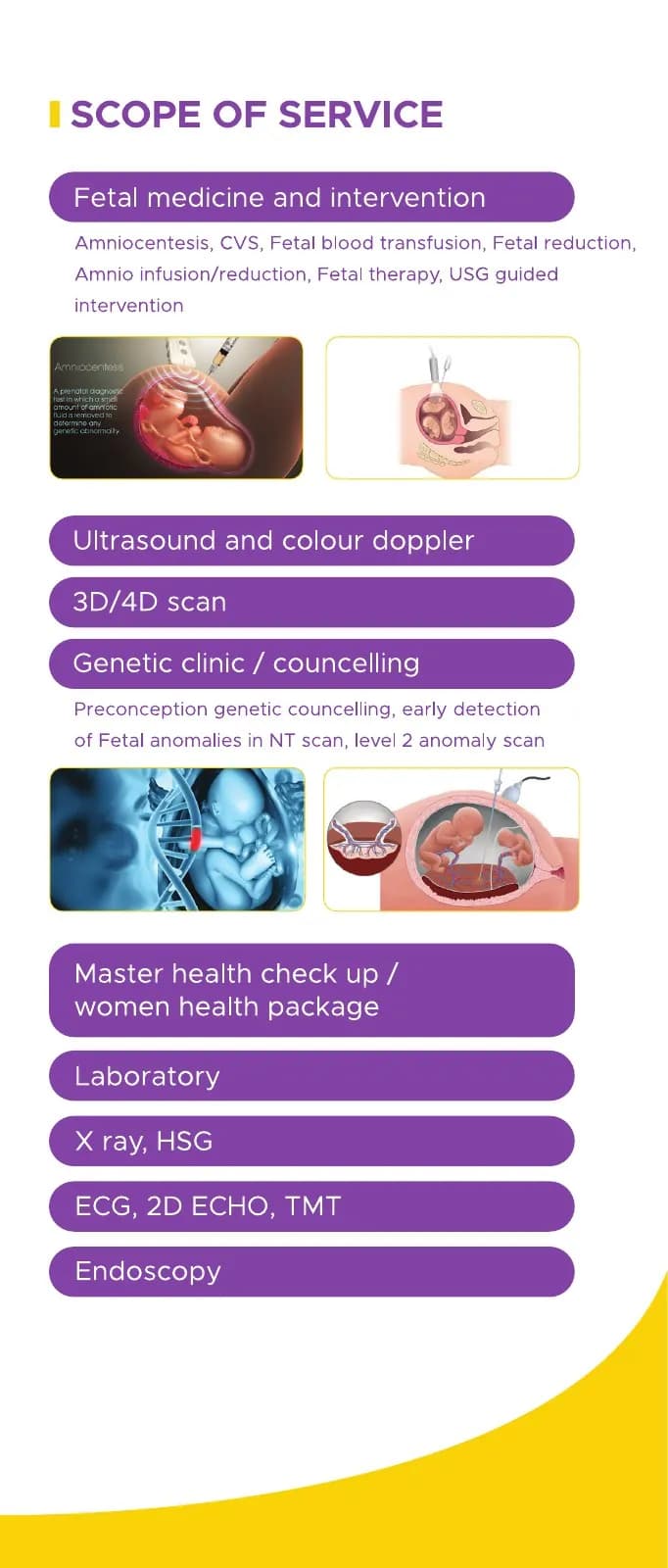
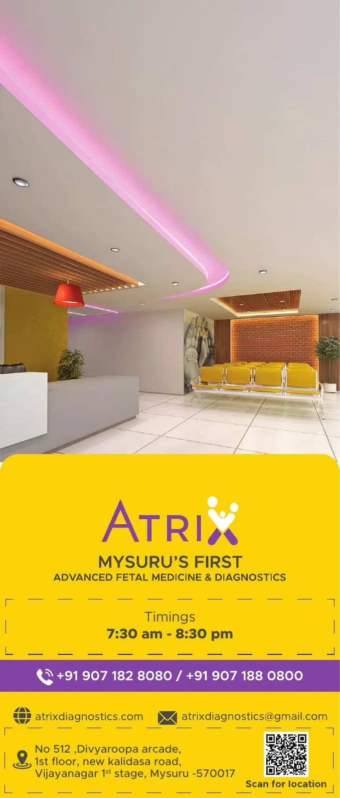
The final system was checked at real scale, in colour and one-colour reproduction, and against the surfaces where people will actually meet it.
Why the design works
Warm colour and real care cues make the premium experience feel supportive, not exclusive.
The concise format stays calm because each spread carries one clear message.
The tall page feels more like a personal invitation than a conventional corporate brochure.
Colour system
The palette balances recognition, category trust and practical reproduction. Primary colours carry the identity; supporting tones create hierarchy, space and flexibility.
#F3C318
#8D3BB7
#E7D7EF
#FBF8F0
#3F3342
Mini brand guidelines
Delivered system
The work in context
The final piece brings information, imagery, colour and production decisions together as one coherent experience.
Delivered value
Build something relevant to your market
The same team, process and attention to business intent are available for your next brand or design project.
Explore Graphic Design & Branding →More Branding & Design
Tell us what the work should mean before we discuss how it should look. We’ll turn that story into a distinctive, usable design system.
Prefer to talk? WhatsApp us → · +91 77568 73424





