A
Look for gestures
Open arms, joined hands and supportive postures gave the mood board a human starting point.
Atrix
Logo Design & Brand Identity · Family Services
A bright wordmark whose final letter becomes a small symbol of support, connection and shared care.
01Listen
We looked at family gestures, bright wayfinding and the confidence of modern care spaces rather than literal houses or family trees.
Three words became the filter for every choice: supportive, optimistic, clear.

Supportive.Optimistic.Clear.
Open arms · Human connections · Care wayfinding
The X carries the emotional idea: two abstract figures lean toward a shared centre, creating a small embrace within the word.
02Draw
We started with loose visual gestures, tested the strongest relationship and then removed detail until the idea stayed clear at real working sizes.
Open arms, joined hands and supportive postures gave the mood board a human starting point.
Instead of adding an icon, figure studies were fitted into the natural crossings of an X.
The two forms were balanced so they read as connection at a glance and as people on a second look.
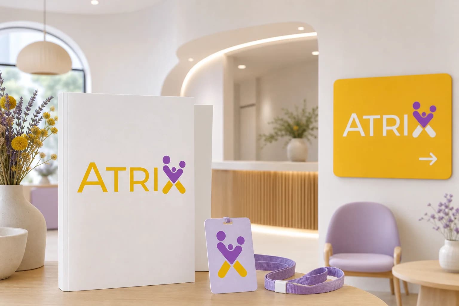
Colour contrast and lock-ups were tested on patient folders, lanyards and directional signs.
The silhouette had to belong unmistakably to Atrix, not merely to its category.
Every line that did not strengthen recognition, balance or reproduction was removed.
The final artwork was checked against keep the two x figures in contrasting purple and use yellow for high-visibility fields.
03Mean
The X carries the emotional idea: two abstract figures lean toward a shared centre, creating a small embrace within the word. Yellow delivers optimism and visibility; purple adds warmth and maturity so the system can serve both family and professional contexts.
Embedding the symbol inside the word makes the idea ownable and avoids a separate generic family icon.
Yellow welcomes; purple steadies it, creating warmth without losing professional trust.
The X is distinct enough to become a navigation marker, avatar or service badge.
Colour contrast and lock-ups were tested on patient folders, lanyards and directional signs.
04Systemise
The logo becomes a usable identity when clear space, scale, colour fields and reproduction rules are defined well enough for another person to apply consistently.
Atrix · mini brand guidelines
Identity guide · 01
Core palette
Atrix Yellow
#F5C400
Care Purple
#9B3ED1
Soft Lavender
#EADDF5
Open White
#FFFFFF
Deep Plum
#57276F
Primary
Reversed
One colour
Clear space
Keep the two X figures in contrasting purple
Use yellow for high-visibility fields
Do not redraw the central embrace
Use the X alone only after brand recognition
Delivered identity family
Identity in the world
The applications use the logo at a comfortable scale, with enough surrounding space for the symbol and wordmark to remain complete, legible and recognisable.
Delivered value
Build something relevant to your market
The same team, process and attention to business intent are available for your next brand or design project.
Explore Graphic Design & Branding →More Branding & Design
Tell us what the work should mean before we discuss how it should look. We’ll turn that story into a distinctive, usable design system.
Prefer to talk? WhatsApp us → · +91 77568 73424





