A
Define the personal tone
Signatures, editorial names and precise geometric objects helped balance warmth with professional authority.
Chandni Gupta
Personal Identity Design · Professional Services
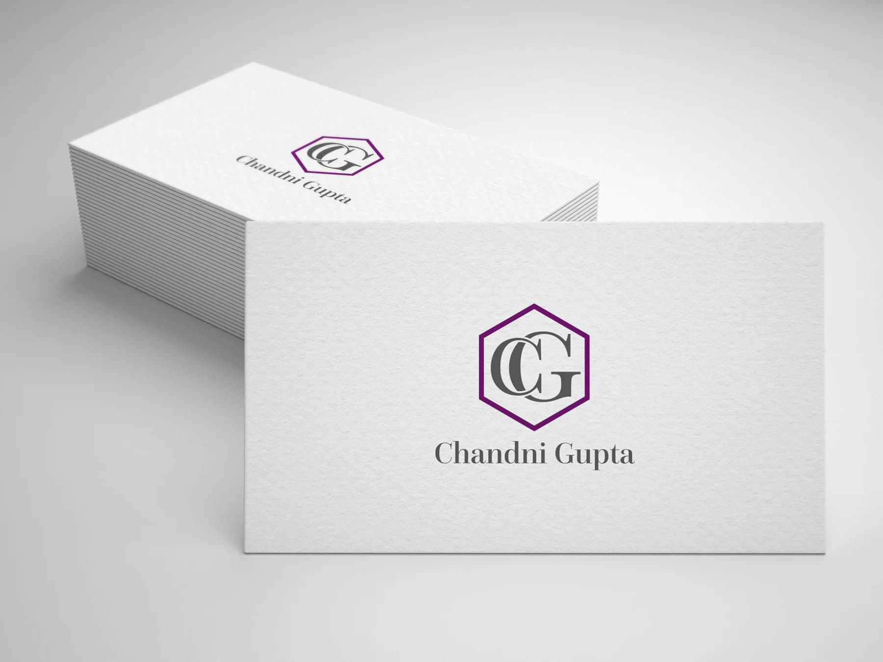
A composed CG monogram held inside a geometric frame—personal enough to sign, structured enough to lead.
01Listen
Editorial signatures, gemstone facets, architectural frames and tactile white stationery set a direction that felt individual without becoming informal.
Three words became the filter for every choice: articulate, modern, personal.

Articulate.Modern.Personal.
Initial signatures · Faceted frames · Editorial serif type
The two initials share a central spine and are contained within a faceted hexagon. The frame suggests clarity and multiple perspectives while protecting the monogram as a compact seal.
02Draw
We started with loose visual gestures, tested the strongest relationship and then removed detail until the idea stayed clear at real working sizes.
Signatures, editorial names and precise geometric objects helped balance warmth with professional authority.
Initial studies explored overlap before a shared spine produced the clearest, most balanced reading.
A faceted hexagon gave the organic letterforms structure without enclosing them in a familiar circle.
Scale, ink density and whitespace were tuned for understated, tactile stationery.
The silhouette had to belong unmistakably to Chandni Gupta, not merely to its category.
Every line that did not strengthen recognition, balance or reproduction was removed.
The final artwork was checked against use the monogram above 12 mm and keep the faceted frame intact.
03Mean
The two initials share a central spine and are contained within a faceted hexagon. The frame suggests clarity and multiple perspectives while protecting the monogram as a compact seal. Purple provides individuality; graphite typography and generous white space keep the system composed.
The shared construction makes the monogram feel considered and prevents visual competition.
The geometry suggests discernment and perspective while creating a recognisable outer silhouette.
Purple appears selectively, allowing the personal mark to stand out on restrained professional material.
Scale, ink density and whitespace were tuned for understated, tactile stationery.
04Systemise
The logo becomes a usable identity when clear space, scale, colour fields and reproduction rules are defined well enough for another person to apply consistently.
Chandni Gupta · mini brand guidelines
Identity guide · 01
Core palette
Signature Purple
#8A1278
Graphite
#4A4A4A
Soft Lavender
#D8C0D5
Paper White
#F9F9F8
Silver
#B8B8BB
Primary
Reversed
One colour
Clear space
Use the monogram above 12 mm
Keep the faceted frame intact
Prefer uncoated white stock
Use purple as a signature accent, not a full-page field
Delivered identity family
Identity in the world
The applications use the logo at a comfortable scale, with enough surrounding space for the symbol and wordmark to remain complete, legible and recognisable.
Delivered value
Build something relevant to your market
The same team, process and attention to business intent are available for your next brand or design project.
Explore Graphic Design & Branding →More Branding & Design
Tell us what the work should mean before we discuss how it should look. We’ll turn that story into a distinctive, usable design system.
Prefer to talk? WhatsApp us → · +91 77568 73424





