A
Study the host
Portrait references focused on posture, eyewear and toque—the details guests are most likely to remember.
Chef Abdul
Logo Design & Brand Identity · Culinary & Hospitality
An illustrated portrait mark that makes the chef—not a generic dish—the enduring face of the experience.
01Listen
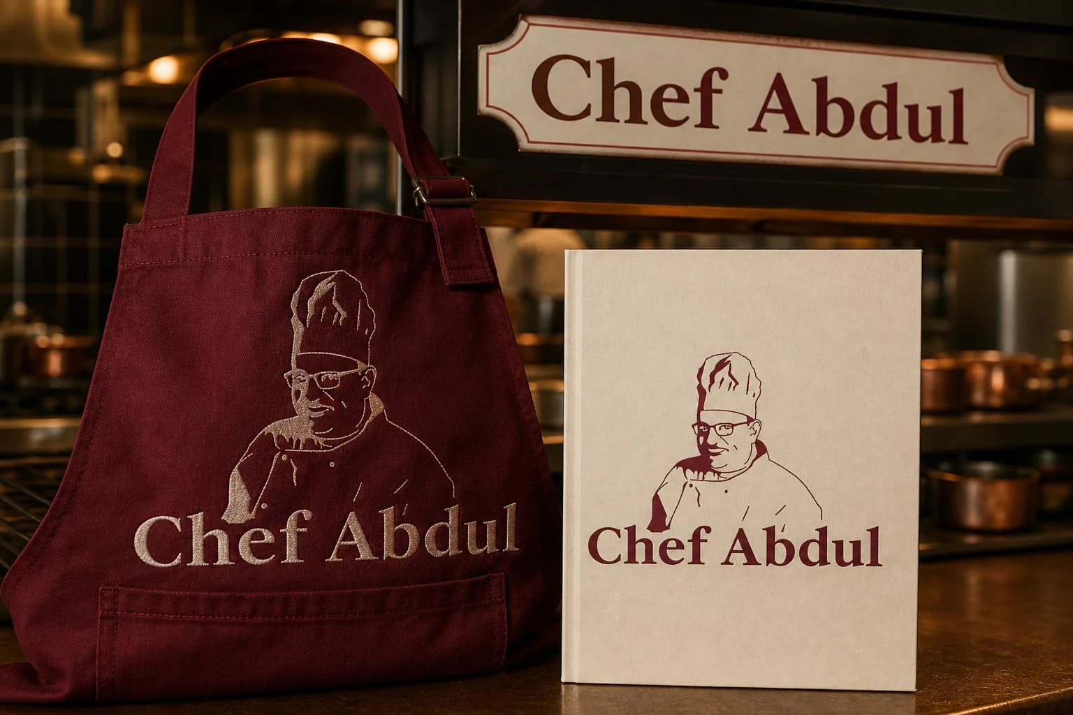
Chef portraits, handwritten menus, deep kitchen reds and the warm patina of copper serviceware shaped an identity that feels hosted by a real person.
Three words became the filter for every choice: personal, crafted, generous.
Personal.Crafted.Generous.
Chef portraiture · Tall toque · Menu signatures
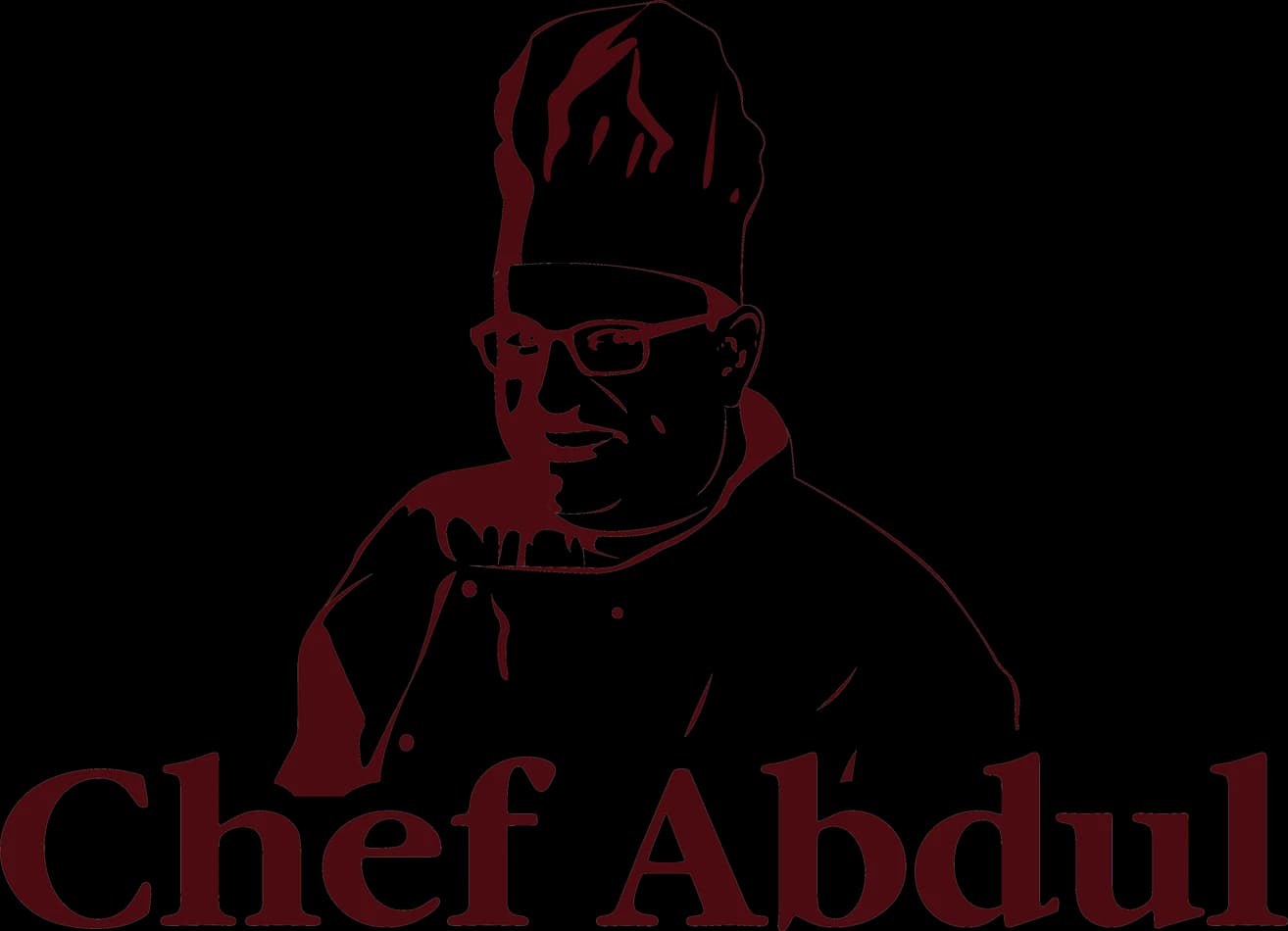
A confident line portrait—glasses, moustache and toque—becomes the signature. The illustration captures recognisable features without turning into a cartoon.
02Draw
We started with loose visual gestures, tested the strongest relationship and then removed detail until the idea stayed clear at real working sizes.
Portrait references focused on posture, eyewear and toque—the details guests are most likely to remember.
Multiple line studies removed unnecessary detail while preserving the chef's individual character.
The portrait and wordmark were scaled as a signature rather than a mascot sitting above text.
One-colour and reversed versions were checked on cloth, menus, stamps and environmental signs.
The silhouette had to belong unmistakably to Chef Abdul, not merely to its category.
Every line that did not strengthen recognition, balance or reproduction was removed.
The final artwork was checked against use the simplified portrait below 24 mm and keep facial features unaltered.
03Mean
A confident line portrait—glasses, moustache and toque—becomes the signature. The illustration captures recognisable features without turning into a cartoon. Deep burgundy carries warmth and culinary heritage; the cream serif wordmark reads like a name on a well-kept menu.
Putting a real personality at the centre turns service and craft into the brand's most ownable asset.
Controlled linework keeps the identity warm and memorable without undermining culinary credibility.
The colour feels generous and established while supporting cream and copper hospitality materials.
One-colour and reversed versions were checked on cloth, menus, stamps and environmental signs.
04Systemise
The logo becomes a usable identity when clear space, scale, colour fields and reproduction rules are defined well enough for another person to apply consistently.
Chef Abdul · mini brand guidelines
Identity guide · 01
Core palette
Kitchen Burgundy
#681019
Wine
#8A2A2B
Menu Cream
#F2E2CC
Copper
#B56B3E
Charcoal
#241A19
Primary
Reversed
One colour
Clear space
Use the simplified portrait below 24 mm
Keep facial features unaltered
Use burgundy as the primary field
Allow extra clear space above the toque
Delivered identity family
Identity in the world
The applications use the logo at a comfortable scale, with enough surrounding space for the symbol and wordmark to remain complete, legible and recognisable.
Delivered value
Build something relevant to your market
The same team, process and attention to business intent are available for your next brand or design project.
Explore Graphic Design & Branding →More Branding & Design
Tell us what the work should mean before we discuss how it should look. We’ll turn that story into a distinctive, usable design system.
Prefer to talk? WhatsApp us → · +91 77568 73424





