A
Study auspicious geometry
Lotus structures, temple halos and traditional jewellery proportions established the composition.
Dhanalakshmi Jewellers
Logo Design & Brand Identity · Jewellery Retail
A devotional, heritage-led emblem refined for the scale and ceremony of a contemporary jewellery house.
01Listen
Temple jewellery, lotus geometry, gold-leaf halos and the ceremonial moment of opening a jewellery box shaped the visual world.
Three words became the filter for every choice: auspicious, precious, enduring.

Auspicious.Precious.Enduring.
Lotus petals · Temple halos · Goddess iconography
The goddess sits within a lotus and radiating halo, turning prosperity into a composed, symmetrical seal.
02Draw
We started with loose visual gestures, tested the strongest relationship and then removed detail until the idea stayed clear at real working sizes.
Lotus structures, temple halos and traditional jewellery proportions established the composition.
Illustrative detail was removed carefully so the figure remained dignified and immediately recognisable.
Petals and rays were spaced into a symmetrical halo that holds at both sign and box scale.
Positive and reversed versions were prepared for foil, embossing, engraving and flat print.
The silhouette had to belong unmistakably to Dhanalakshmi Jewellers, not merely to its category.
Every line that did not strengthen recognition, balance or reproduction was removed.
The final artwork was checked against use the detailed emblem above 24 mm and use the simplified seal for engraving.
03Mean
The goddess sits within a lotus and radiating halo, turning prosperity into a composed, symmetrical seal. The emblem is balanced by a wide uppercase wordmark, giving sacred detail a stable, contemporary retail foundation.
The flower grounds the figure and links beauty, purity and prosperity to the jewellery experience.
The halo creates richness through rhythm rather than excessive ornament.
A deep ceremonial field lets the metallic mark feel warm, precious and unmistakably Indian.
Positive and reversed versions were prepared for foil, embossing, engraving and flat print.
04Systemise
The logo becomes a usable identity when clear space, scale, colour fields and reproduction rules are defined well enough for another person to apply consistently.
Dhanalakshmi Jewellers · mini brand guidelines
Identity guide · 01
Core palette
Temple Maroon
#5B101D
Prosperity Gold
#D89A2B
Antique Gold
#B27621
Ivory
#F6EBDD
Charcoal
#251B1C
Primary
Reversed
One colour
Clear space
Use the detailed emblem above 24 mm
Use the simplified seal for engraving
Metallic gold should sit on maroon or ivory
Never stretch the radial halo
Delivered identity family
Identity in the world
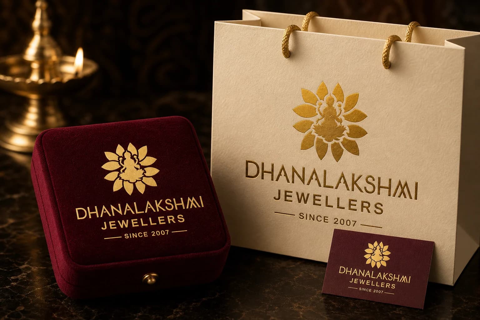
The applications use the logo at a comfortable scale, with enough surrounding space for the symbol and wordmark to remain complete, legible and recognisable.
Delivered value
Build something relevant to your market
The same team, process and attention to business intent are available for your next brand or design project.
Explore Graphic Design & Branding →More Branding & Design
Tell us what the work should mean before we discuss how it should look. We’ll turn that story into a distinctive, usable design system.
Prefer to talk? WhatsApp us → · +91 77568 73424





