A
Translate the bazaar
Market stalls, payment tiles and linked supply paths became a modular reference system.
Digi Bharath Mart
Logo Design & Brand Identity · Digital Commerce
An interlocking D and B that feels like a storefront, a network and a dependable digital transaction.
01Listen
The mood board combined Indian market energy with the confidence of a modern payments interface: modular stalls, connected blocks and crisp digital grids.
Three words became the filter for every choice: connected, accessible, progressive.
Connected.Accessible.Progressive.
Market modules · Linked paths · App tiles
Two geometric paths form D and B while locking into a single modular shape. The negative space suggests a doorway—an entry into the marketplace.
02Draw
We started with loose visual gestures, tested the strongest relationship and then removed detail until the idea stayed clear at real working sizes.
Market stalls, payment tiles and linked supply paths became a modular reference system.
Dozens of monograms were tested until both initials remained readable without feeling mechanical.
The central negative space was widened to create a welcoming entrance and a cleaner app icon.
Colour balance and lock-ups were tested across retail fascia, bags and digital launch screens.
The silhouette had to belong unmistakably to Digi Bharath Mart, not merely to its category.
Every line that did not strengthen recognition, balance or reproduction was removed.
The final artwork was checked against use the monogram for app icons and keep gold below 20% of a layout.
03Mean
Two geometric paths form D and B while locking into a single modular shape. The negative space suggests a doorway—an entry into the marketplace. Blue provides trust, teal signals connection and a small gold plane adds the optimism and energy of commerce.
The modular mark carries the structure of a market and the logic of an interface.
The white doorway makes the platform feel accessible and gives the dense monogram air.
Cobalt builds trust, teal connects participants and gold marks opportunity.
Colour balance and lock-ups were tested across retail fascia, bags and digital launch screens.
04Systemise
The logo becomes a usable identity when clear space, scale, colour fields and reproduction rules are defined well enough for another person to apply consistently.
Digi Bharath Mart · mini brand guidelines
Identity guide · 01
Core palette
Cobalt
#1D58C7
Teal
#208B83
Market Gold
#F2BE3B
Digital Ice
#EDF4FA
Deep Ink
#18304E
Primary
Reversed
One colour
Clear space
Use the monogram for app icons
Keep gold below 20% of a layout
Do not close the central doorway
Prefer cobalt on high-trust touchpoints
Delivered identity family
Identity in the world
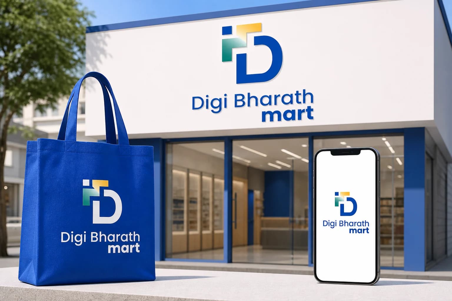
The applications use the logo at a comfortable scale, with enough surrounding space for the symbol and wordmark to remain complete, legible and recognisable.
Delivered value
Build something relevant to your market
The same team, process and attention to business intent are available for your next brand or design project.
Explore Graphic Design & Branding →More Branding & Design
Tell us what the work should mean before we discuss how it should look. We’ll turn that story into a distinctive, usable design system.
Prefer to talk? WhatsApp us → · +91 77568 73424





