A
Start below the surface
Soil textures, root systems and germination sequences gave the mood board a practical point of view.
Eco Soil Organics
Logo Design & Brand Identity · Organic Agriculture
A grounded wordmark where seed, soil and living growth are built directly into the name.
01Listen
The visual world came from soil cross-sections, germinating seeds, working farms and uncoated agricultural materials rather than polished eco symbolism.
Three words became the filter for every choice: living, practical, regenerative.

Living.Practical.Regenerative.
Seed germination · Soil particles · Field rows
The O becomes a seed and soil particle: the smallest unit from which the full system grows. The letters stay sturdy and uncomplicated, like labels made to work in the field.
02Draw
We started with loose visual gestures, tested the strongest relationship and then removed detail until the idea stayed clear at real working sizes.
Soil textures, root systems and germination sequences gave the mood board a practical point of view.
Seed and dotted-soil sketches were simplified until they remained legible within the word.
The wordmark was weighted for sacks, crates and outdoor signs where fine detail would disappear.
Orange was assigned to calls to action, product variants and moments that need to be found quickly.
The silhouette had to belong unmistakably to Eco Soil Organics, not merely to its category.
Every line that did not strengthen recognition, balance or reproduction was removed.
The final artwork was checked against use the seed o intact and allow one cap-height of clear space.
03Mean
The O becomes a seed and soil particle: the smallest unit from which the full system grows. The letters stay sturdy and uncomplicated, like labels made to work in the field. Orange is used as the moment of harvest and action, preventing the green-led identity from disappearing among conventional organic brands.
The identity makes regeneration a process, not a decorative leaf placed above a name.
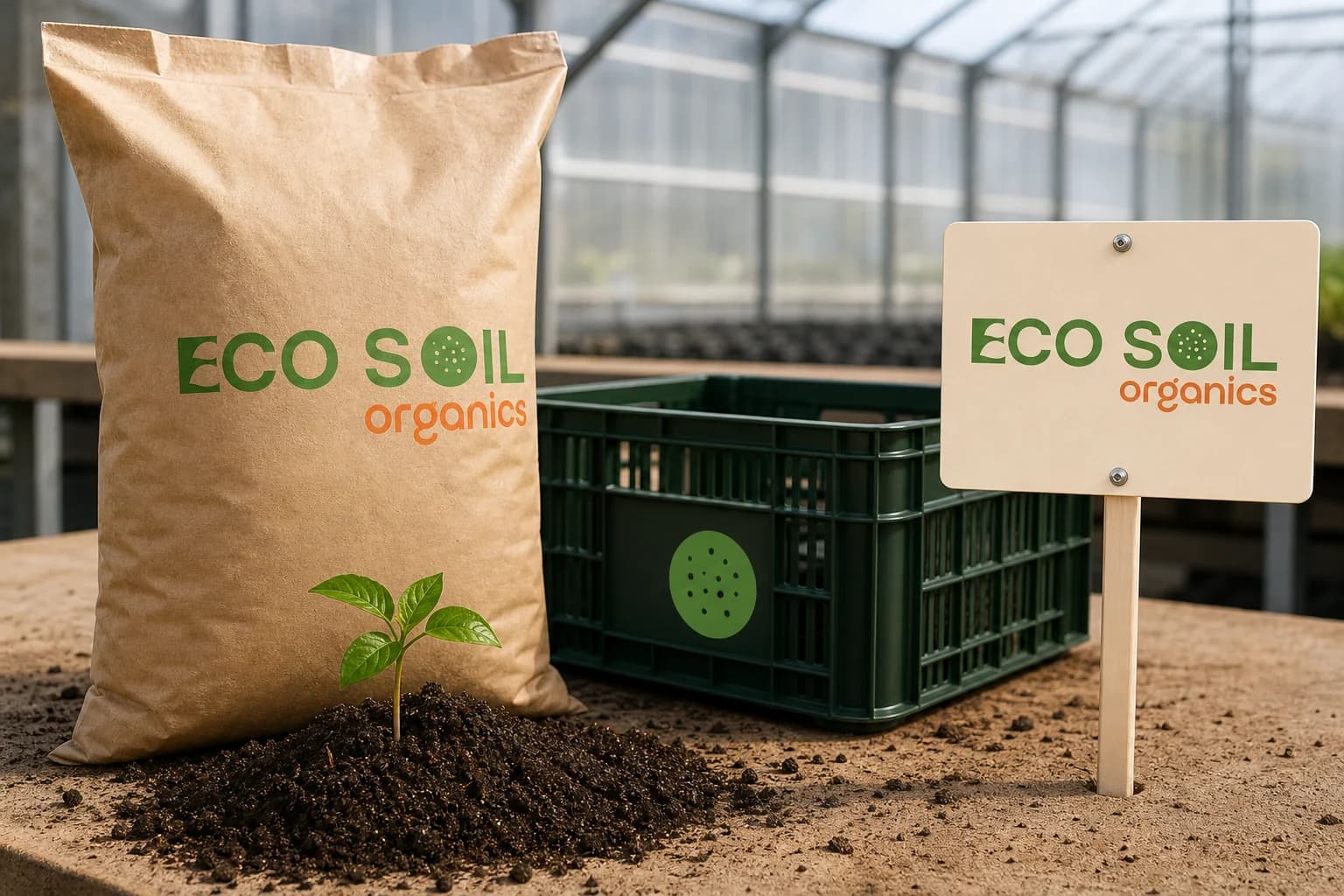
Broad letters and simple forms stay readable on rough kraft, plastic crates and field boards.
The warm accent introduces harvest, activity and shelf recognition into a green category.
Orange was assigned to calls to action, product variants and moments that need to be found quickly.
04Systemise
The logo becomes a usable identity when clear space, scale, colour fields and reproduction rules are defined well enough for another person to apply consistently.
Eco Soil Organics · mini brand guidelines
Identity guide · 01
Core palette
Growth Green
#4E8D38
Young Leaf
#78A83B
Harvest Orange
#F47A2F
Living Soil
#6B4B31
Natural Cream
#F3EBDD
Primary
Reversed
One colour
Clear space
Use the seed O intact
Allow one cap-height of clear space
Prefer cream or kraft backgrounds
Use orange for variants and action, not body text
Delivered identity family
Identity in the world
The applications use the logo at a comfortable scale, with enough surrounding space for the symbol and wordmark to remain complete, legible and recognisable.
Delivered value
Build something relevant to your market
The same team, process and attention to business intent are available for your next brand or design project.
Explore Graphic Design & Branding →More Branding & Design
Tell us what the work should mean before we discuss how it should look. We’ll turn that story into a distinctive, usable design system.
Prefer to talk? WhatsApp us → · +91 77568 73424





