A
Audit engineering shorthand
Drawings, joints, tools and standard category symbols were mapped before the familiar clichés were removed.
Forte Engineers & Consultants
Logo Design & Brand Identity · Engineering Consultancy
A strong technical wordmark where the O becomes the point at which structure and insight meet.
01Listen
The mood board moved between engineering drawings, structural joins, illuminated ideas and the durable materials of a working site.
Three words became the filter for every choice: exact, inventive, dependable.
Exact.Inventive.Dependable.
Blueprint grids · Structural joints · Idea filaments
The word FORTE is treated as a structure. Its orange O interrupts the navy mass like a resolved joint or illuminated idea—the place where analysis becomes an answer.
02Draw
We started with loose visual gestures, tested the strongest relationship and then removed detail until the idea stayed clear at real working sizes.
Drawings, joints, tools and standard category symbols were mapped before the familiar clichés were removed.
Custom block letters were aligned to a shared grid so the name feels assembled rather than typed.
Circular, filament and joint studies converged on one orange focal point.
The system was checked on reports, engraved metal, safety gear and low-resolution site use.
The silhouette had to belong unmistakably to Forte Engineers & Consultants, not merely to its category.
Every line that did not strengthen recognition, balance or reproduction was removed.
The final artwork was checked against keep the orange o unchanged and use the descriptor above 32 mm.
03Mean
The word FORTE is treated as a structure. Its orange O interrupts the navy mass like a resolved joint or illuminated idea—the place where analysis becomes an answer. Heavy geometry creates confidence; precise spacing and a narrow descriptor preserve the consultancy's professional tone.
Broad letterforms give the wordmark the stability expected from an engineering partner.
The orange O signals analysis and invention without turning the identity into an illustration.
A disciplined navy, orange and neutral palette behaves predictably across office and site materials.
The system was checked on reports, engraved metal, safety gear and low-resolution site use.
04Systemise
The logo becomes a usable identity when clear space, scale, colour fields and reproduction rules are defined well enough for another person to apply consistently.
Forte Engineers & Consultants · mini brand guidelines
Identity guide · 01
Core palette
Technical Navy
#13075D
Signal Orange
#F39B43
Copper
#D86B2D
Plan Paper
#F4F1EA
Steel
#6E7480
Primary
Reversed
One colour
Clear space
Keep the orange O unchanged
Use the descriptor above 32 mm
Prefer flat colour on safety applications
Align supporting text to the wordmark grid
Delivered identity family
Identity in the world
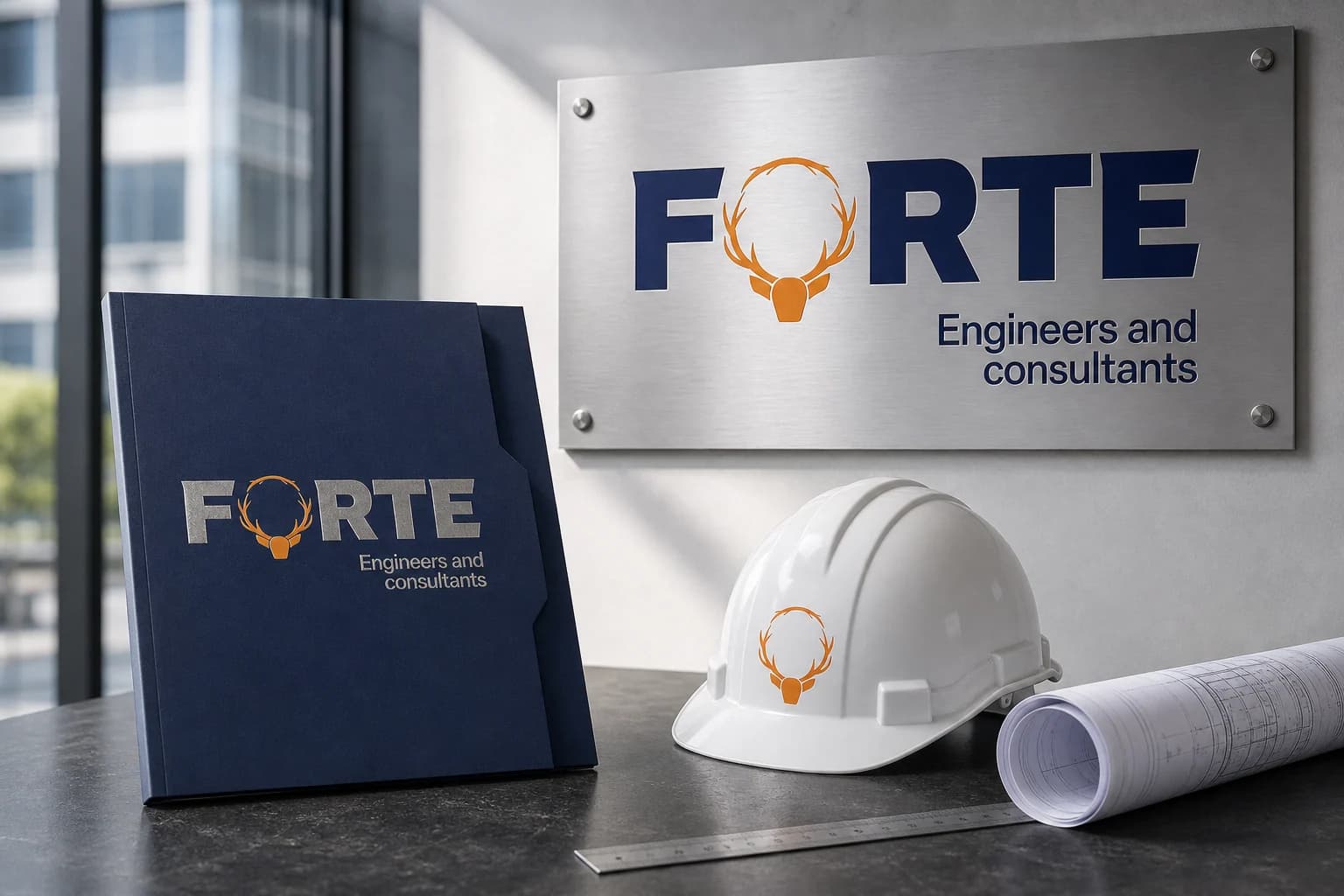
The applications use the logo at a comfortable scale, with enough surrounding space for the symbol and wordmark to remain complete, legible and recognisable.
Delivered value
Build something relevant to your market
The same team, process and attention to business intent are available for your next brand or design project.
Explore Graphic Design & Branding →More Branding & Design
Tell us what the work should mean before we discuss how it should look. We’ll turn that story into a distinctive, usable design system.
Prefer to talk? WhatsApp us → · +91 77568 73424





