A
Read the board language
Trace widths, pads, vias and inspection marks established an authentic industrial vocabulary.
Global Circuits
Logo Design & Brand Identity · PCB Manufacturing
A precise industrial identity that brings worldwide reach and printed-circuit logic into the same symbol.
01Listen
Circuit traces, plated contact points, board masks and globe arcs built a mood board where every line had a technical reason to exist.
Three words became the filter for every choice: precise, connected, industrial.
Precise.Connected.Industrial.
PCB traces · Contact pads · Globe arcs
A circular G is routed with circuit paths and gold contact points. It can be read as an initial, a board and a connected world without splitting into separate symbols.
02Draw
We started with loose visual gestures, tested the strongest relationship and then removed detail until the idea stayed clear at real working sizes.
Trace widths, pads, vias and inspection marks established an authentic industrial vocabulary.
The G was built as a continuous board path rather than decorated with circuit lines afterward.
Connection points were reduced to the few needed for recognition and clean reproduction.
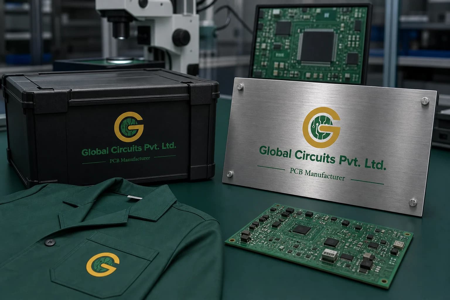
Positive, reversed and etched versions were tested on labels, boxes and metal equipment plates.
The silhouette had to belong unmistakably to Global Circuits, not merely to its category.
Every line that did not strengthen recognition, balance or reproduction was removed.
The final artwork was checked against use the simplified g below 20 mm and keep contact points in gold where colour allows.
03Mean
A circular G is routed with circuit paths and gold contact points. It can be read as an initial, a board and a connected world without splitting into separate symbols. A stable green wordmark grounds the more detailed emblem and gives technical documents a clear hierarchy.
The technical language creates the letter itself, making the category intrinsic to the symbol.
Small contact points add precision and value while staying meaningful to PCB manufacturing.
The familiar board colour is deepened and paired with steel neutrals for a more global B2B tone.
Positive, reversed and etched versions were tested on labels, boxes and metal equipment plates.
04Systemise
The logo becomes a usable identity when clear space, scale, colour fields and reproduction rules are defined well enough for another person to apply consistently.
Global Circuits · mini brand guidelines
Identity guide · 01
Core palette
PCB Green
#246D49
Conductive Gold
#C99A24
Circuit Sage
#6FA37E
Machine Steel
#D8DBD7
Deep Board
#16352B
Primary
Reversed
One colour
Clear space
Use the simplified G below 20 mm
Keep contact points in gold where colour allows
Do not add extra circuit branches
Use flat artwork for etching and screen print
Delivered identity family
Identity in the world
The applications use the logo at a comfortable scale, with enough surrounding space for the symbol and wordmark to remain complete, legible and recognisable.
Delivered value
Build something relevant to your market
The same team, process and attention to business intent are available for your next brand or design project.
Explore Graphic Design & Branding →More Branding & Design
Tell us what the work should mean before we discuss how it should look. We’ll turn that story into a distinctive, usable design system.
Prefer to talk? WhatsApp us → · +91 77568 73424





