Begin with belonging
The mood board focused on the life a plot enables—gathering, growing and staying connected to place.
Hasiru Group
Real-estate Brochure Design · Real Estate
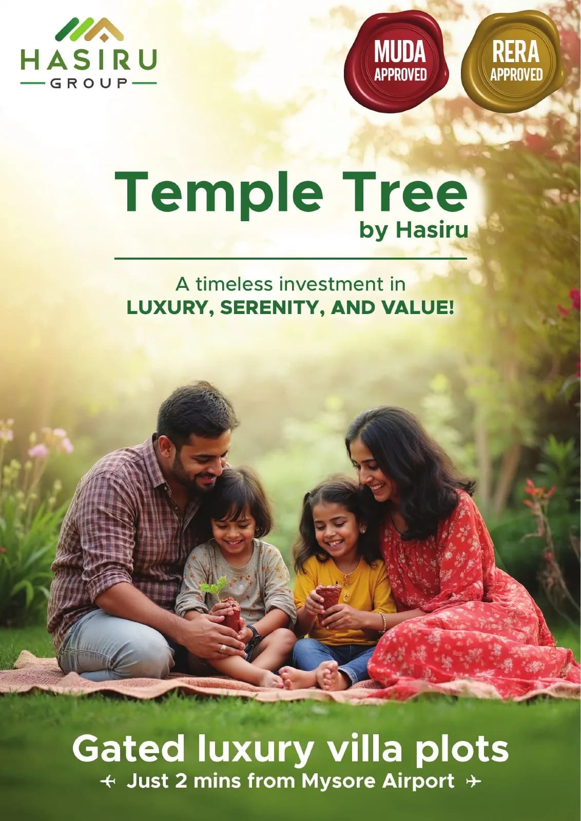
A warm family-led brochure that turns a plotted development into a believable picture of everyday life in Mysuru.
The client and context
A plotted development is physically abstract before it is built. The brochure needed to help buyers imagine life there while still giving location and project information real clarity.
It also had to feel grounded and credible, avoiding the over-polished fantasy common in property marketing.
The central idea
The tree becomes both place and promise: shade today, continuity tomorrow. Family imagery and green space create the emotional frame; clear information modules bring the decision back to practical detail.
Earthy neutrals keep the visual language believable and distinctly connected to Mysuru.
Mood board · visual territory
Mysuru greenery, mature trees, family weekends and the quiet permanence of land ownership created a brochure about belonging rather than plotted geometry alone.
Reference language
Editorial system · Visual direction
Structure to final artwork
Four deliberate stages turned information, imagery and format into a coherent physical experience.
The mood board focused on the life a plot enables—gathering, growing and staying connected to place.
Emotional imagery and factual project information were assigned their own spaces and reading speeds.
Canopy shapes and natural tones connect the pages without turning every surface into a landscape.
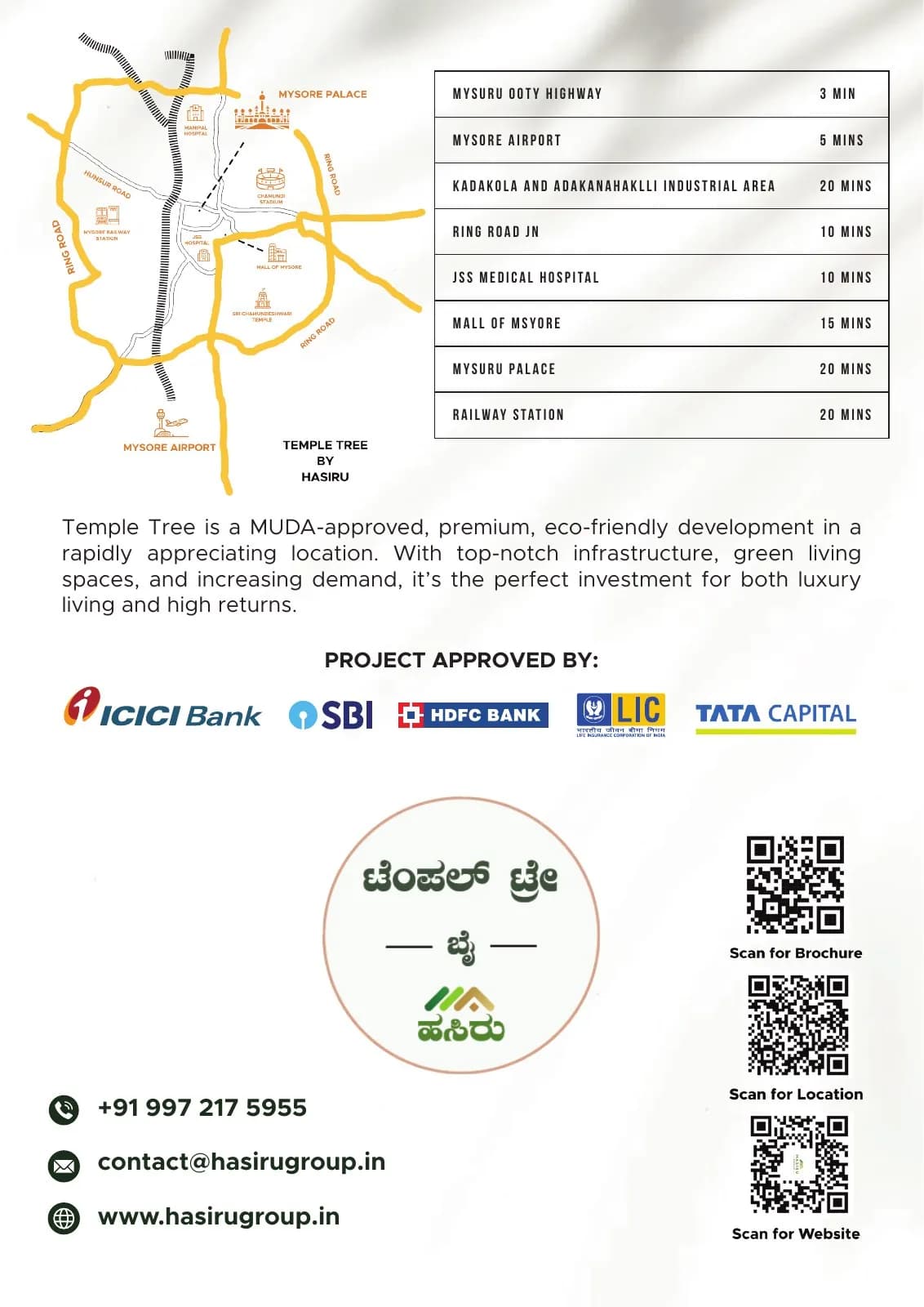
Location, project detail and response information were refined to support a considered family decision.
Resolved artwork
The final system was checked at real scale, in colour and one-colour reproduction, and against the surfaces where people will actually meet it.
Why the design works
People and shade give meaning to land that would otherwise remain a plan on paper.
Natural tones appear in deliberate zones so the project retains credibility and legibility.
Practical information is not overlaid on emotional imagery, making the brochure easier to trust and use.
Colour system
The palette balances recognition, category trust and practical reproduction. Primary colours carry the identity; supporting tones create hierarchy, space and flexibility.
#7E9F44
#496B31
#8A6744
#F1E9D7
#6D6A61
Mini brand guidelines
Delivered system
The work in context
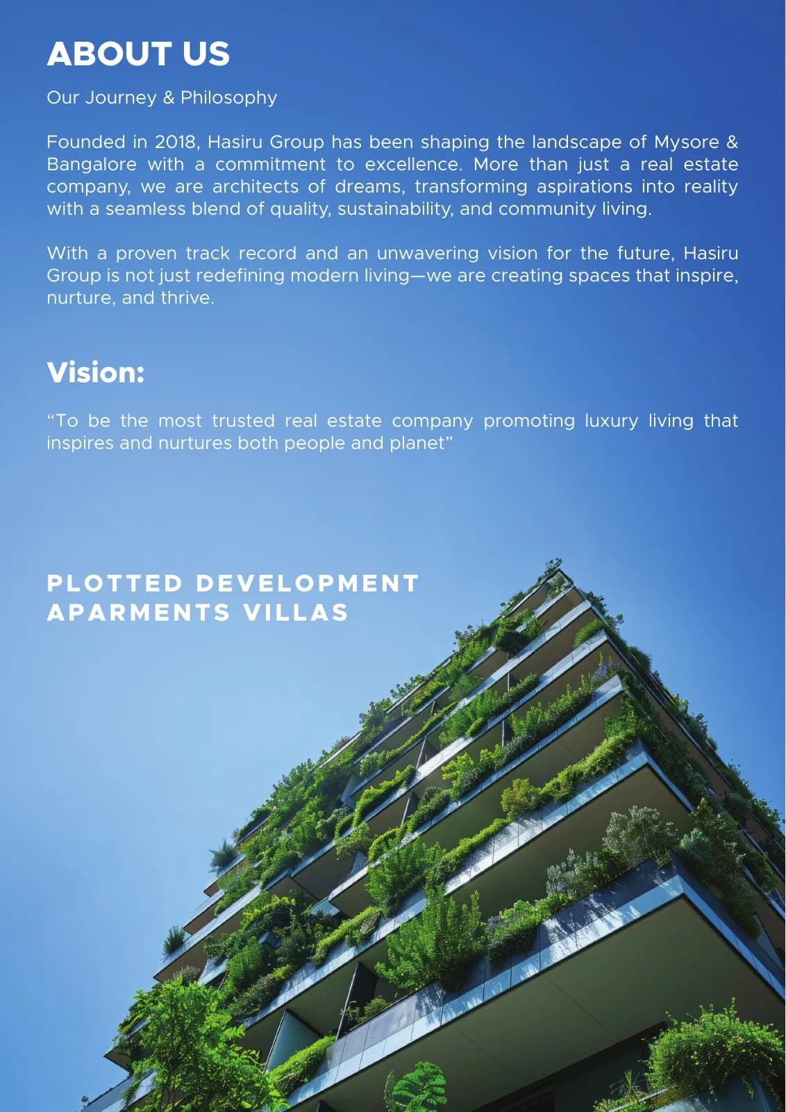
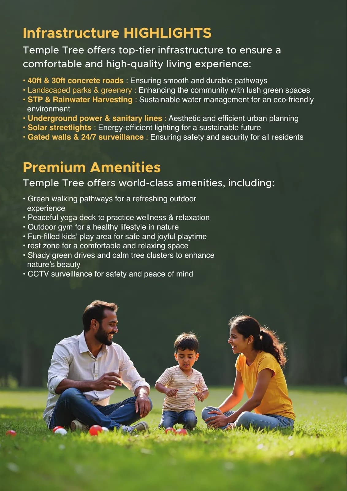
The final piece brings information, imagery, colour and production decisions together as one coherent experience.
Delivered value
Build something relevant to your market
The same team, process and attention to business intent are available for your next brand or design project.
Explore Graphic Design & Branding →More Branding & Design
Tell us what the work should mean before we discuss how it should look. We’ll turn that story into a distinctive, usable design system.
Prefer to talk? WhatsApp us → · +91 77568 73424





