Build the pantry board
Ingredients, serving rituals and warm natural materials defined a visual world led by food rather than supplements.
Sattva Healthy Delight
Packaging Design · Food & Nutrition
A warm, ingredient-first pouch that turns a dense health proposition into an appetising daily ritual.
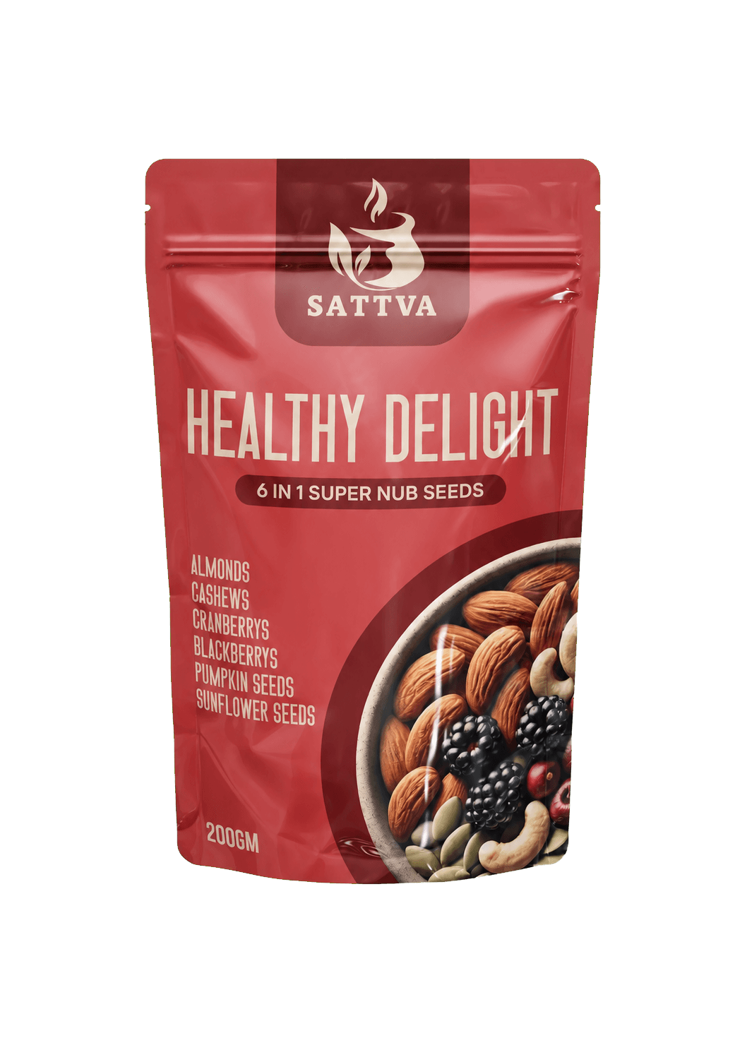
A nutrition product can quickly become a wall of claims. The pouch needed to explain what it is and why it matters while still creating appetite from a shelf.
So the first mood board stayed out of the supplement aisle. We collected breakfast bowls, pantry jars, seed textures, sun-warmed paper and the deep reds of dried fruit. The direction became wholesome, abundant and everyday.
Small black-and-white thumbnails exposed the real problem: brand, product, ingredients and benefits were all competing to speak first. Each round gave one message a clearer job.
01 · All claims
02 · Product first
03 · Add appetite
04 · Final rhythm
Ingredients, serving rituals and warm natural materials defined a visual world led by food rather than supplements.
Thumbnail studies tested how quickly the brand, variant and ingredient promise could be understood at distance.
The circular food window was sized to feel generous while leaving calm zones for essential information.
Type, contrast and spacing were resolved for the front story and the practical reading of the physical pouch.
The final composition turns the pack into a simple sequence: recognise the product, desire the ingredients, then spend time with the detail.
A darker top panel anchors the Sattva mark without adding another shape to the shelf face.
Condensed lettering creates scale and confidence while leaving room for the pouch to breathe.
The bowl is not decoration; it shows the mix and turns nutrition into something recognisably edible.
A broad arc contains the food photography and moves the gaze naturally toward the pack base.
Shelf clarity is not fewer words; it is an agreed sequence. The front panel lets every layer appear at the distance where it becomes useful.
Sattva owns the top band, giving the pouch a familiar, dependable entry point.
Healthy Delight is the largest message, set tall and direct for quick recognition.
The ingredient list and generous bowl image make the blend tangible before claims begin.
Weight and supporting information sit in quieter zones, available without interrupting appetite.
Colour, clear space, image behaviour and information zones were defined together so future variants can feel related without becoming visually identical.
Front-panel rules
Print & production
#A63232
#D05A50
#F4DCC7
#5A3A27
#2E2421
Every presentation below uses the same clean pack artwork—no grey image box, no cropped logo and enough room for the physical form to read as a product rather than a pasted photograph.
Delivered system
Delivered value
Build something relevant to your market
The same team, process and attention to business intent are available for your next brand or design project.
Explore Graphic Design & Branding →More Branding & Design
Tell us what the work should mean before we discuss how it should look. We’ll turn that story into a distinctive, usable design system.
Prefer to talk? WhatsApp us → · +91 77568 73424





