Map the care pathway
The offer was broken into who it serves, how it works and why the connection matters.
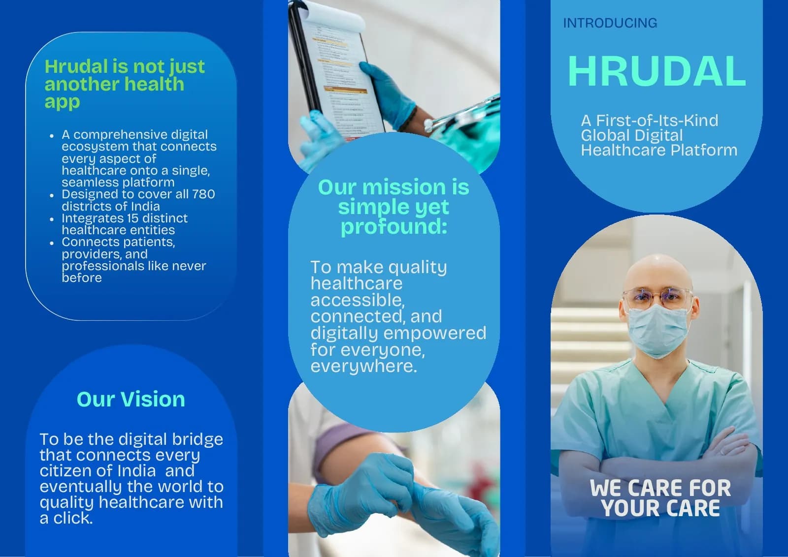
Jireh Cardiodigi
Corporate Brochure Design · Digital Healthcare
A confident blue editorial system that turns a technical healthcare proposition into a clear corporate conversation.

The client and context
The brochure needed to explain a technology-led healthcare offering to readers with different levels of technical familiarity.
It also had to establish corporate credibility quickly without becoming a dense specification document.
The central idea
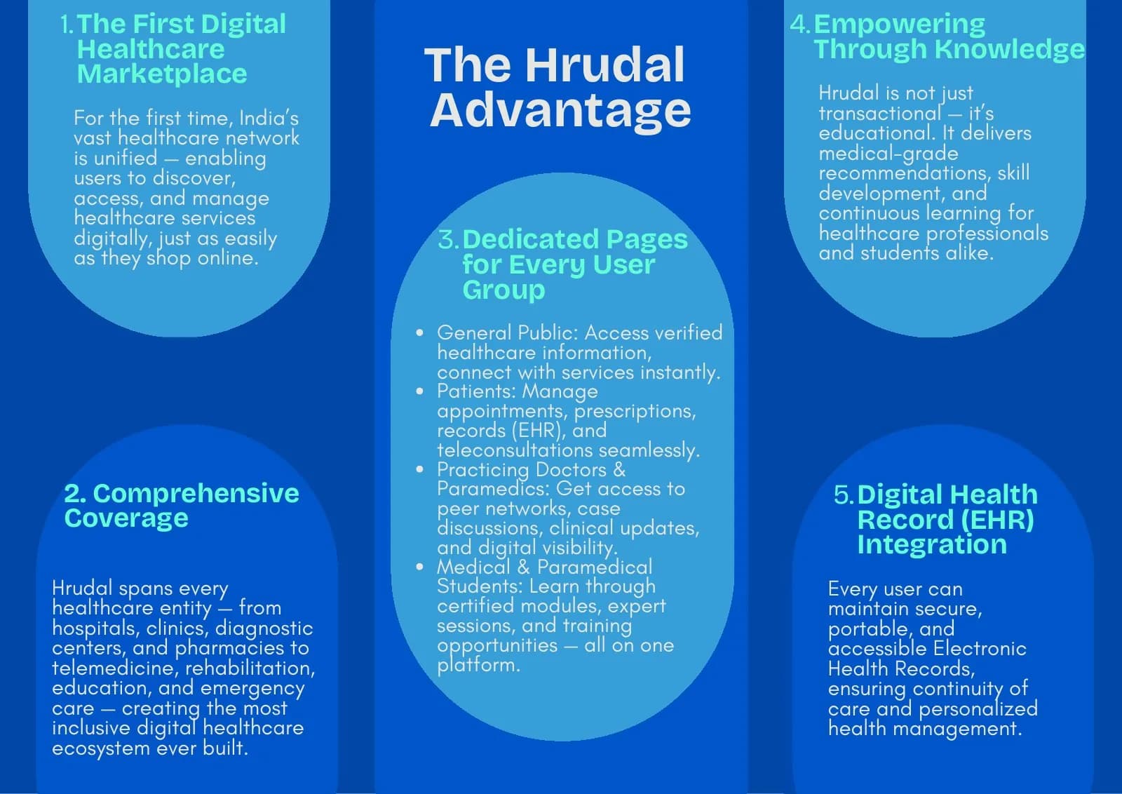
A blue information architecture connects people, technology and outcomes. Strong headings provide the main route; diagrams and supporting copy reward the reader who wants more depth.
White space acts as an interface layer, giving a technical subject the ease of a well-designed digital product.
Mood board · visual territory
Clinical dashboards, connected care pathways, cardiology signals and clear corporate reports formed a system where technology supports—not obscures—the healthcare message.
Reference language
Editorial system · Visual direction
Structure to final artwork
Four deliberate stages turned information, imagery and format into a coherent physical experience.
The offer was broken into who it serves, how it works and why the connection matters.
Headings and key facts support scanning while secondary text carries the fuller corporate story.
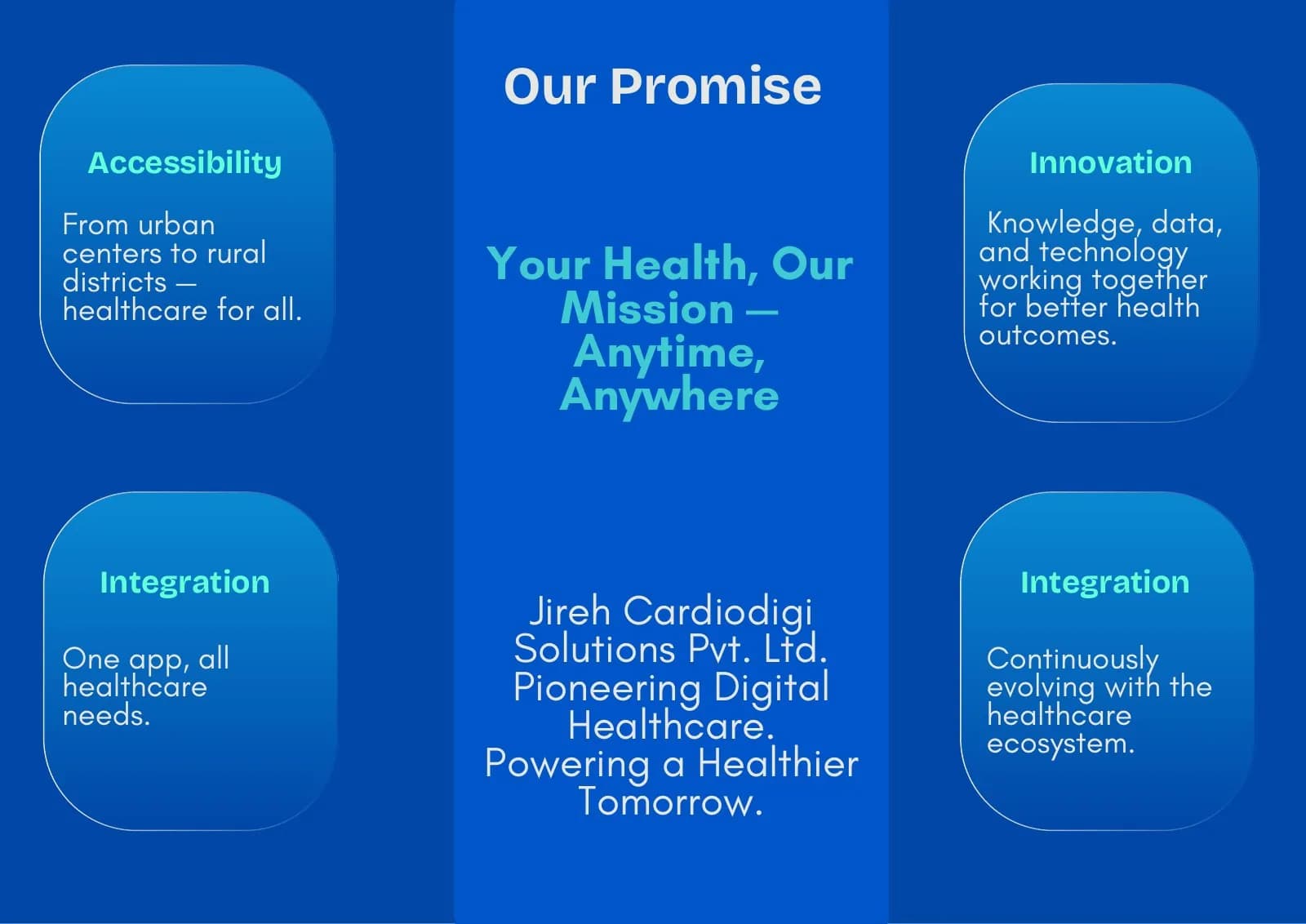
Navy, blue and cyan were assigned to trust, core information and connection cues.
Pages were composed to feel equally natural in hand and as a shared digital document.
Resolved artwork
The final system was checked at real scale, in colour and one-colour reproduction, and against the surfaces where people will actually meet it.
Why the design works
The brochure earns authority through organisation rather than decorative corporate effects.
Cyan marks pathways and relationships, helping the eye move through the technical story.
Calm content modules make the printed page feel as usable as a digital dashboard.
Colour system
The palette balances recognition, category trust and practical reproduction. Primary colours carry the identity; supporting tones create hierarchy, space and flexibility.
#1664C0
#38A7D4
#123B69
#F5F9FC
#C7D4DF
Mini brand guidelines
Delivered system
The work in context
The final piece brings information, imagery, colour and production decisions together as one coherent experience.
Delivered value
Build something relevant to your market
The same team, process and attention to business intent are available for your next brand or design project.
Explore Graphic Design & Branding →More Branding & Design
Tell us what the work should mean before we discuss how it should look. We’ll turn that story into a distinctive, usable design system.
Prefer to talk? WhatsApp us → · +91 77568 73424





