A
Follow real routes
Road lanes, map turns and vehicle graphics provided the most useful movement references.
Kaira Transport
Logo Design & Brand Identity · Transport & Logistics
Road, route and upward movement compressed into a fast, practical symbol for a logistics business.
01Listen
Highway markings, route arrows, fleet livery and the visibility of safety graphics created a direct, motion-led visual direction.
Three words became the filter for every choice: forward, reliable, visible.
Forward.Reliable.Visible.
Road lanes · Upward arrows · Route maps
A blue road rises into a red-orange arrow, turning transport and progress into one continuous gesture. The route feels directed, not merely fast.
02Draw
We started with loose visual gestures, tested the strongest relationship and then removed detail until the idea stayed clear at real working sizes.
Road lanes, map turns and vehicle graphics provided the most useful movement references.
Sketches gradually removed the boundary between the route and the destination cue.
The silhouette and colour split were simplified for recognition on moving fleet vehicles.
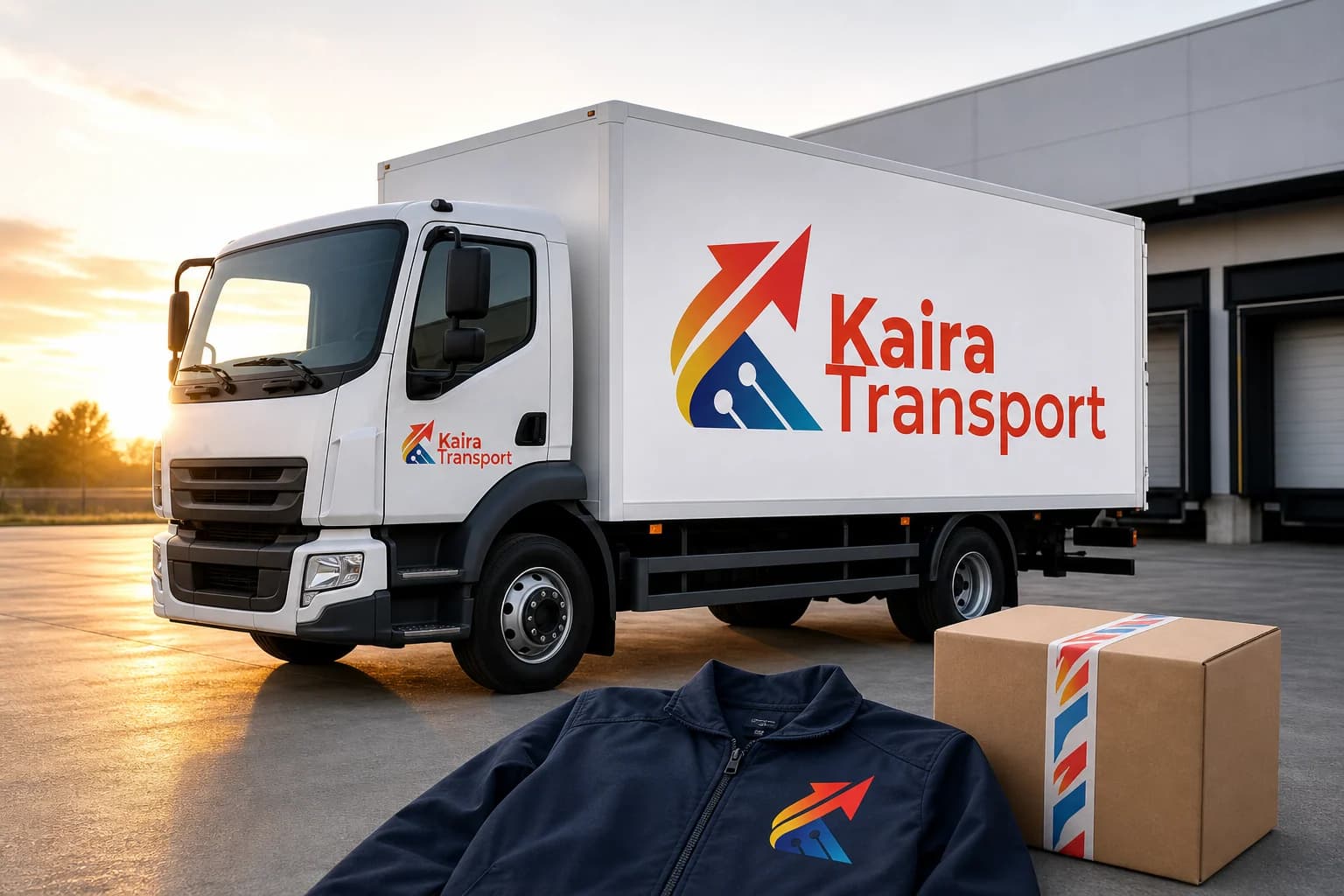
Horizontal, stacked and one-colour artwork was tested on jackets, cartons and paperwork.
The silhouette had to belong unmistakably to Kaira Transport, not merely to its category.
Every line that did not strengthen recognition, balance or reproduction was removed.
The final artwork was checked against keep the road-to-arrow join continuous and use full colour on white fleet surfaces.
03Mean
A blue road rises into a red-orange arrow, turning transport and progress into one continuous gesture. The route feels directed, not merely fast. The italic energy is balanced by a stable navy base and a straightforward wordmark suited to operational use.
The arrow emerges from a clear road, suggesting planned movement rather than speed for its own sake.
Red-orange creates visibility while blue and navy carry dependability.
Broad forms and strong contrast stay recognisable at distance and in changing road conditions.
Horizontal, stacked and one-colour artwork was tested on jackets, cartons and paperwork.
04Systemise
The logo becomes a usable identity when clear space, scale, colour fields and reproduction rules are defined well enough for another person to apply consistently.
Kaira Transport · mini brand guidelines
Identity guide · 01
Core palette
Motion Red
#F13A24
Route Orange
#F58E24
Logistics Blue
#1856A3
Fleet Navy
#16365E
Road White
#F5F7FA
Primary
Reversed
One colour
Clear space
Keep the road-to-arrow join continuous
Use full colour on white fleet surfaces
Use navy monochrome on documents
Do not compress the horizontal lock-up
Delivered identity family
Identity in the world
The applications use the logo at a comfortable scale, with enough surrounding space for the symbol and wordmark to remain complete, legible and recognisable.
Delivered value
Build something relevant to your market
The same team, process and attention to business intent are available for your next brand or design project.
Explore Graphic Design & Branding →More Branding & Design
Tell us what the work should mean before we discuss how it should look. We’ll turn that story into a distinctive, usable design system.
Prefer to talk? WhatsApp us → · +91 77568 73424





