A
Unfold the category
Carton nets and production diagrams provided shapes that genuinely belong to packaging.
Maverick Technopack
Logo Design & Brand Identity · Packaging Solutions
A geometric monogram that behaves like folded board, an open carton and a precise industrial component.
01Listen
Carton nets, die-cut folds, stacked substrates and production registration marks led to a system built from structure rather than decoration.
Three words became the filter for every choice: engineered, modular, progressive.
Engineered.Modular.Progressive.
Carton folds · Die-cut geometry · Open packages
The M is assembled from folded planes. Its central blue triangle reads as an opening flap, revealing the package as both object and engineered process.
02Draw
We started with loose visual gestures, tested the strongest relationship and then removed detail until the idea stayed clear at real working sizes.
Carton nets and production diagrams provided shapes that genuinely belong to packaging.
Planes were folded into an initial instead of placing an M inside a conventional box.
The central triangle was isolated as a flap, entry point and memorable colour accent.
The geometry was checked in solid ink, reverse print and at bag-to-carton scales.
The silhouette had to belong unmistakably to Maverick Technopack, not merely to its category.
Every line that did not strengthen recognition, balance or reproduction was removed.
The final artwork was checked against keep the opening triangle blue and use solid artwork for production print.
03Mean
The M is assembled from folded planes. Its central blue triangle reads as an opening flap, revealing the package as both object and engineered process. A squared lower form gives the symbol stability while the upward peak suggests development and technical ambition.
The form carries both the company name and its manufacturing language in one construction.
The blue flap turns a static container into a moment of reveal and progress.
Flat planes and strong edges hold reliably across paper, board, fabric and industrial processes.
The geometry was checked in solid ink, reverse print and at bag-to-carton scales.
04Systemise
The logo becomes a usable identity when clear space, scale, colour fields and reproduction rules are defined well enough for another person to apply consistently.
Maverick Technopack · mini brand guidelines
Identity guide · 01
Core palette
Pack Blue
#125AA8
Structural Navy
#17395B
Process Cyan
#2A83C6
Board White
#F4F5F6
Industrial Ink
#12202F
Primary
Reversed
One colour
Clear space
Keep the opening triangle blue
Use solid artwork for production print
Do not round the structural corners
Maintain one module of clear space
Delivered identity family
Identity in the world
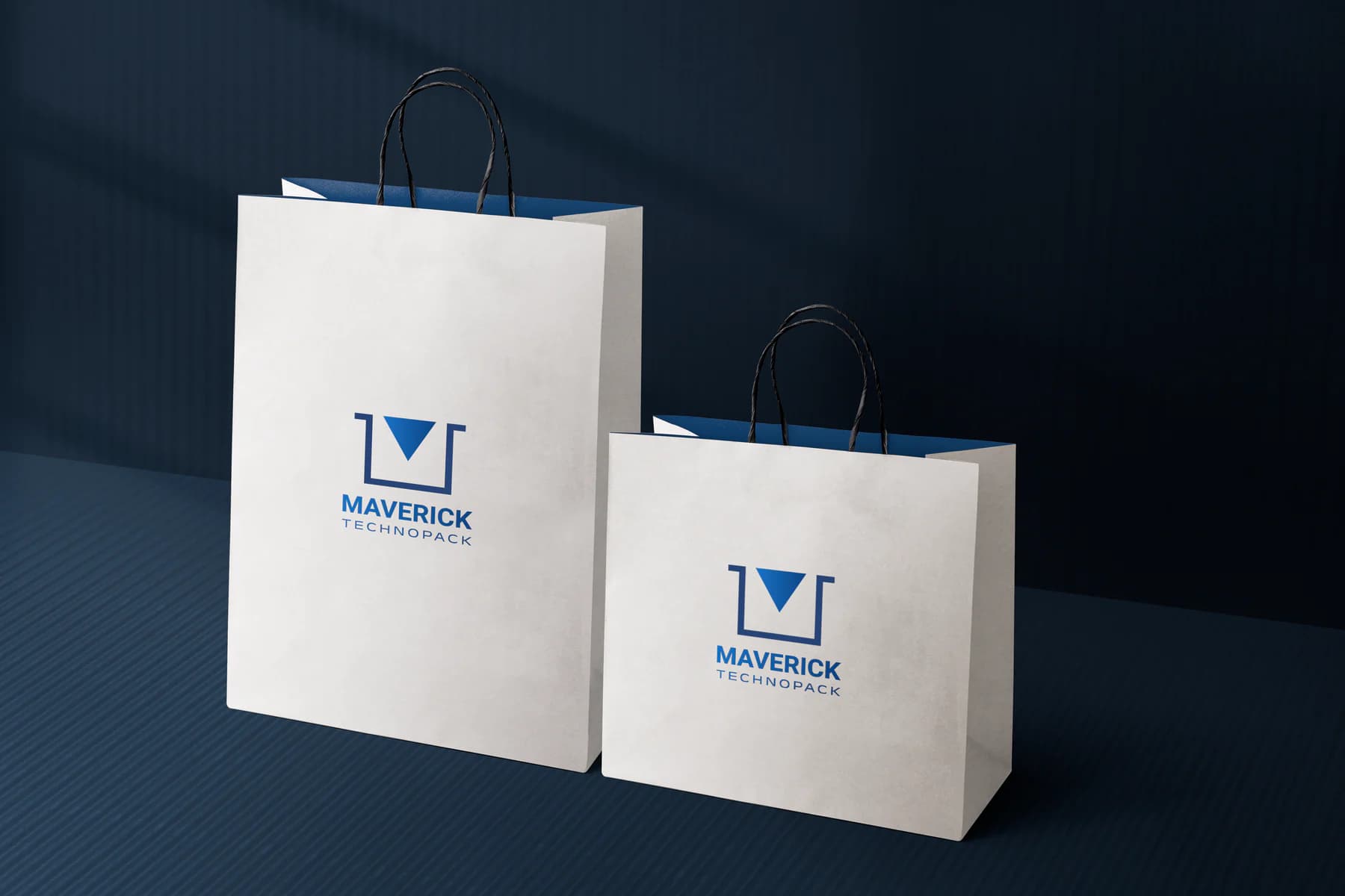
The applications use the logo at a comfortable scale, with enough surrounding space for the symbol and wordmark to remain complete, legible and recognisable.
Delivered value
Build something relevant to your market
The same team, process and attention to business intent are available for your next brand or design project.
Explore Graphic Design & Branding →More Branding & Design
Tell us what the work should mean before we discuss how it should look. We’ll turn that story into a distinctive, usable design system.
Prefer to talk? WhatsApp us → · +91 77568 73424





