A
Empty the travel bag
Maps, lenses, meals and field notes were collected into one energetic visual language.
Nam Payana
Logo Design & Brand Identity · Food & Travel Media
Camera, route, flight and food cues woven into a lively identity for stories discovered on the move.
01Listen
The mood board resembled a creator's open bag: camera equipment, scribbled maps, roadside food, ticket stubs and routes still being planned.
Three words became the filter for every choice: curious, unfiltered, mobile.

Curious.Unfiltered.Mobile.
Camera frames · Dotted routes · Food bowls
A camera frame becomes the storytelling device. A dotted route passes through it, linking flight and food as moments within the same journey.
02Draw
We started with loose visual gestures, tested the strongest relationship and then removed detail until the idea stayed clear at real working sizes.
Maps, lenses, meals and field notes were collected into one energetic visual language.
Sketches used the dotted path as the connective tissue between otherwise separate content themes.
The camera shape was simplified and secondary symbols were spaced for fast thumbnail recognition.
Even as static artwork, the route was composed to imply a natural intro and outro motion.
The silhouette had to belong unmistakably to Nam Payana, not merely to its category.
Every line that did not strengthen recognition, balance or reproduction was removed.
The final artwork was checked against keep the route continuous and use one red accent per composition.
03Mean
A camera frame becomes the storytelling device. A dotted route passes through it, linking flight and food as moments within the same journey. The informal lowercase wordmark feels spoken and personal—closer to an invitation to come along than a media corporation.
A single line makes food and travel feel like chapters of one continuing experience.
A documentary base prevents the multiple pictograms from becoming overly playful.
One small accent helps guide the eye and can become a useful motion cue in video.
Even as static artwork, the route was composed to imply a natural intro and outro motion.
04Systemise
The logo becomes a usable identity when clear space, scale, colour fields and reproduction rules are defined well enough for another person to apply consistently.
Nam Payana · mini brand guidelines
Identity guide · 01
Core palette
Story Black
#101010
Page White
#F5F2EC
Route Red
#D5352F
Warm Grey
#A89E95
Coffee
#6B3C25
Primary
Reversed
One colour
Clear space
Keep the route continuous
Use one red accent per composition
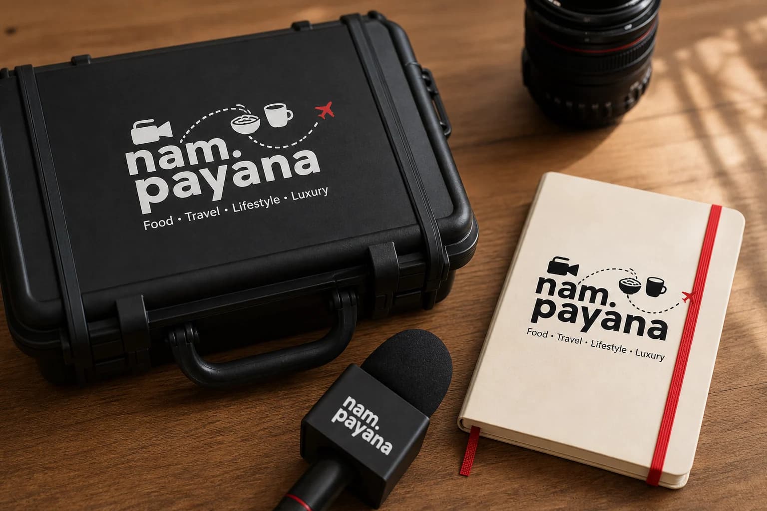
Use the compact mark for microphones
Avoid placing detailed photos behind the emblem
Delivered identity family
Identity in the world
The applications use the logo at a comfortable scale, with enough surrounding space for the symbol and wordmark to remain complete, legible and recognisable.
Delivered value
Build something relevant to your market
The same team, process and attention to business intent are available for your next brand or design project.
Explore Graphic Design & Branding →More Branding & Design
Tell us what the work should mean before we discuss how it should look. We’ll turn that story into a distinctive, usable design system.
Prefer to talk? WhatsApp us → · +91 77568 73424





