Curate the atmosphere
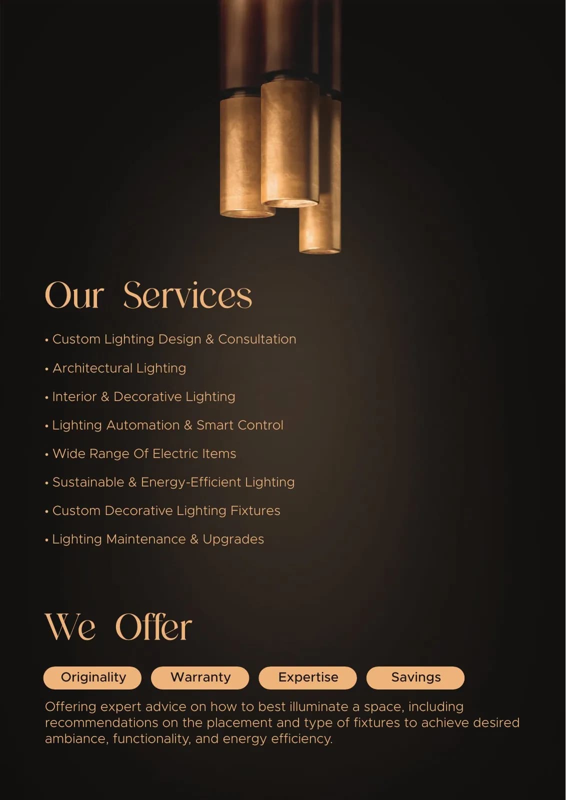
Interior scenes were grouped by mood and light behaviour rather than simply by file name or product order.
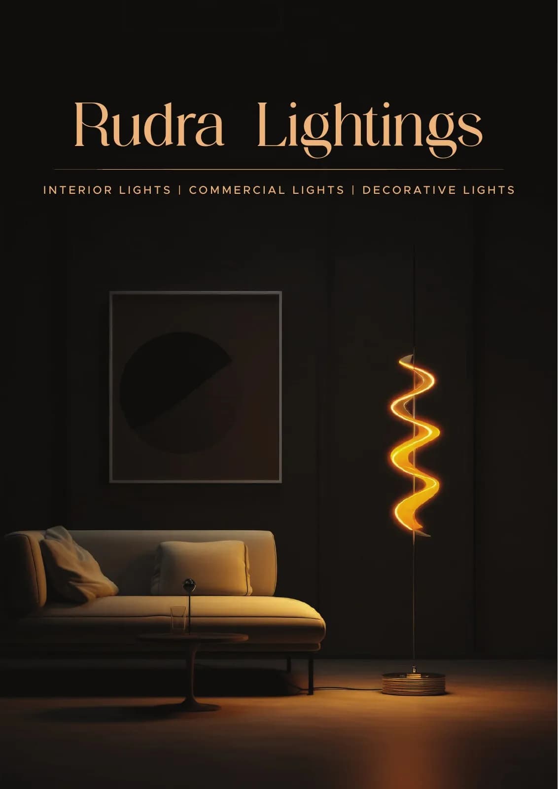
Rudra Lightings
Product Catalogue Design · Lighting & Interiors
An atmospheric product catalogue that presents luminaires with the drama and restraint of a premium interiors journal.
The client and context
Lighting products are selected for their form and for what they do to a room. The catalogue needed to show both without becoming a repetitive grid of specifications.
Seven pages had to establish a premium point of view, create useful comparison and still leave space for technical information.
The central idea
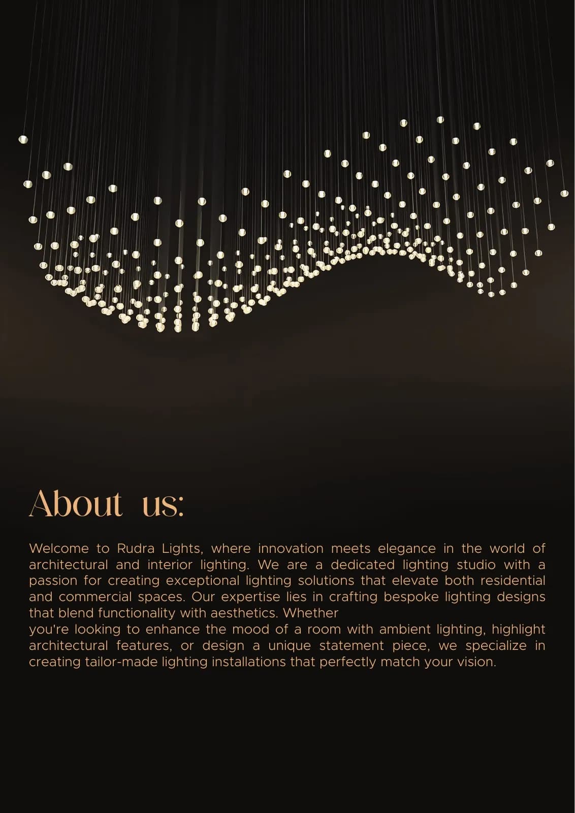
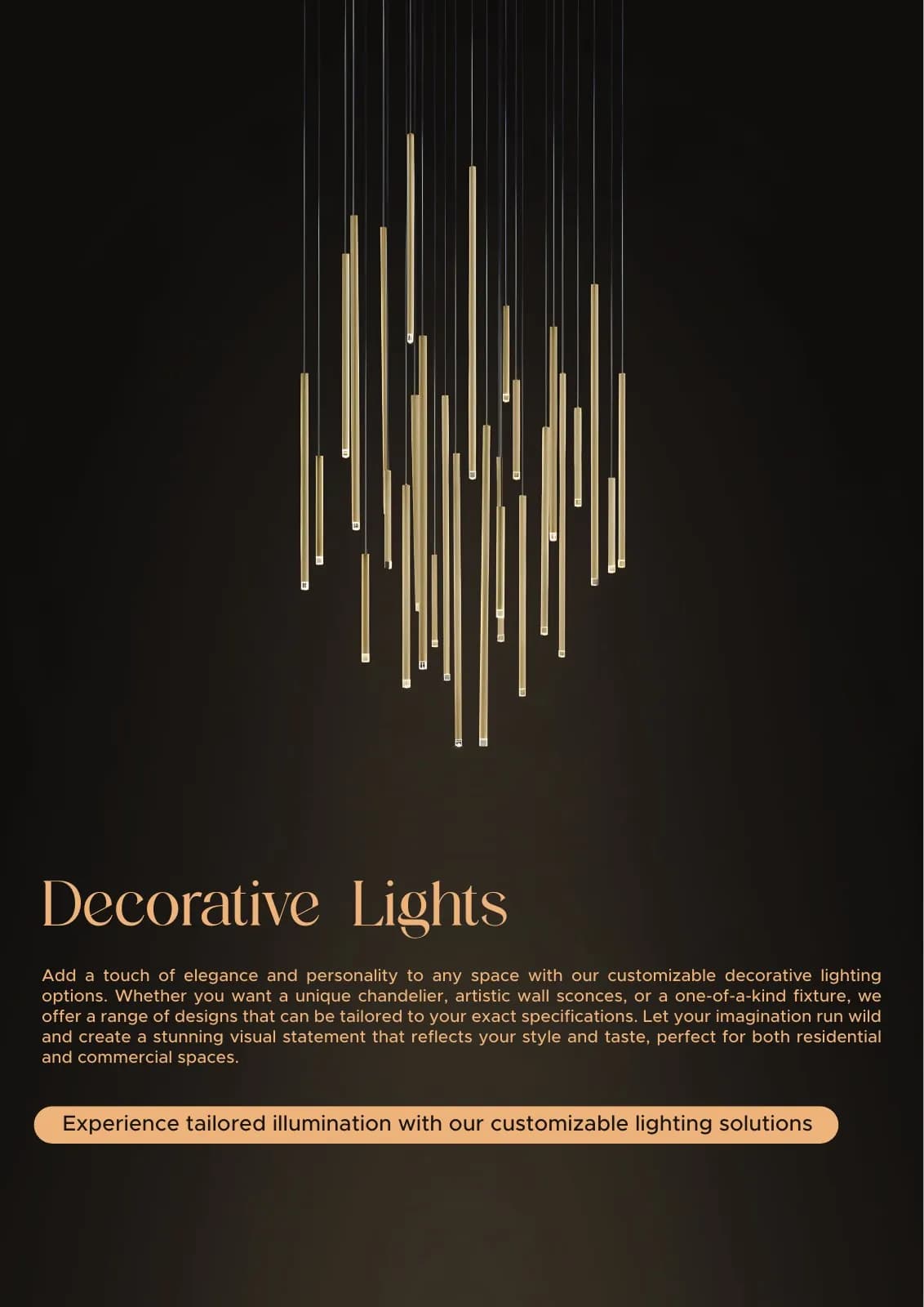
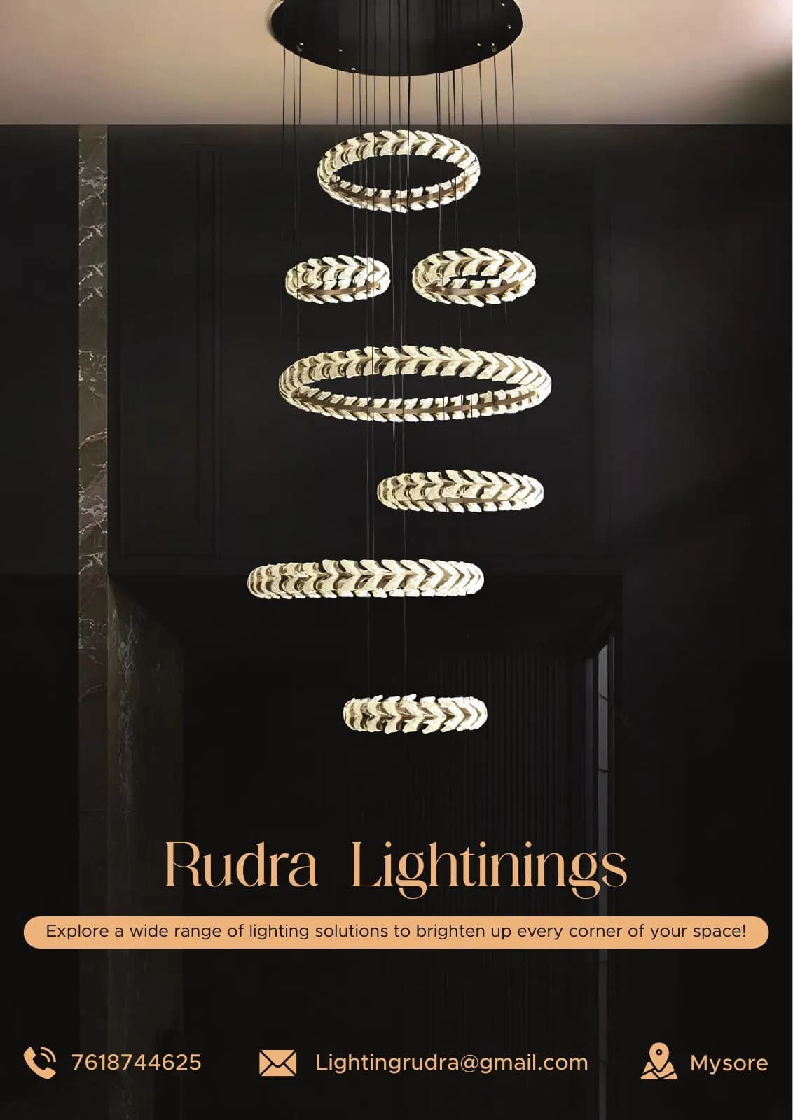
Black pages behave like a darkened room; copper and warm imagery become the light source. The catalogue moves between immersive scenes and quieter product detail.
Editorial pacing creates desire first, then gives the reader the information needed to specify with confidence.
Mood board · visual territory
Dark interior journals, pools of warm light, material close-ups and gallery pacing shaped a catalogue where the effect of the product matters as much as the product itself.
Reference language
Catalogue system · Visual direction
Structure to final artwork
Four deliberate stages turned information, imagery and format into a coherent physical experience.
Interior scenes were grouped by mood and light behaviour rather than simply by file name or product order.
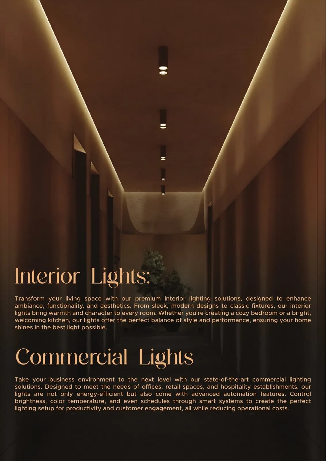
Immersive pages and specification pages were alternated to create a useful reading rhythm.
Black fields were treated as active negative space, allowing every glow and metallic detail to register.
Captions, dimensions and supporting information were aligned to a repeatable catalogue grid.
Resolved artwork
The final system was checked at real scale, in colour and one-colour reproduction, and against the surfaces where people will actually meet it.
Why the design works
Readers first feel what the light can do before evaluating the luminaire itself.
One metallic accent bridges the colour of illumination and the premium material language.
Changing scale and page density keeps a product-rich document engaging from cover to close.
Colour system
The palette balances recognition, category trust and practical reproduction. Primary colours carry the identity; supporting tones create hierarchy, space and flexibility.
#11100F
#D0A271
#B9824E
#39342F
#EFE4D6
Mini brand guidelines
Delivered system
The work in context
The final piece brings information, imagery, colour and production decisions together as one coherent experience.
Delivered value
Build something relevant to your market
The same team, process and attention to business intent are available for your next brand or design project.
Explore Graphic Design & Branding →More Branding & Design
Tell us what the work should mean before we discuss how it should look. We’ll turn that story into a distinctive, usable design system.
Prefer to talk? WhatsApp us → · +91 77568 73424





