Observe the brewing pause
Garden freshness and domestic tea rituals were combined so the pack felt natural and genuinely usable.
Sattva Green Tea
Packaging Design · Tea & Wellness
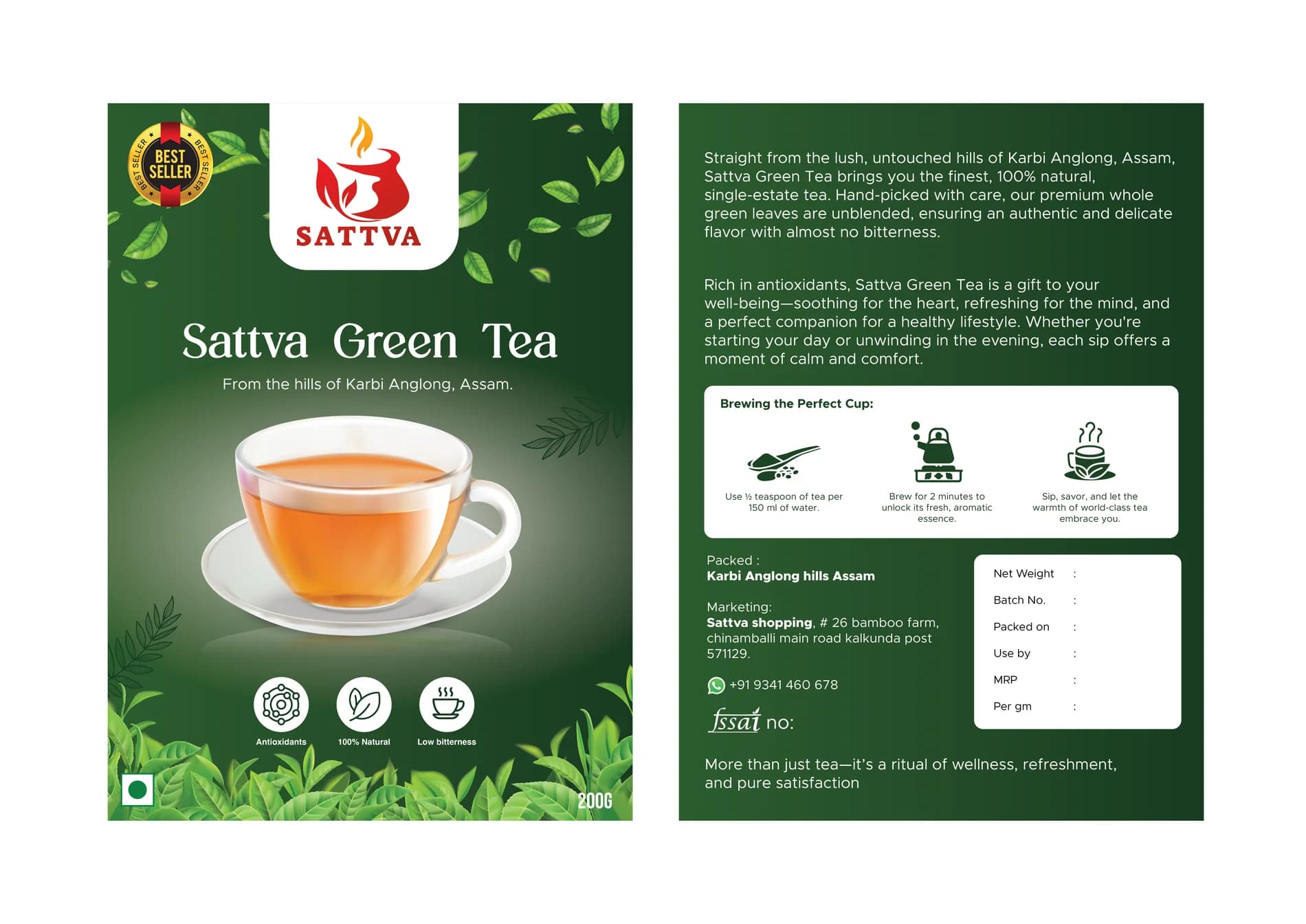
A complete front-and-back tea pack that balances freshness, ritual, origin and the small details that build product trust.
The client and context
Green tea competes in a visually crowded wellness category. The pack had to feel fresh without becoming another collection of floating leaves.
Front and back needed to work as one experience: emotional promise on the shelf, practical brewing and product information in the hand.
The central idea
A deep green architecture frames the freshness of leaf and cup. Light panels create pauses in the information, echoing the calm the product promises.
Gold is held to a supporting role—quality and warmth—while amber connects the graphic system to the brewed tea itself.
Mood board · visual territory
Tea gardens, lifted steam, porcelain cups, fresh leaves and slow morning light created a mood board built around a repeatable pause in the day.
Reference language
Packaging system · Visual direction
Structure to final artwork
Four deliberate stages turned information, imagery and format into a coherent physical experience.
Garden freshness and domestic tea rituals were combined so the pack felt natural and genuinely usable.
Both panels were wireframed as one story instead of treating the back as leftover space.
A deep foundation and one fresh leaf tone created depth without the noise of many similar shades.
Instructions, benefits and supporting copy were spaced for comfortable use at pack scale.
Resolved artwork
The final system was checked at real scale, in colour and one-colour reproduction, and against the surfaces where people will actually meet it.
Why the design works
Clear bands and generous margins make the pack feel trustworthy before any wellness claim is read.
Showing the brewed ritual connects the raw ingredient to the experience the customer wants.
Small warm details suggest quality without pushing the design into a decorative premium cliché.
Colour system
The palette balances recognition, category trust and practical reproduction. Primary colours carry the identity; supporting tones create hierarchy, space and flexibility.
#124D26
#3C7B38
#D6A524
#F7F6EF
#C7792D
Mini brand guidelines
Delivered system
The work in context
The final piece brings information, imagery, colour and production decisions together as one coherent experience.
Delivered value
Build something relevant to your market
The same team, process and attention to business intent are available for your next brand or design project.
Explore Graphic Design & Branding →More Branding & Design
Tell us what the work should mean before we discuss how it should look. We’ll turn that story into a distinctive, usable design system.
Prefer to talk? WhatsApp us → · +91 77568 73424





