Define the fan world
Character energy, manga pacing and collectible formats set the tone before individual pages were designed.
Uchiha
Menu & Editorial Design · Food & Beverage
An anime-charged menu that makes browsing drinks feel playful, fast and full of character.
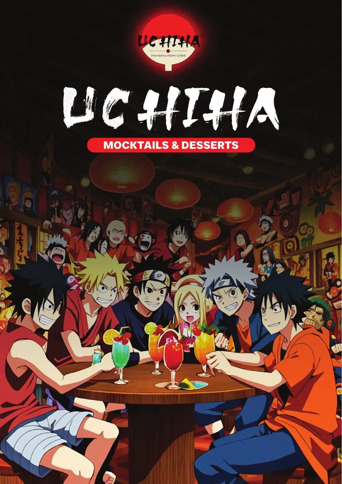
The client and context
The menu needed a strong fan-culture identity while keeping drink names, prices and choices easy to scan in a real ordering moment.
Eight pages offered room for character, but the visual energy had to be controlled so novelty never blocked usability.
The central idea
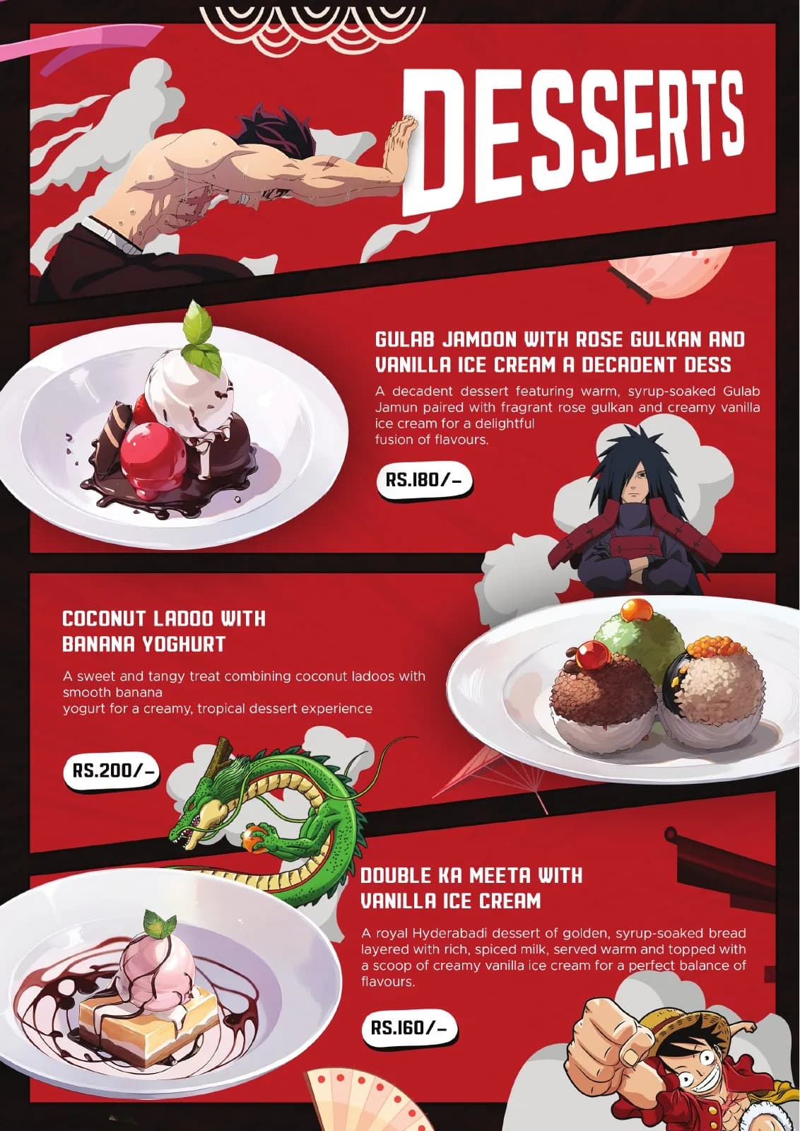
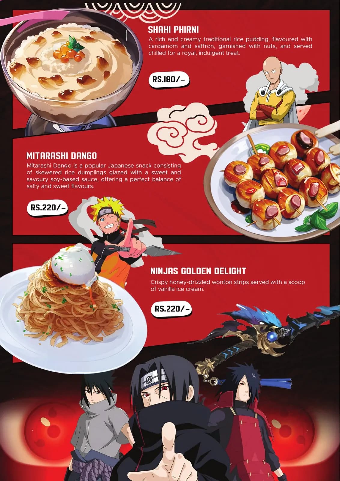
Each page acts like a collectible panel: bold character moments draw attention, then a stable grid handles the practical choice.
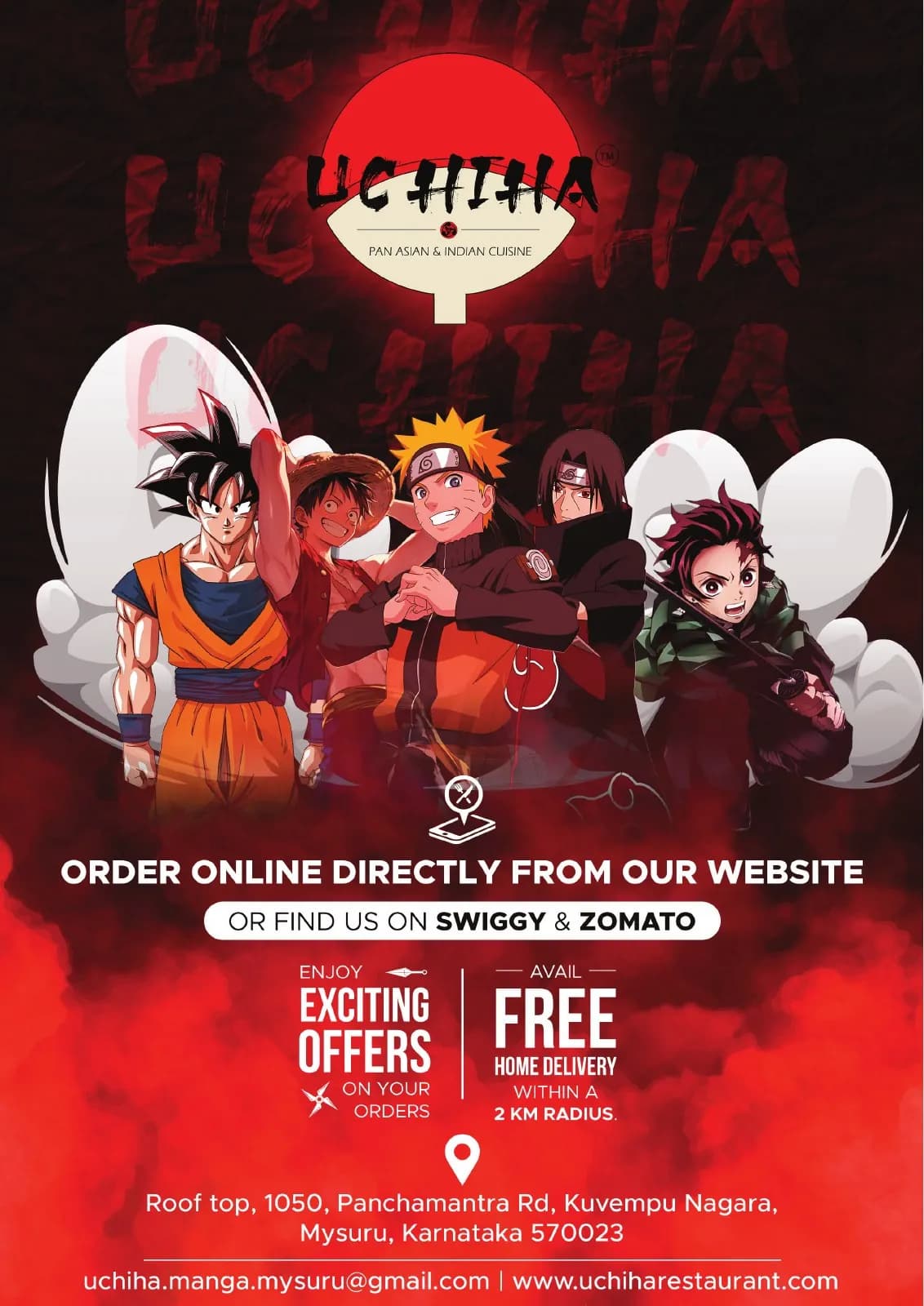
Red and black provide the series identity while white content zones protect menu legibility and make each reveal feel intentional.
Mood board · visual territory
Manga panels, character cards, dramatic red-black contrast and arcade menus created a world where every drink could feel like its own episode.
Reference language
Menu system · Visual direction
Structure to final artwork
Four deliberate stages turned information, imagery and format into a coherent physical experience.
Character energy, manga pacing and collectible formats set the tone before individual pages were designed.
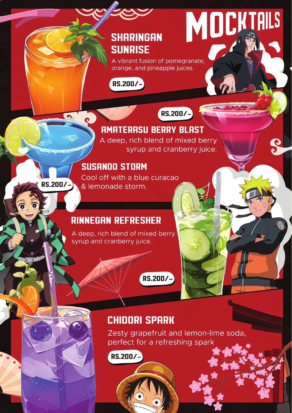
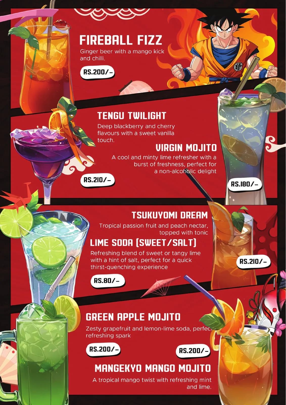
Drink names and prices were assigned a consistent structure beneath the expressive layer.
Large reveals, denser menu pages and quieter transitions were sequenced to prevent visual fatigue.
Contrast, type size and navigation were checked for low-light, quick-decision use.
Resolved artwork
The final system was checked at real scale, in colour and one-colour reproduction, and against the surfaces where people will actually meet it.
Why the design works
Expressive imagery creates anticipation before the stable menu system takes over.
High-energy art stays separate from the information guests need to order confidently.
One strong series colour makes varied pages feel like a single collectible object.
Colour system
The palette balances recognition, category trust and practical reproduction. Primary colours carry the identity; supporting tones create hierarchy, space and flexibility.
#E23127
#111111
#F27422
#F4F0E8
#38223F
Mini brand guidelines
Delivered system
The work in context
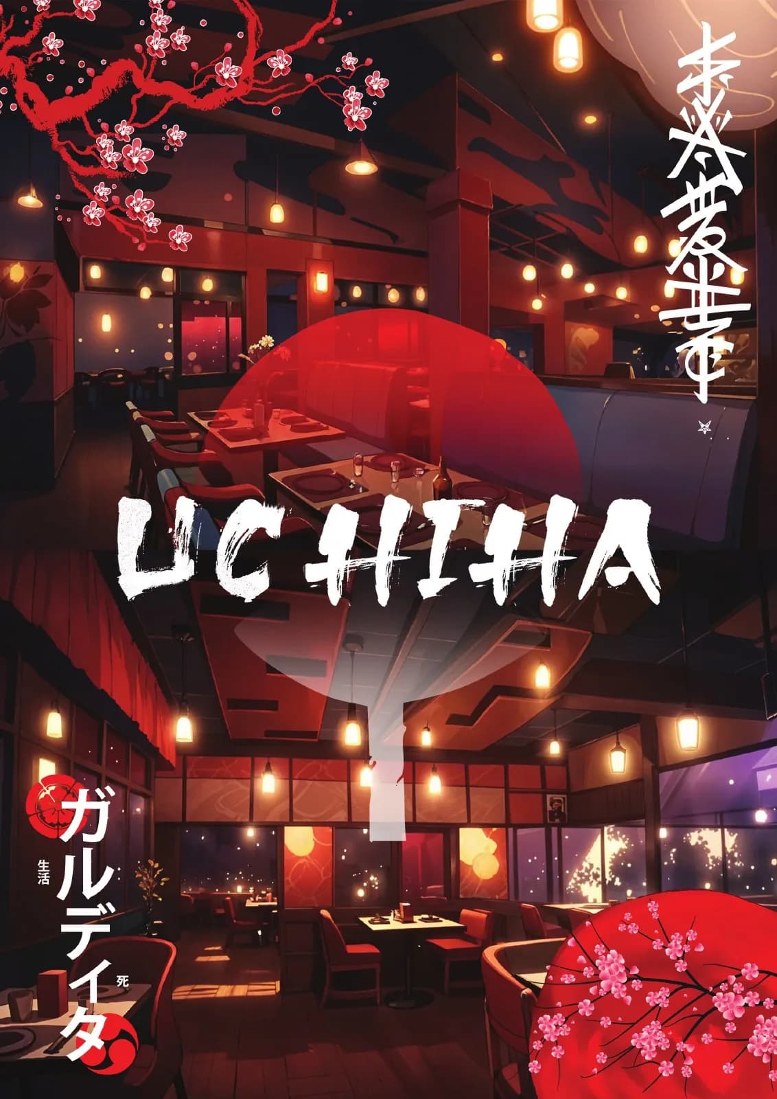
The final piece brings information, imagery, colour and production decisions together as one coherent experience.

Delivered value
Build something relevant to your market
The same team, process and attention to business intent are available for your next brand or design project.
Explore Graphic Design & Branding →More Branding & Design
Tell us what the work should mean before we discuss how it should look. We’ll turn that story into a distinctive, usable design system.
Prefer to talk? WhatsApp us → · +91 77568 73424





