Collect the coffee story
Estate references, pantry objects and vintage labels established an intimate, discovered visual tone.
Zesty Vibe Coffee
Packaging & Label Design · Speciality Coffee
A softly illustrated label system that wraps a pantry jar with origin, warmth and a recognisable human story.
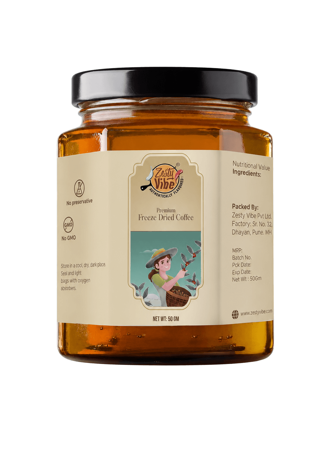
The label needed premium personality without imitating the severe black-and-gold language common to speciality coffee.
The mood board moved away from severe black packs and polished gold seals. We gathered estate greens, amber pantry glass, vintage travel labels and warm illustrated portraits. The filter became artisanal, warm and story-led.
We planned the strip as one continuous journey. The centre attracts, the left reassures and the right carries the practical detail, with enough rhythm for each panel to breathe on a small curved jar.
Reassure
Invite
Inform
Estate references, pantry objects and vintage labels established an intimate, discovered visual tone.
Portrait directions were explored until one figure could carry warmth without overpowering the product name.
The illustration, hierarchy and side information were composed for the changing sightline of a cylindrical jar.
Cream, sage and coral were adjusted against amber so the complete object—not only the flat label—felt balanced.
Rather than another bean or cup, the central illustration gives the label a person, a place and a moment of discovery. It makes the product feel brought home rather than manufactured for a shelf.
The hand-drawn logo feels individual and expressive without competing with the illustrated panel.
Freeze Dried Coffee remains clear and central, keeping the story grounded in the buying decision.
The grower and coffee branch turn origin into a recognisable scene rather than a generic premium device.
A vertical cartouche keeps the narrative visible even as the wrap recedes around the amber jar.
A good jar label changes its emphasis as the customer moves closer. Recognition begins the conversation; story earns attention; information completes the decision.
01Amber glass, the cream band and the framed centre panel create the first recognisable block.
02The grower illustration and product name reward the closer, more considered moment of choice.
03Claims, storage guidance and mandatory information follow the curve in quieter side panels.
The glass colour, wrap overlap, curved sightline and regulatory zones are part of the system. The artwork was designed as an object in the hand, not a flat rectangle on a screen.
Bleed and trim field
Claims
Primary sightline
Information
Wrap-label rules
Print & application
#B8702E
#6E8366
#E5D6B5
#2E2B25
#C56A4A
The final label works because the cream stock, amber glass and human illustration read as one collected object. Every presentation gives the jar room—without the old grey image box or edge-touching crop.
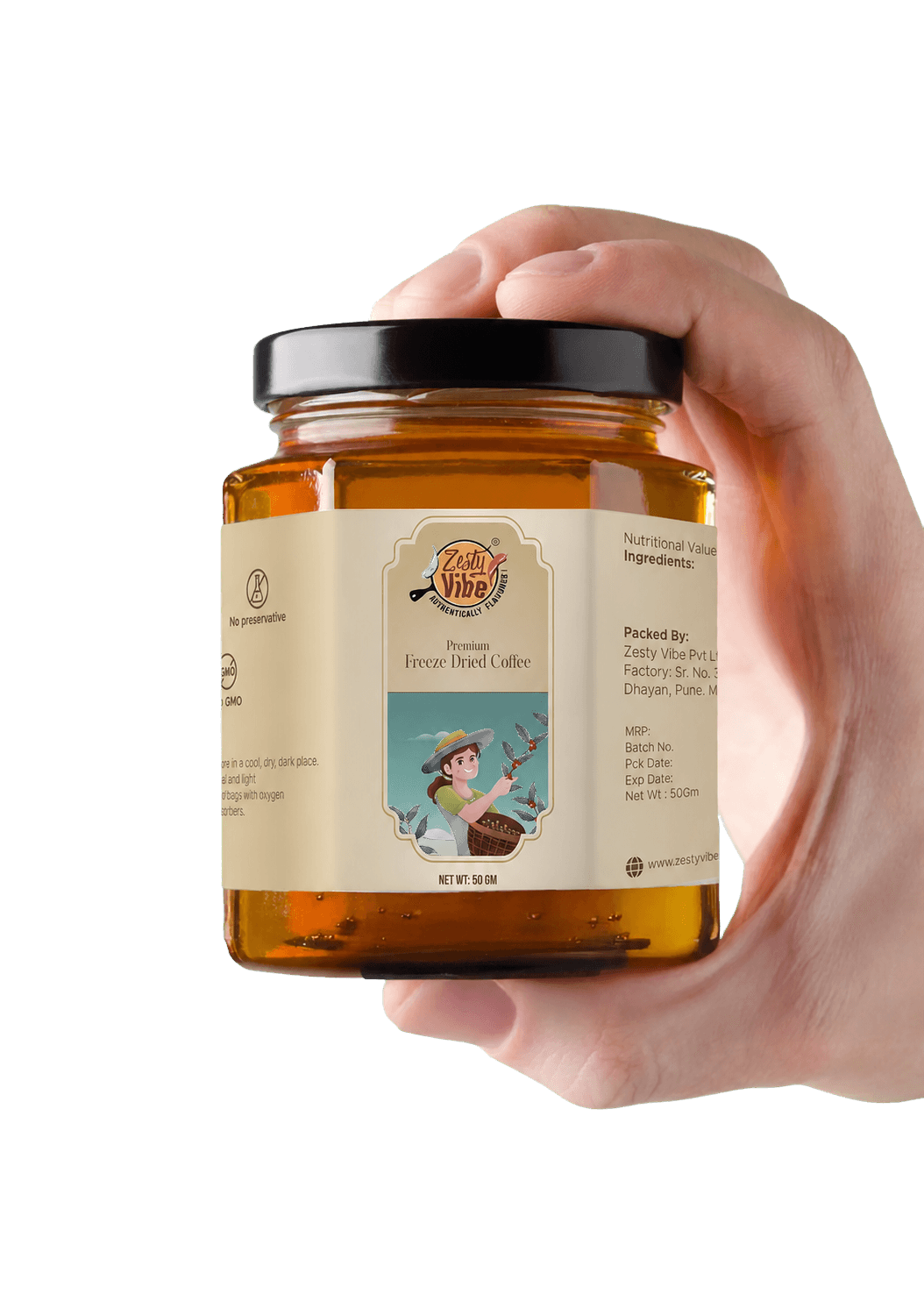
Delivered system
Delivered value
Build something relevant to your market
The same team, process and attention to business intent are available for your next brand or design project.
Explore Graphic Design & Branding →More Branding & Design
Tell us what the work should mean before we discuss how it should look. We’ll turn that story into a distinctive, usable design system.
Prefer to talk? WhatsApp us → · +91 77568 73424





